Redesigning the website and STAC search for the Marble platform at the University of Toronto.
Before
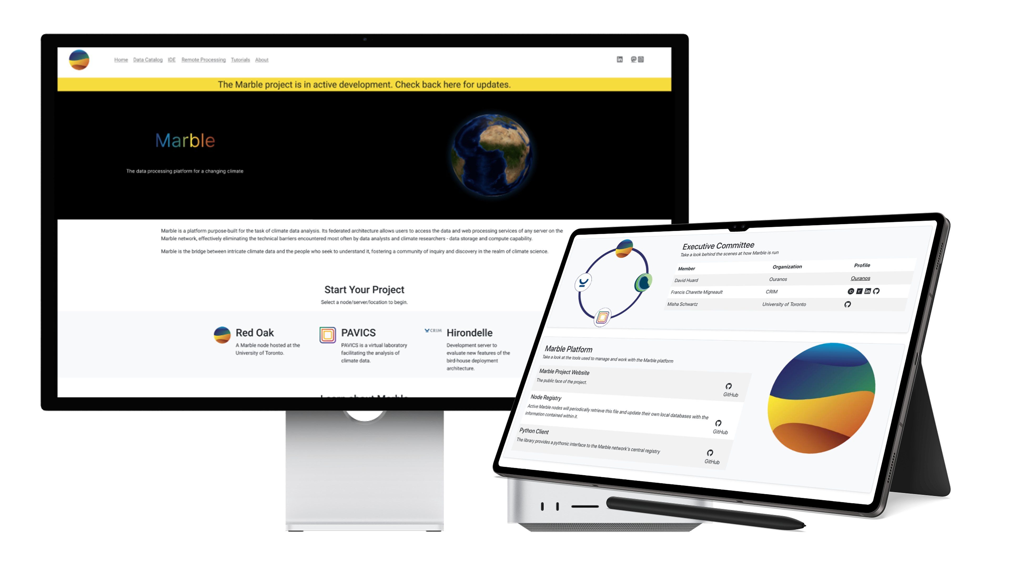
Marble Climate Original UI
After
Marble Climate
Developed by DACCS: A collaboration led by Canadian institutions like the University of Toronto, Concordia, Ouranos, and Natural Resources Canada.
The Goal: Transform Marble Climate Website
I led an initiative to challenge this assumption and reimagine what’s possible on the Marble platform.
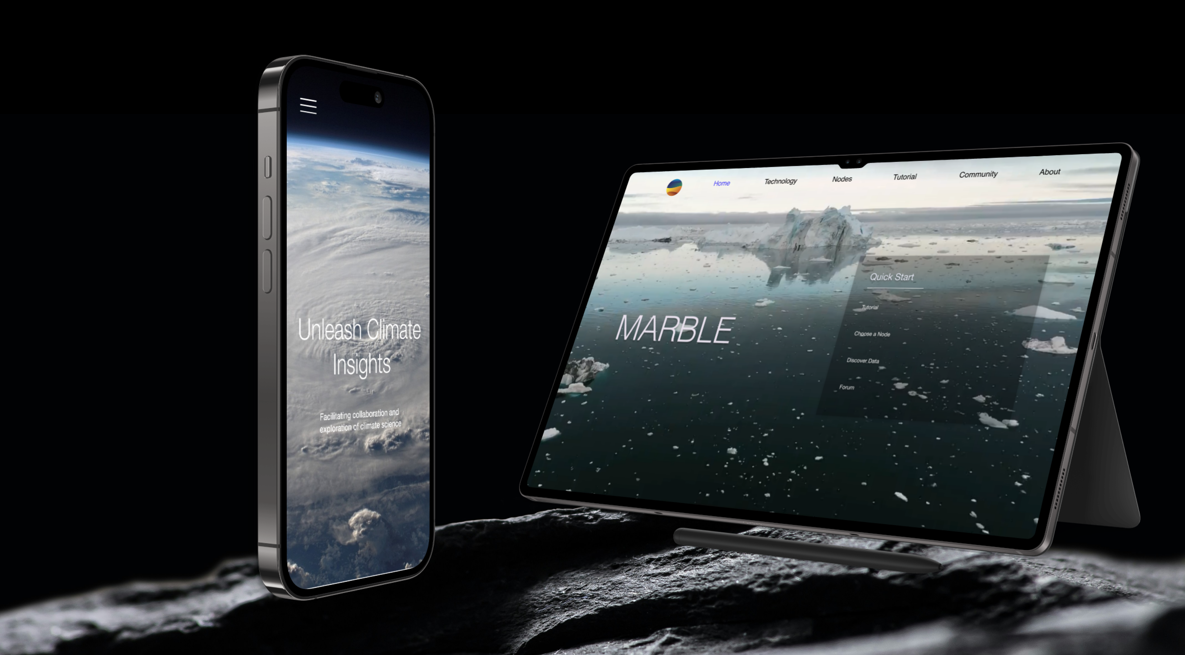
To make this vision a reality, I redesigned the Marble Climate platform with a fully responsive interface that adapts seamlessly across devices.
My Role
I led the end-to-end UX/UI redesign of the Marble Climate platform as the sole designer on the project.
My responsibilities included:
Conducting user research to identify pain points in onboarding, node selection, and community support
Creating wireframes and high-fidelity prototypes for responsive web design
Collaborating with developers and system architecture to ensure accurate implementation of design components using Figma and GitHub
Throughout the process, I guided the design strategy with a user-first mindset, aiming to minimize friction, increase clarity, and foster long-term engagement.
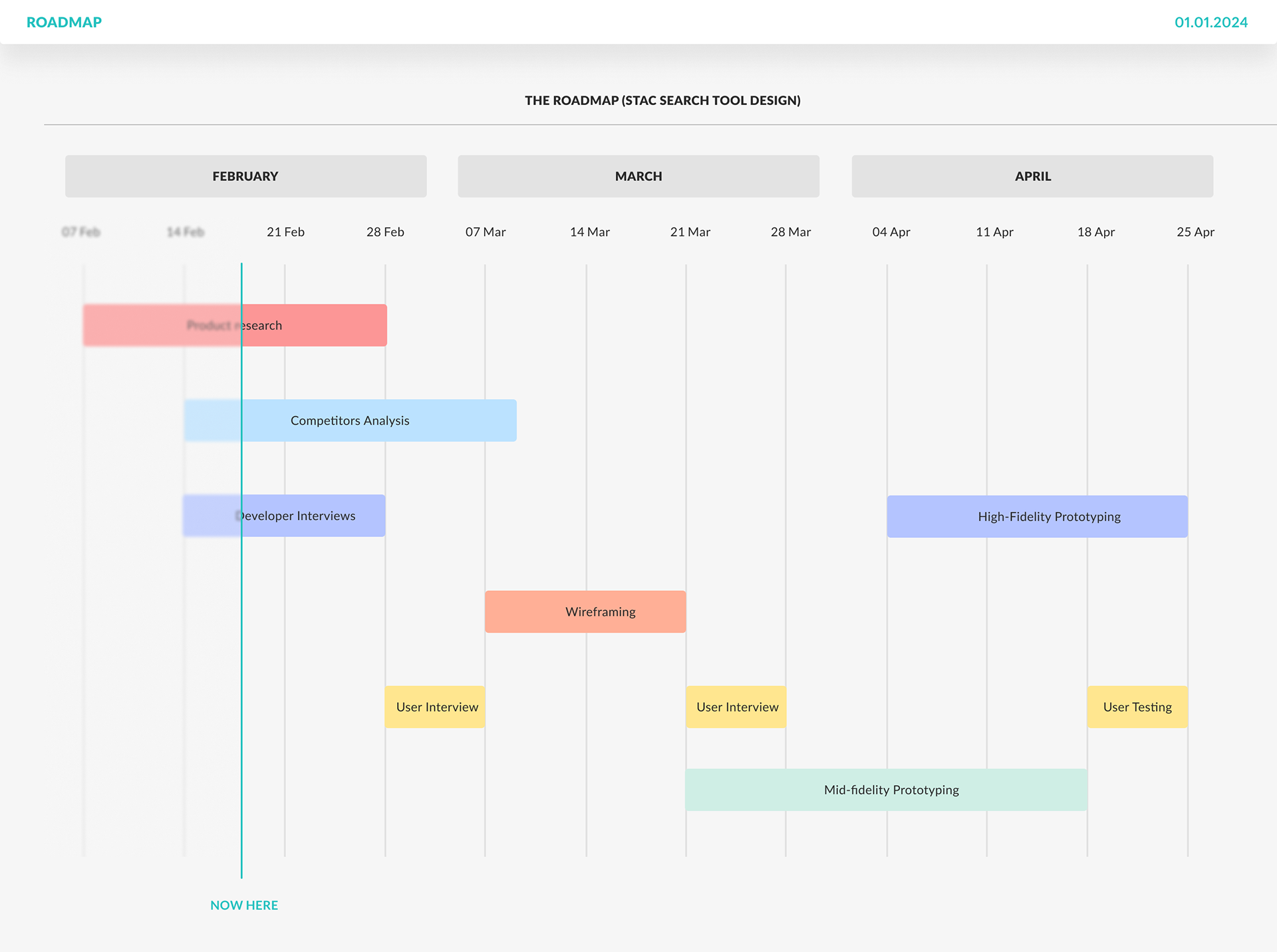
Timeline Roadmap
Problem Area
Our research uncovered several critical pain points in completing complex tasks on the platform:
•Users are required to fill out a form and wait for approval to register with a data node, creating friction in access.
•There is a lack of clear, detailed information about what each data node offers, making it difficult for researchers to choose the right one.
•Users expressed a strong need for a dedicated community and feedback section to ask questions, share experiences, and address concerns collaboratively.
Challenges and Opportunities
"Users abandoned the platform due to the lengthy and cumbersome registration process."
"New researchers struggled to identify where and how to begin their research journey."
"Students and researchers were unsure which data node best suited their specific research needs."
Introduced A Design system
Mapping Data Nodes To User Types
Nodes Mapped To User Types
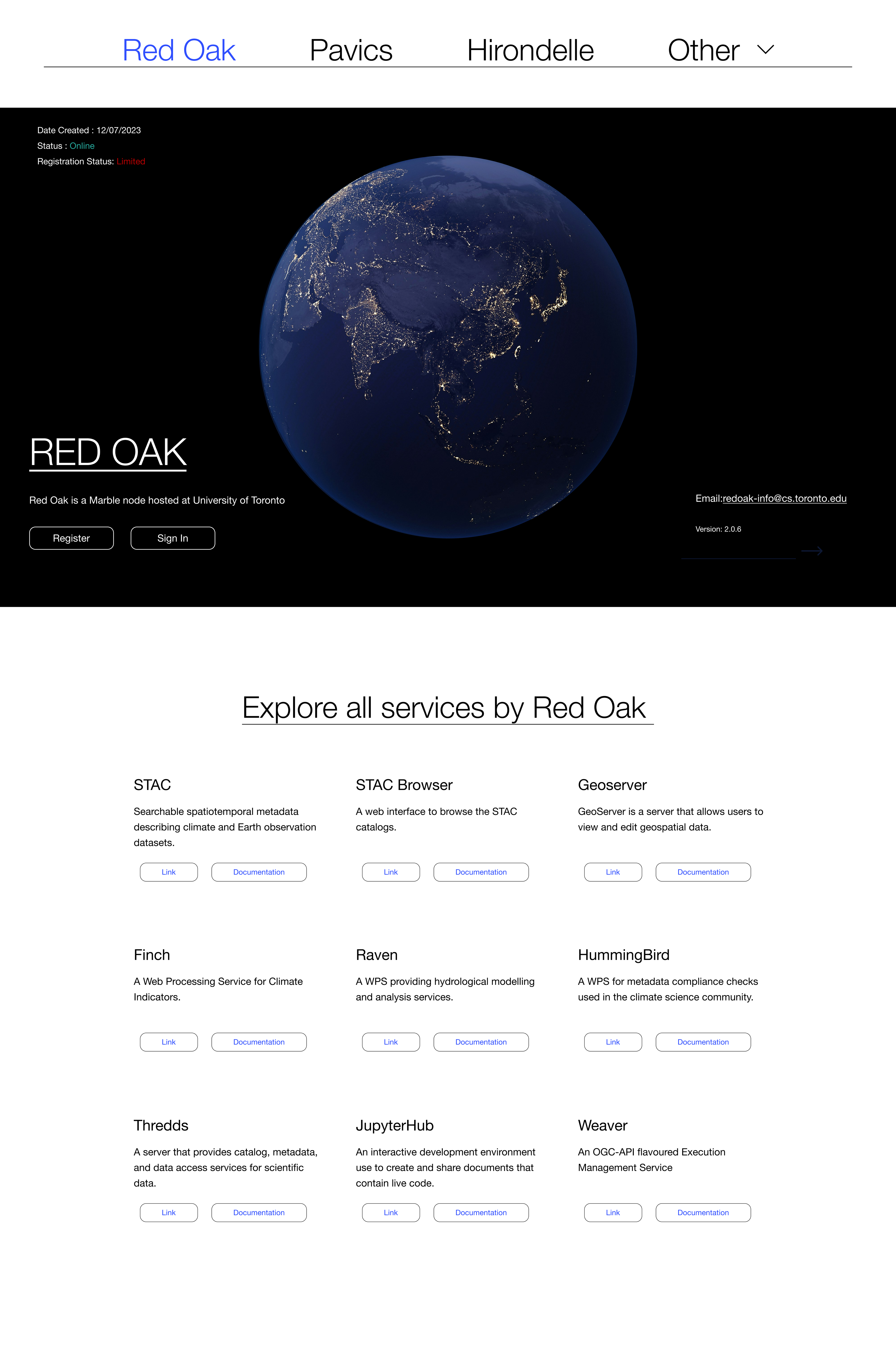
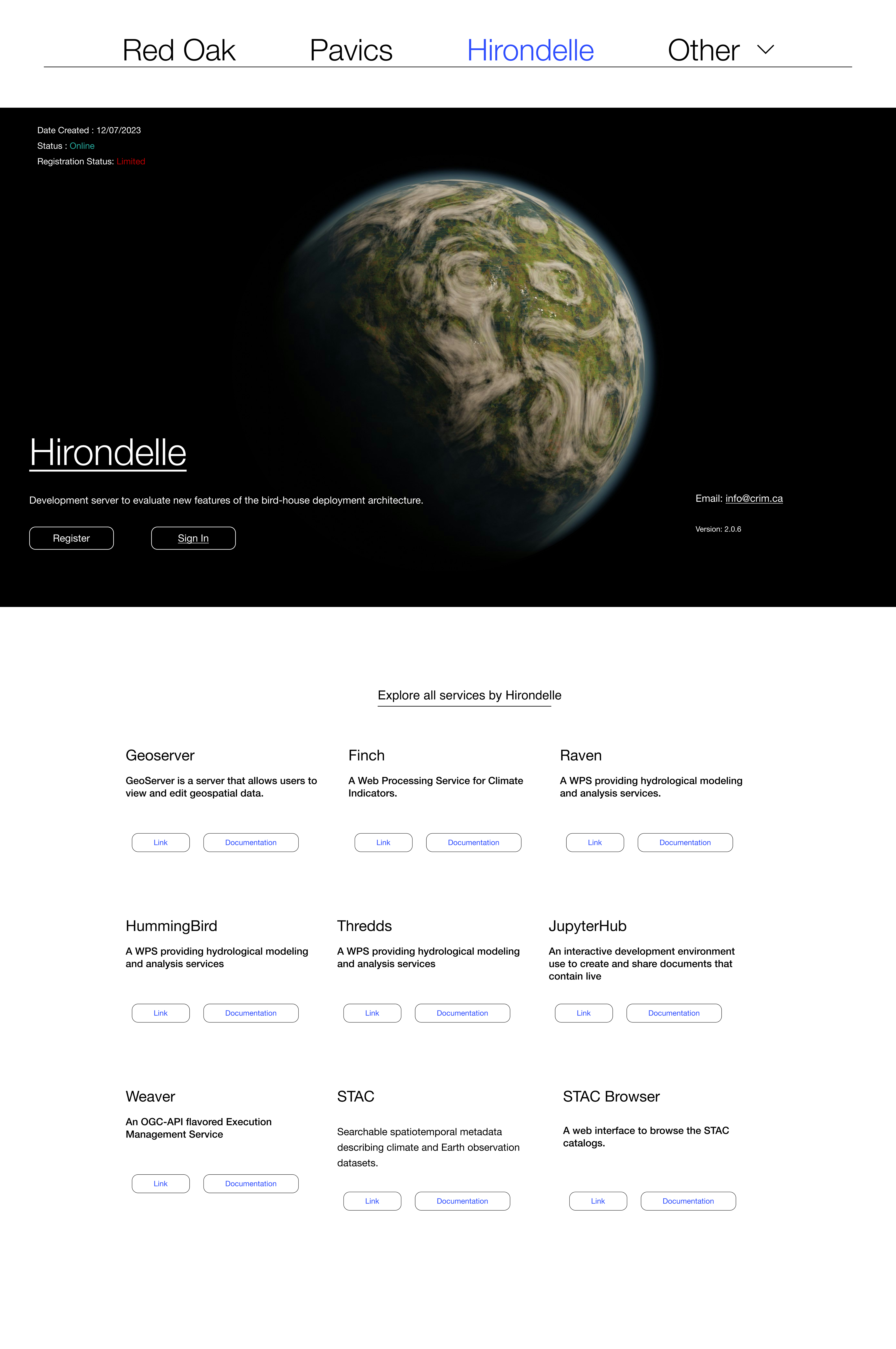
Services by Each Node
Login Experience
Mobile Experience
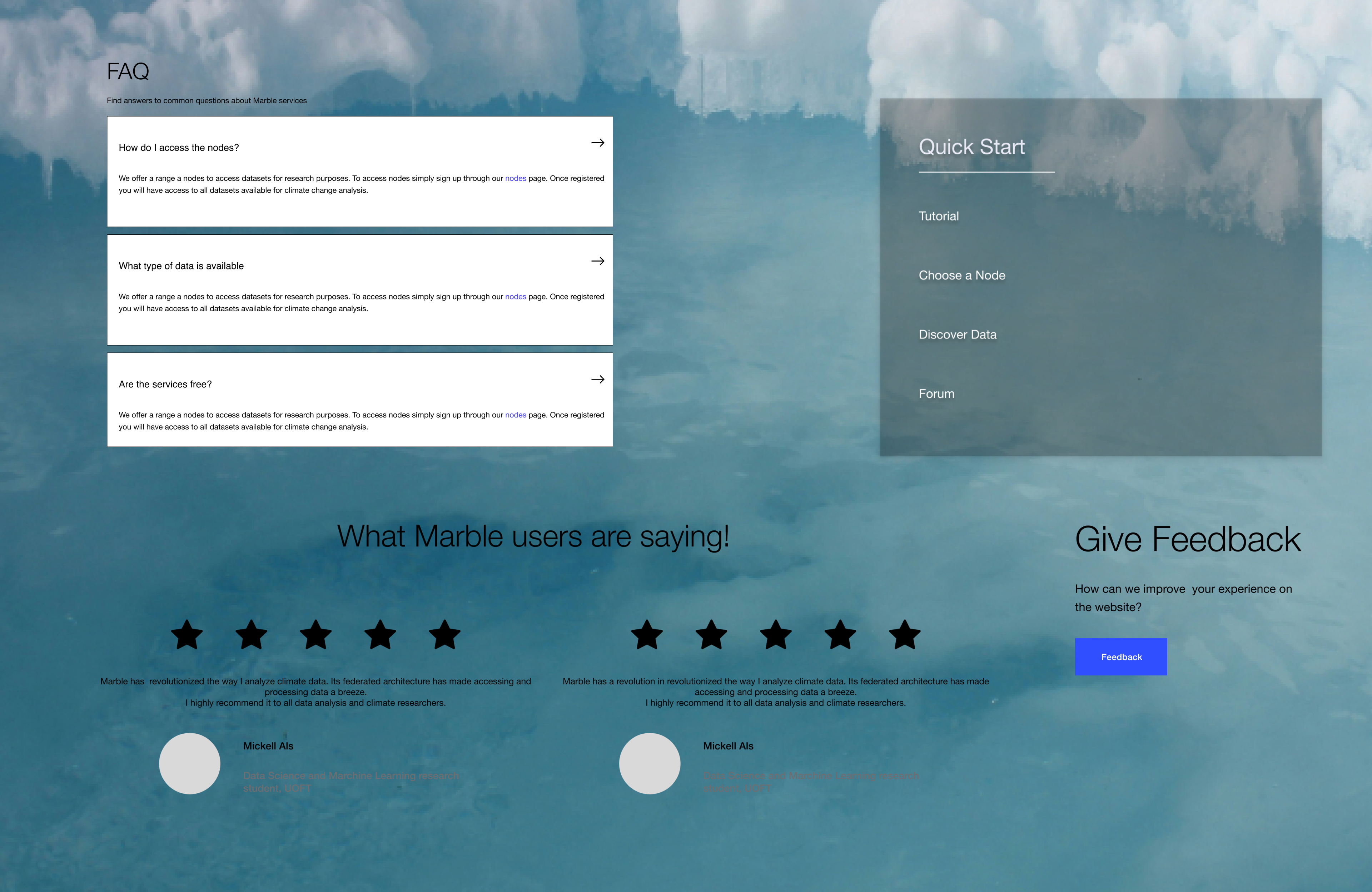
Features For Users to Connect, Provide Feedback And Navigate With Ease
Key Outcomes And Results
