Cutting Interaction Complexity by 60% for 1,000+ Climate Researchers and Scientists
Role
Lead UX designer
I led a full UX overhaul of the STAC Browser — a search interface for climate datasets used by scientists and researchers. The legacy system was powerful, but it was also difficult to navigate.
This case study shows how I turned a complex backend into a refined search and filtering experience that’s both intuitive and scalable.
Timeline
10 months (April 2024 - Feb 2025)
Team
System Architect, Software Developer, PM
Tools Used
Design & Analysis with Figma, Figma Make
Analysis Collaboration, Brainstorming with Mural
Climate models simulation with Python
Collaboration with developers, system architecture & stakeholders with GitHub

AI Tools
AI content creation with Descript
UX research with WEVO combines high-volume feedback, expert human analysis, and AI to deliver meaningful user insights.
User Interview with Tactiq (Zoom extension for note-taking, meeting summary, key discussions)
What is STAC?
STAC (SpatioTemporal Asset Catalog) is a standard and open community initiative aimed at making geospatial data easier to find and utilize.
How does it work?
Users can search for images or files by:
• Date range (e.g., from Jun 1955 to Dec 1961), historic research
• Location (draw a box on the map)
• Satellite or sensor (like Sentinel-2 or Landsat-8)
• Cloud coverage and other properties
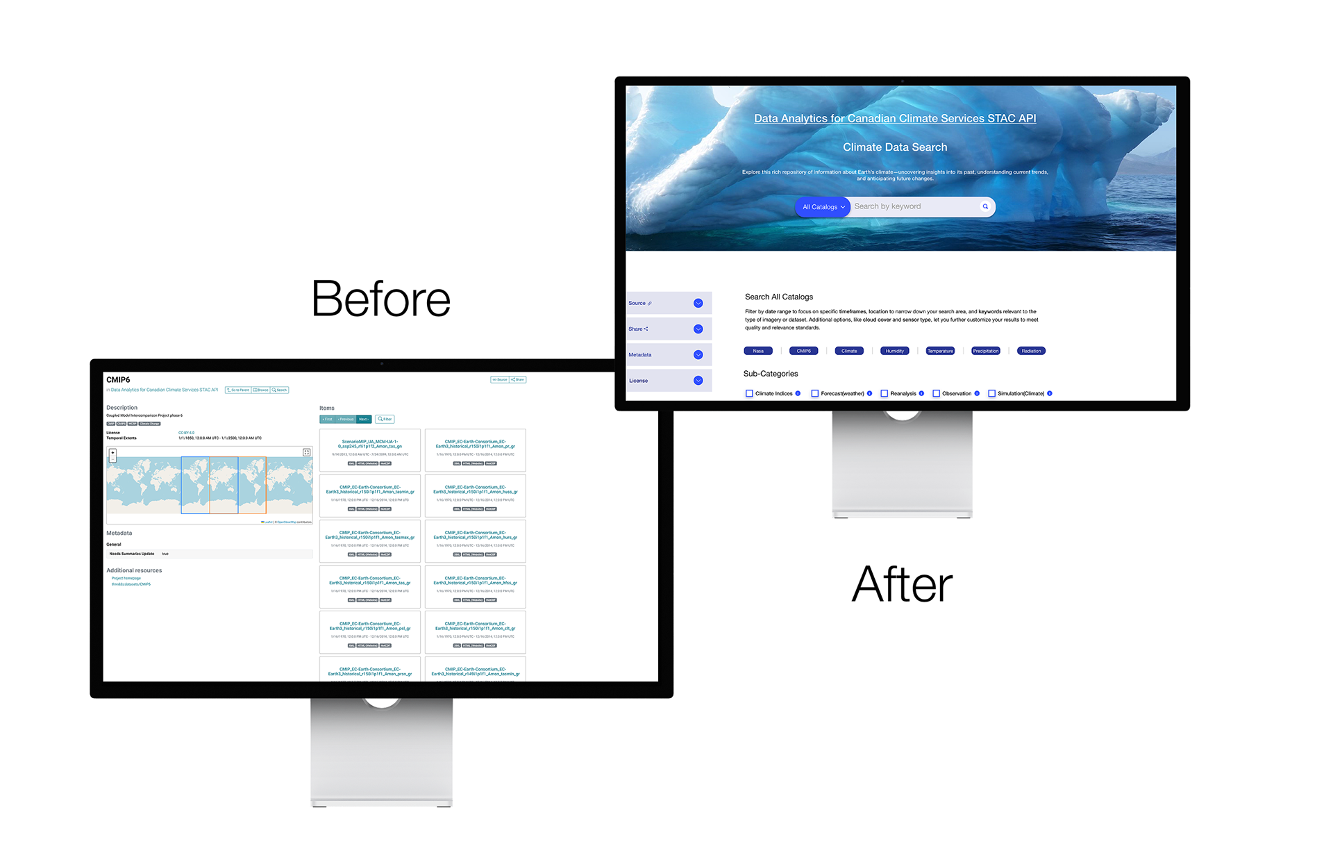
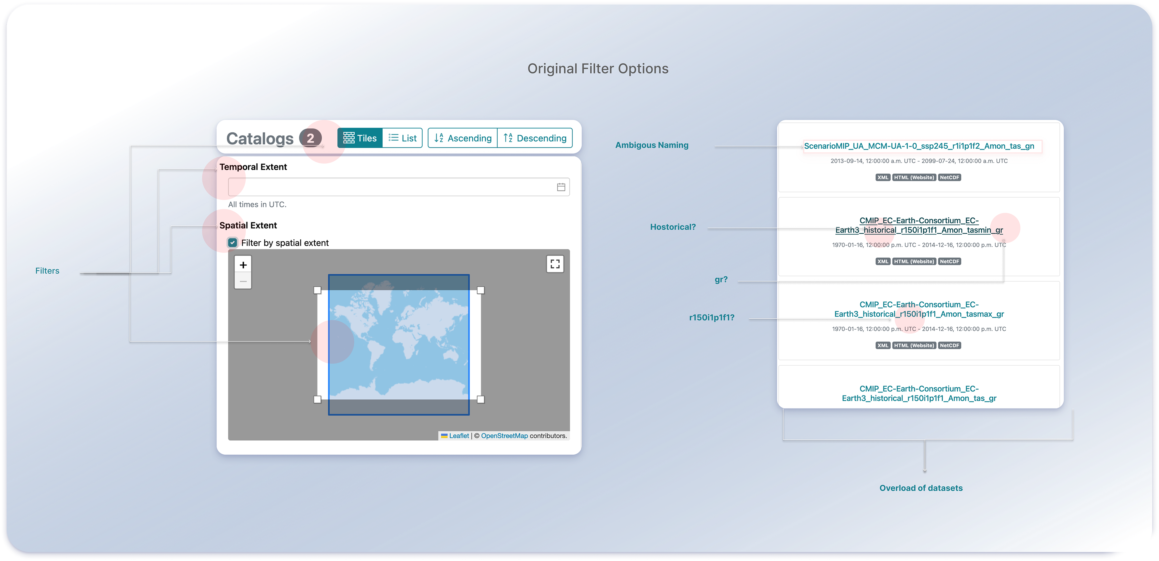
STAC Original UI
In this flow, users have two existing filters: temporal, which allows them to filter datasets based on a period, and Spatial extent, where users can filter datasets based on location.
But… to search properly, you usually need to know the right filter syntax or write JSON queries, or a diverse set to filters to extract the desired datasets.
Try out the new version!
The Problem
• Researchers were forced into a filter-first flow; many abandoned before finding datasets because they didn’t know the right facets or acronyms.
Users mainly struggled with:
“I’m not sure if I’m searching the right way or if the data even exists.” — User, Environmental Research
Technical Constraints vs. User Expectations
Real-time dataset previews could not be implemented due to Limited Storage
Personalized search recommendations were not offered due to stability concernsRich geospatial overlays were eliminated due to the cost of compute-heavy features
What I did:
• Led design efforts for rebuilding the data search platform and bulk filtering experiences
• Conducted 14+ user research sessions with climate scientists, researchers, and students to understand user needs.
• Pioneered AI integration in our design process using V0 by Vercel and Figma Make
• Collaborated closely with PM and system architect to navigate technical constraints and business priorities
• Established design review processes to ensure quality delivery despite handoff challenges
Methodologies Used
•31 interviews and a 32-response survey to identify motivational barriers among users (climate researchers, students, data scientists)
•Concurrent & Retrospective Think-Aloud methods for qualitative research
•Heuristic evaluations of STAC Browser and Data.europa.eu
• Prototyping cycles using AI tools, cutting iteration time by 50% and enabling
more efficient usability testing and research-informed pivotsSurveys & task-based assessments
more efficient usability testing and research-informed pivotsSurveys & task-based assessments
Competitor's Analysis
We had four prime platforms that served the same purpose. PANGEO, ESGF, COPRNICUS, URANUS.
We cannot say they are competitors, as the researchers can use several platforms to find the datasets they need for their research.
A full analysis suggested :
1. No Direct search exists on any platforms
2. Multiple intuitive filters are available for users to filter datasets according to their needs.
3. No clear description of acronyms used in dataset names.
Explore full competitor analysis below
Developer Onboarding to Design Tools
Created a live Figma tutorial and walkthrough explaining:
How to inspect styles, spacing, and structure
How to extract design tokens
How to translate components into code with accuracy
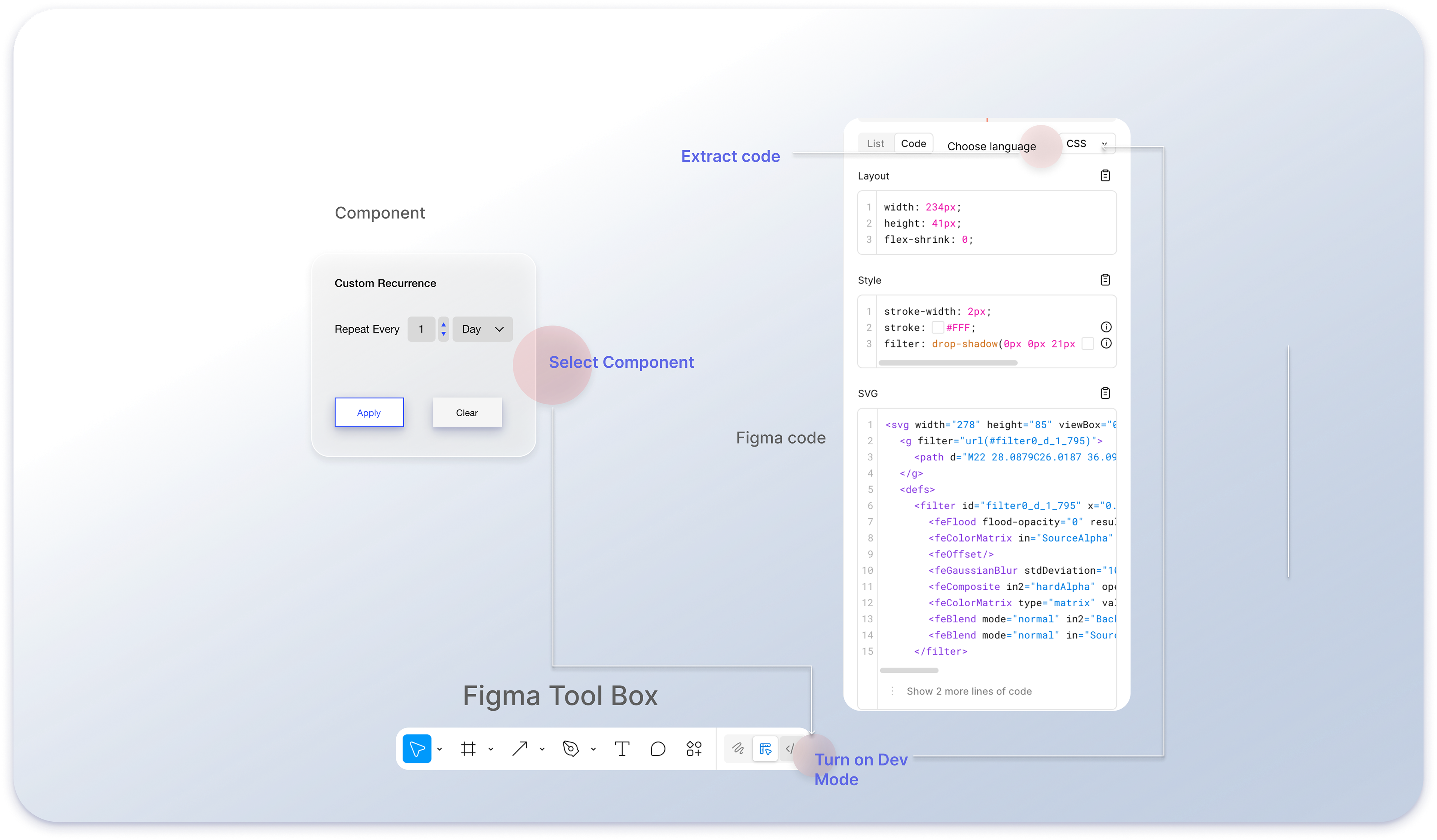
This reduced back-and-forth and dramatically improved developer speed.
No Design System Existed!
There was no UI kit, no spacing rules, no reusable patterns — just raw HTML.
What I did:
Built a robust Figma design system from scratch:
Created UI components for all filter types and modals, ensuring system-level consistency across every screen
Google's Material Design–inspired functional color system for data-driven interfaces.
I built a design system based on a scientific / data-first palette since the tones (blue + teal + neutral grays) evoke trust, credibility, and a research feel.
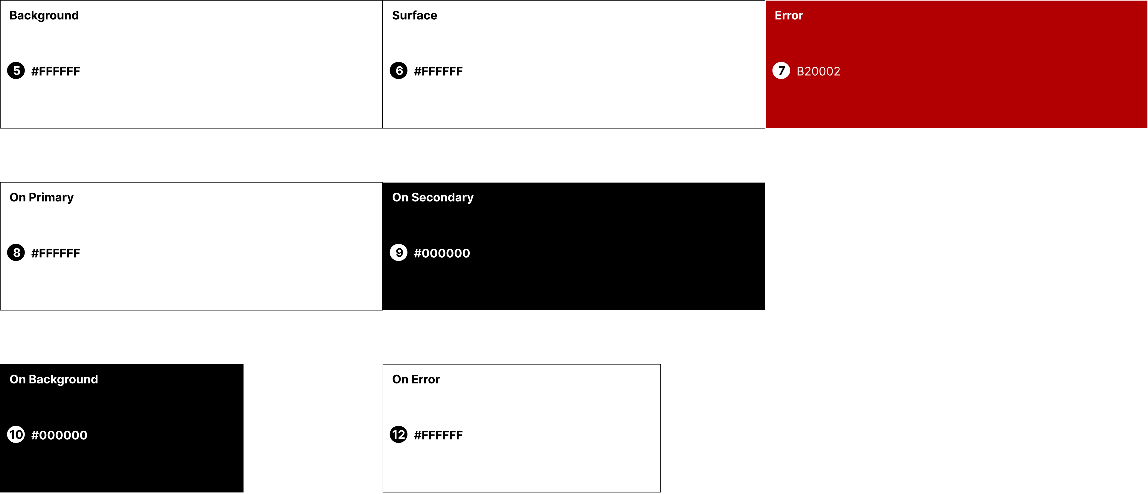
Accessibility & Inclusivity
•High-contrast pairs (#000000 on #FFFFFF, #FFFFFF on #B20002) align with WCAG guidelines, making the product accessible for users with low vision.
•Consistent “on-color” rules (text on surfaces) ensure that no matter the background, readability is guaranteed.
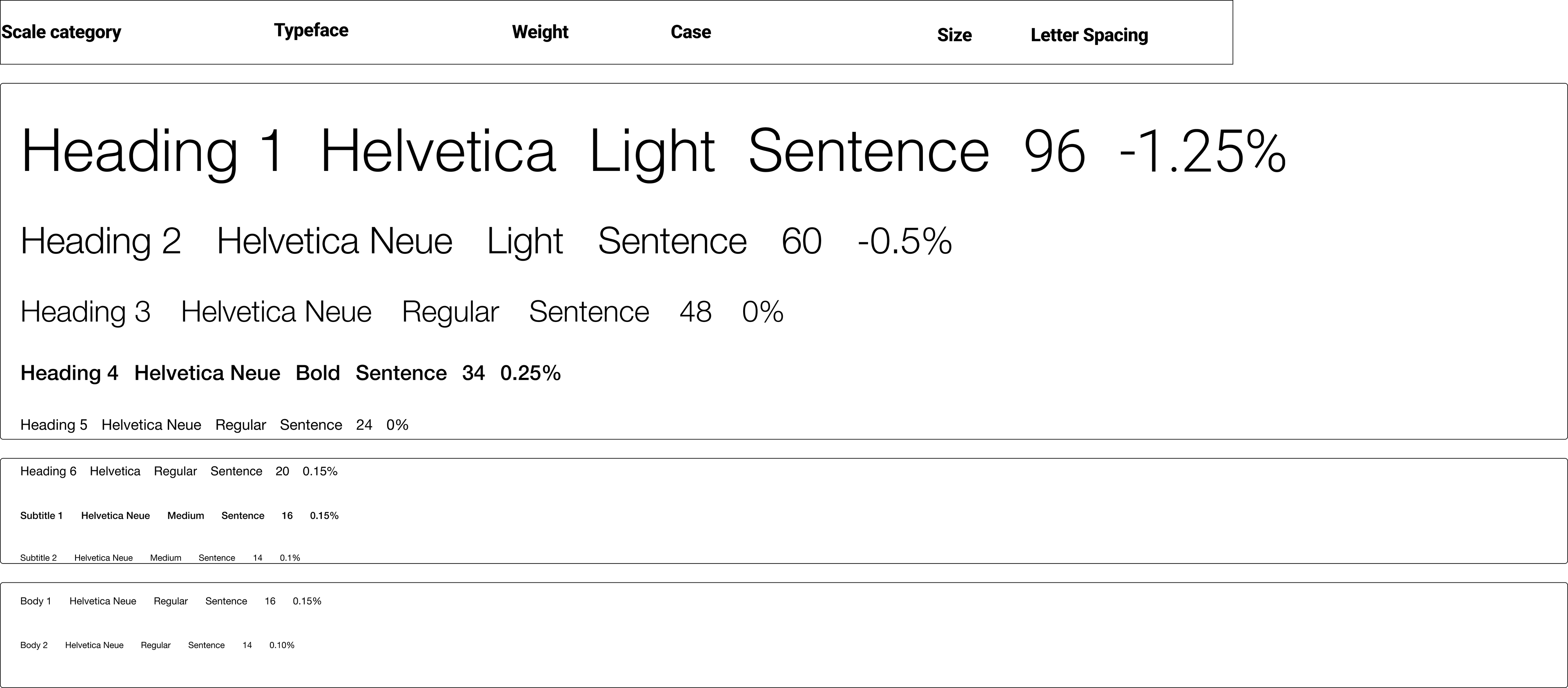
Standardize Typography
I chose Sans Serif's Helvetica Neue font style because as it balances clarity, neutrality, and hierarchy. It helps users scan dense data quickly, trust the interface as scientific and professional, and navigate content with a clear typographic rhythm.
The system isn’t just aesthetic. It’s a functional UX decision to optimize readability and reduce cognitive load in a research-heavy product.
Smarter Climate Dataset Search: Component Library
Designed a reusable component library for STAC Browser’s smarter dataset search.
Guided by consistency, accessibility, scalability, and flexibility, the library includes a global NLP-powered search bar, result cards, filter chips, and an adaptive results panel.
It ensures a cohesive experience, speeds up developer handoff, and scales across tools. This approach reduced time-to-result by 50% and improved dataset discovery by 30%.
Understanding Our Users: Analysts Under Pressure
This section is divided into 3 subsections. The first two subsections document feedback for Marble Dataset Search and data.europe.eu, labeled P for positive and N for negative.
Marble Dataset Search User Interaction
P1: 68% of participants noted the search filter, search button, and Temporal extent features as easily accessible and user-friendly, commenting that the design was “comfortable.”
P2: 79% of participants expressed a clear understanding and appreciation of the layout of the search results page.
N1: 26% of participants observed that there was an overload of datasets when searching for a specific dataset and did not know which dataset to utilize for particular research.
"To find the data set that I needed, I first had to find a research paper outlining what every acronym was and the data formatting for specific models."
N2: In a multitasking scenario, 21% of participants found that they needed to refer to a research paper to find an acronym
N3: 16% of participants found the data search confusing.
“It is difficult to understand the naming conventions.”
N5: 11% of participants were unsure about datasets specific to the temporal range of monthly, hourly and daily.
N6: Participants had to use a different search engine to find high-resolution and low-resolution datasets.
"I was looking for a way to mark this dataset, but I couldn’t find it,” - after extensive scrolling.
N7: An undergraduate participant from China noted that the spatial extent feature is not functioning; she was unable to filter the dataset by the region or area she was searching for. Both the participant and the researchers acknowledged the limitations of the search features for users of browsers lacking comprehensive filter options.
N8: STAC Dataset Search suggested only one dataset, which wasn’t the best match. The rearrangement of search terms had a substantial effect on the results and the time spent searching.
Setting out STAC's re-design with these goals
Make filtering effortless: Create a direct search engine for dataset exploration, eliminating the need to filter out datasets.
Enhance search efficiency: Improve performance for multi-node queries using NLP search method.
Bridge the knowledge gap by providing easy-to-access explanations(metadata) for domain-specific terms/acronyms.
Modernize the experience: Deliver a polished, responsive design for a flawless and intuitive user experience
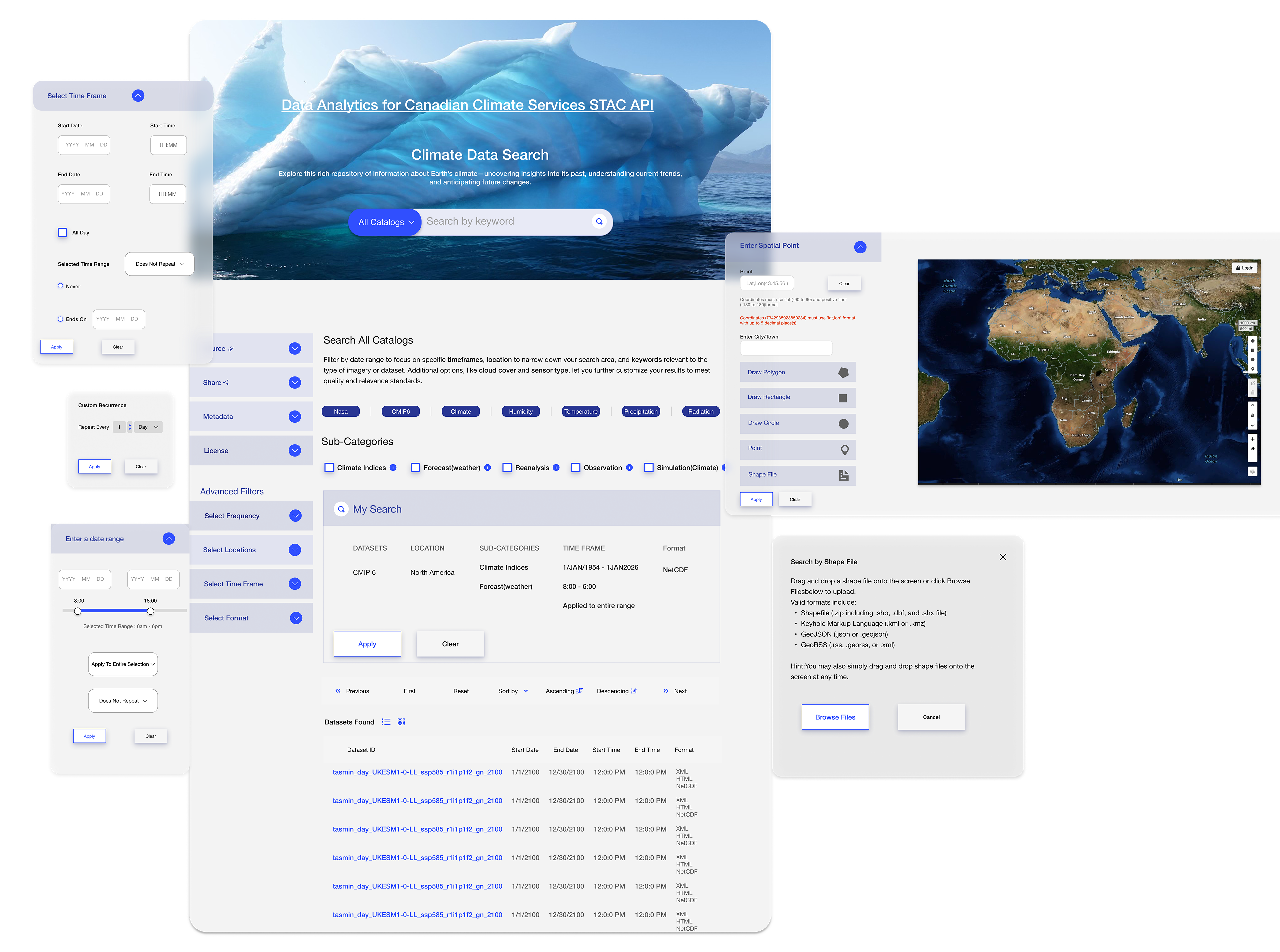
Proposed Search Features :
Fitt's Law - Search as the First Touchpoint
Problem
Researchers were forced into a filter-first flow; many abandoned before finding datasets because they didn’t know the right facets or acronyms.
Principle applied
Fitts’ Law → shorten motor travel and increase target size for the most-used action. I placed a large, high-contrast search bar at the top of every page (edge-aligned, full-width, autofocus on load, / keyboard shortcut) so the first pointer movement and keystroke go straight to search.
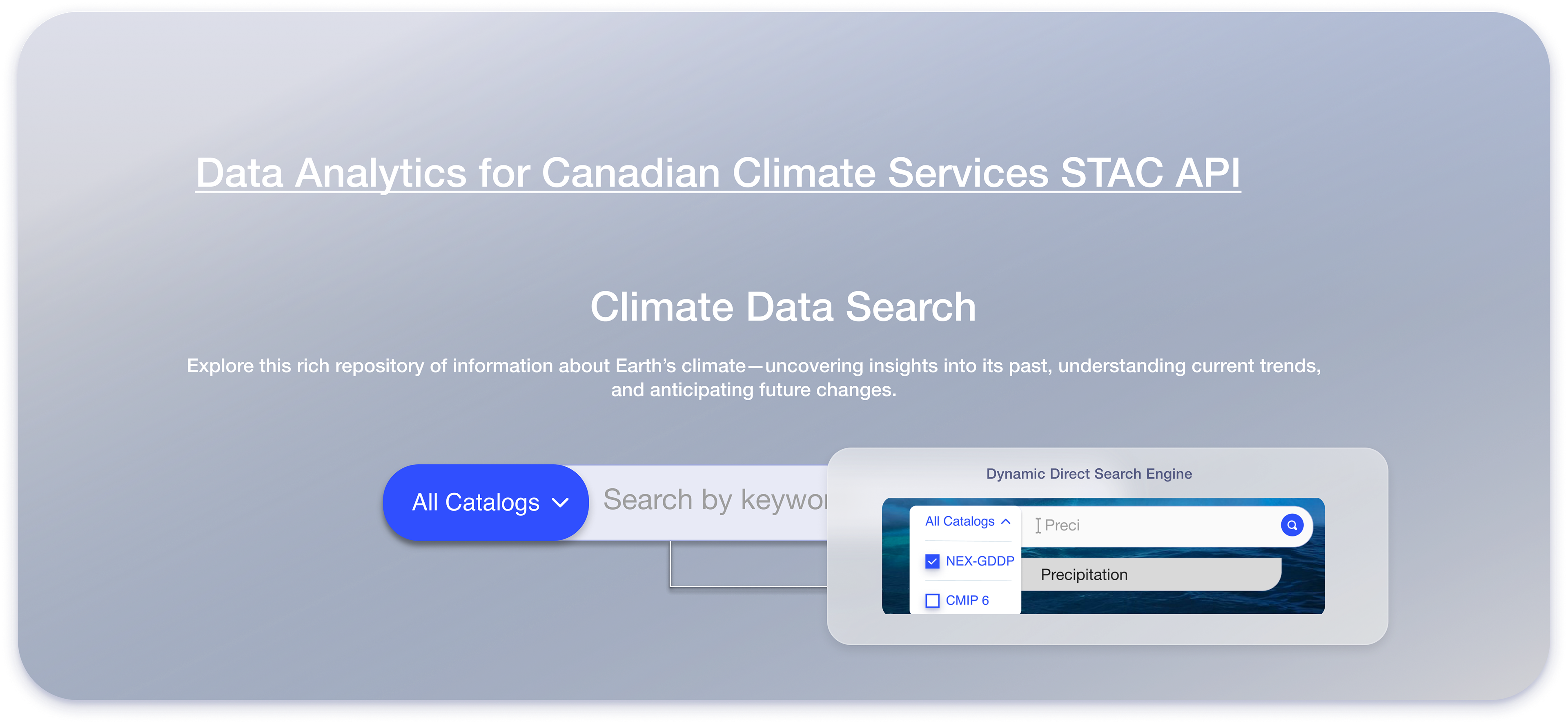
Direct “intent → result” path
Collaborated with the system architect to bypass the filter wall by letting search run NLP retrieval (synonym & acronym expansion, typo tolerance, lemmatization) across titles, variables, abstracts, and tags—returning relevant sets immediately. Facets remain, but as refinement, not a prerequisite.
NLP details
Acronym decoding (e.g., “SST” → Sea Surface Temperature), domain synonyms (e.g., “rainfall” ↔ “precipitation”), and unit/variable normalization.
Query understanding: detects entities (place/time/variable), boosts exact matches, and auto-applies suggestive filters post-search (chips) instead of forcing pre-filters.
Typo-tolerance and fuzzy matching reduce zero-result states.
Interaction design
First-hit focus state with large caret and helper text (“Try ‘SST 2010–2020 Pacific’”).
Instant results dropdown (top 5) + Enter opens full results; arrow keys navigate.
The results page keeps the search bar fixed at the top; filters in a secondary column load with pre-selected chips derived from the query.
Accessibility & speed
44px min hit-area, WCAG AA contrast, screen-reader labels (“Search datasets”), and sub-150ms keystroke-to-preview using debounced queries and cached indices.
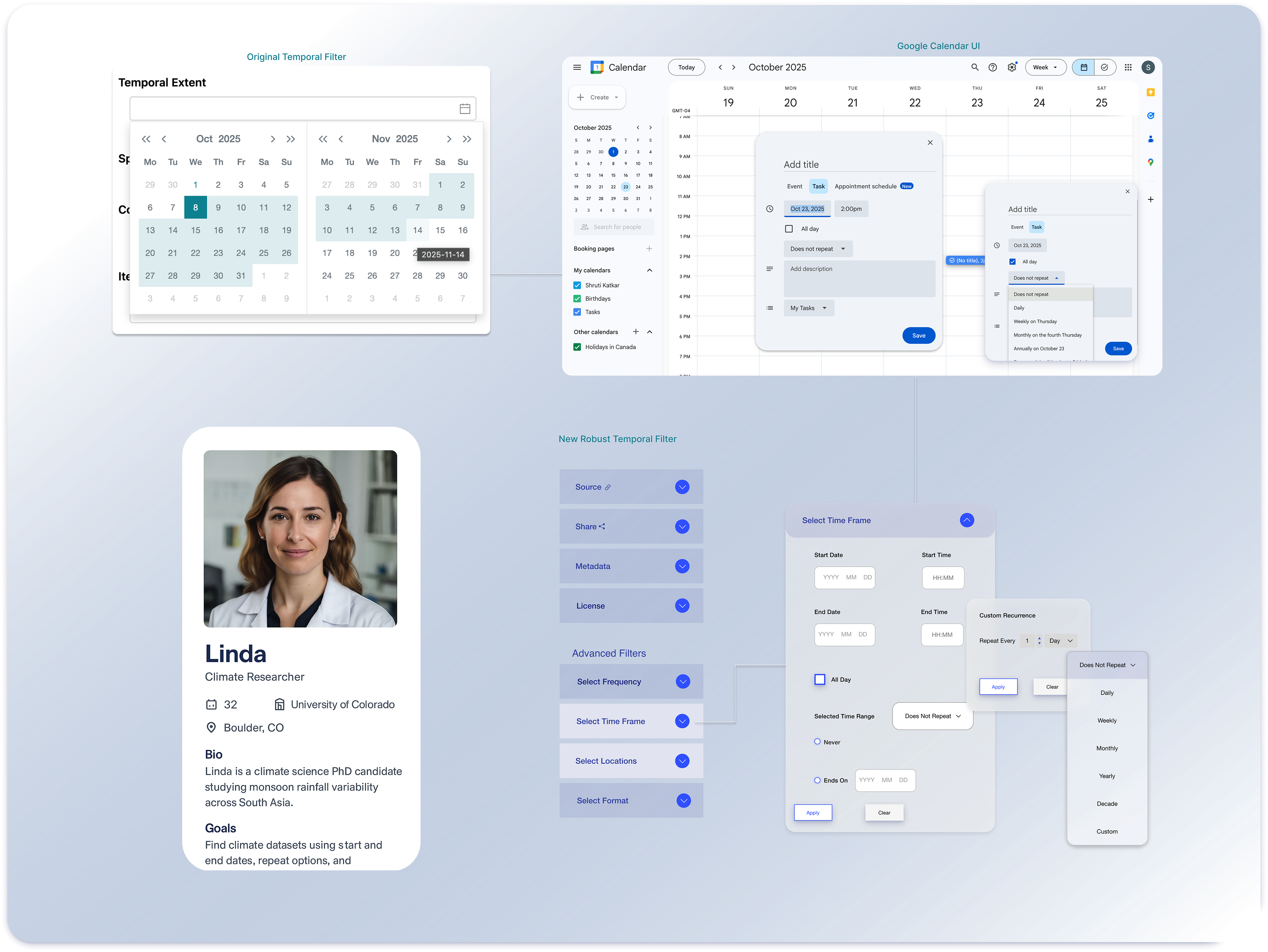
Redesign of the Temporal Filter Using the Law of Similarity
Using the Law of Similarity, I grouped temporal filters—start/end dates, recurrence, and advanced options—under a consistent design language. For researchers like Linda, this made dataset filtering intuitive, reduced errors, and accelerated discovery.
Use Case
Finding Climate Datasets with the New Filter
• Start/End Dates (Similarity in Layout & Style)
Linda notices that all date and time fields share the same shape, spacing, and typography, which makes it clear they belong to one group. She quickly inputs her study period: 1980–2020.
Recurrence Options (Similarity as Grouping)
Just like on Google Calendar, the recurrence dropdown looks visually similar to the date/time fields.
Linda immediately understands that it is part of the same flow. She sets a custom recurrence: every June–September (monsoon season).
• Advanced Filters (Similarity by Icon & Style)
The advanced filter set—frequency, location, format—all share the same pill-shaped style and alignment. This similarity signals to Linda that they are optional refinements, not separate workflows.
The advanced filter set—frequency, location, format—all share the same pill-shaped style and alignment. This similarity signals to Linda that they are optional refinements, not separate workflows.
She chooses a monthly frequency and South Asia as her location.
Result
Within seconds, Linda gets datasets that precisely match her research criteria without navigating confusing, inconsistent filters.
Within seconds, Linda gets datasets that precisely match her research criteria without navigating confusing, inconsistent filters.
Libraries by Common Variable Names
Many climate datasets use cryptic acronyms like tas, pr, ua, rls.
New users or interdisciplinary researchers may not know:
tas = Air Temperature (°C or K)
pr = Precipitation Rate (mm/day)
I collaborated with stakeholders to extract all acronyms with their standard names in the form of Airtable and integrated into the metadata, which helped decode these acronyms instantly, so users can search more accurately.
Smarter Climate Dataset Search: Final Product
Challenges
Use cards or a vertical block layout:
✦ Backend limits restricted real-time preview
✦ Developer new to Figma — solved with tutorial
✦ No design system — built from scratch
✦ Schema inconsistencies — built glossary using Airtable
✦ Collaborated on GitHub to align implementation
Outcomes
List or icons:
Users find relevant datasets faster
Filtering feels intuitive, not technical
Developer now reusing the design system in future tools
Stakeholders aligned across research → execution
Reflection
“This project taught me how to advocate for both user needs and technical feasibility. From system limitations to glossary integration, I worked to bridge clarity, consistency, and collaboration.”
“Have a complex, research-heavy product that needs clarity? I can help.”