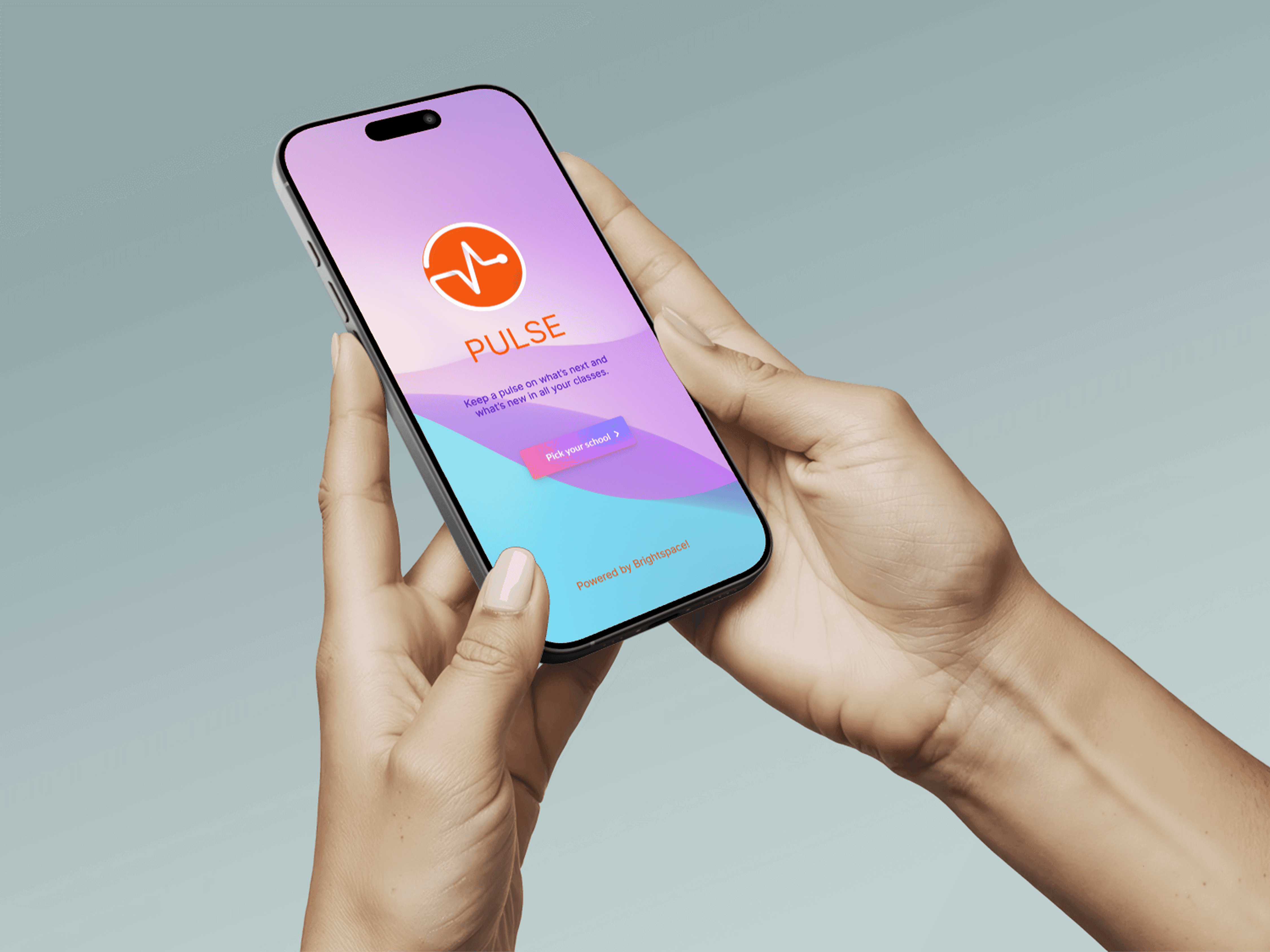
UI / UX Design
Design 2 Learn - Pulse App
The existing grading system in the Pulse app creates friction in how students interpret and act on their academic data. Limited comparability across courses, poor feedback visibility, and lack of progress tracking hinder students’ ability to make informed decisions about their learning.
Year :
2024
Industry :
EdTech
Client :
University of Toronto
Project Duration :
3 weeks
Role:
Tools:
Figma, FigJam, ClaudeAi, FigmaMake, Descript
"The Email That Started Everything"
February 2024. The University of Toronto's Climate Research Department asked me to redesign their website.
I opened marbleclimate.com and stared at it for five minutes, genuinely confused.
If I - someone who designs digital products for a living - couldn't understand this, what chance did a sleep-deprived PhD student have at midnight?
Problem
Week 1: Falling Down the Rabbit Hole
The original site was built with care - comprehensive, technically accurate, thoroughly documented. Brilliant scientists created a complete reference guide to everything Marble offered.
It just hadn't been designed through a user experience lens yet.
01 Paradox of choice
"I was not sure which node should I choose! Thanks to the professors and the Marble team who walk me through it." - PhD student
01 Paradox of choice
02 - Long wait time for registration and student account approvals
Students depended heavily on professors or senior lab members to understand the platform, managing their accounts, requesting changes to their accounts.
“Every time a new student joins, we end up explaining the same tools again. It takes hours, and it’s not sustainable.” - HOD Climate Science Department
02 - Long wait time for registration and student account approvals
03 - Form filling and waiting time for registration to complete
Nodes, services, and the STAC Browser felt like separate systems rather than parts of one research workflow.
“I reached out to the team to find out how long it would take to access RedOak services after filling the registration form”
03 - Form filling and waiting time for registration to complete
Research & Insights
Before User Flow
Lands on home page - Selects a node without prior knowledge->New user fills a form for registration uncertain of the wait time-> 1 road block-> Uses a third party site Magpie for account management-> 2 logins on 2 other third party sites-> starts the research
After User Flow
Constraints
The Constraint That Became My Design Thesis
Week 2. The dev team told me we couldn't change the backend authentication system.
My carefully planned redesign collapsed in 30 seconds.
Marble is a gateway to nodes managed by separate institutions. Manual approvals aren't a bug - they're how the system works. We can't integrate Magpie. We can't automate approvals. We can't even show real-time status.
I went home defeated. next morning, I had a different thought:
What if this constraint was actually the answer?
Everyone designs for perfect systems - instant access, seamless experiences, magic moments. But real systems are messy. They have manual approvals, wait times, imperfect infrastructure.
What if I stopped trying to hide the mess and started being honest about it? I went ahead created a user flow and documented a report on how I would tackle the constraints to convince the team.
🎉Team was Onboarded
Since the team was onboarded and approved the login/account management system UI, I went ahead and designed low fidelity wireframes for the rest of the Mable website with only two screens -Home Page and About Page . I wanted users to find everythig in one place - Quick start menu, Information on technology and services offered, Nodes to select, Tutorials, FAQ's all accessible just on a quick scroll on Home Page. About Page for Information about Marble platform, acknowledging team members - The scientific and executive team, testimonials by existing Phd students and researchers on Marble platform.
How I managed constraints
Since I couldn't eliminate the wait, I designed around it:
1. Set expectations upfront
Before users even clicked "Register," I added clear messaging: "After submitting, you'll receive a confirmation email. Administrators typically review requests within 1-2 business days."
2. Turned waiting time into preparation time
The post-submission confirmation now said: "Registration submitted! While you wait for approval (1-2 days), explore our tutorials to prepare for your research." With direct links to getting-started resources.
3. Designed email communication as part of the experience
Created a confirmation email template that explained the approval process, provided a contact person, and linked to preparatory materials. The wait became less mysterious and more productive.
Process
🎉Team was Onboarded
"I was not sure which node should I choose! Thanks to the professors and the Marble team who walk me through it." - PhD student
Since the team was onboarded and approved the login/account management system UI, I went ahead and designed low fidelity wireframes for the rest of the Mable website with only two screens -Home Page and About Page . I wanted users to find everythig in one place - Quick start menu, Information on technology and services offered, Nodes to select, Tutorials, FAQ's all accessible just on a quick scroll on Home Page. About Page for Information about Marble platform, acknowledging team members - The scientific and executive team, testimonials by existing Phd students and researchers on Marble platform.
Here’s how the prototype evolved…
CONVERSATIONS THAT CHANGED MY APPROACH
I scheduled interviews with 3 PhD students, 2 climate researchers and 2 new users. I expected technical feedback - "the navigation is confusing," "the buttons are hard to find,".
Instead, the struggles were deep rooted, users did not struggle much with the UI, they struggled with onboarding experience. Let's dive straight in to see what they said!
Solution
This project introduces a 3D abstract artwork centered on a coral-colored spiral form with smooth, flowing curves. Set against a soft pink gradient background, the design leverages organic geometry to create a sense of movement and depth.
The use of coral tones brings warmth and vibrancy, while the gentle gradient enhances the overall softness and modern appeal. This composition aims to capture attention while remaining elegant and balanced.
Decision 1: Two Pathways, No Apologies
Week 3. My manager asked why Login was hidden until after clicking "Let's Dive!"
She was right to question it. I'd spent weeks criticizing the original site for treating everyone the same - and here I was about to make the exact same mistake.
Every design principle I'd learned said: One clear CTA per page. Don't give users choices.
But the research was undeniable: two distinct user groups with opposite needs.
I put both buttons on the hero. "Let's Dive!" for new users. "Login" for returning users. Equal weight. No hierarchy.
When I tested it with 5 students, nobody was confused. Each group naturally found their path.
The learning: Sometimes the "rules" we follow protect us from making hard decisions, not users from confusion.
Before No CTA in Hero Section
Users needed to browse through all available nodes as soon as they landed on homepage, leaving new users unclear of what to do1
After 2 CTA's in Hero Section
"Let's Dive!" for new users and "Login" for existing users giving users clear direction of what they can do as soon as they land of the Home Page.

Decision 2: The Persistent Quick Start Menu
What if one solution could serve all three?
I kept staring at my three problems: new users need orientation, returning users need speed, everyone needs to find tutorials.
After: That one solution! 💥
The Quick Start menu with four pathways (Choose a node, Tutorials, Discover data, Forum) - but here's the innovation: make it persistent. Not just on the homepage. Accessible from anywhere.
Decision 3 : The Image I Had to Fight For
Case I made
These students spend their days reading papers about climate catastrophe. They're analyzing data about ice melt, ocean acidification, species extinction. They chose this field because they care deeply about the planet.
This image isn't decoration. It's a reminder of why their work matters.
It says: You're not just accessing a server. You're researching systems that sustain life on Earth. That matters. Your work matters."
Sometimes the most important design decisions feel risky because they're emotional, not logical. But emotion is what makes people feel like they belong.

Decision 4 The Terminology Fight (And Why Student Voices Won)
Week 5. I suggested renaming "Explore the Technologies" to "Your Research ToolKit."
The technical team pushed back: "We're not selling products. We're providing access to technologies. That's accurate. JupyterLab IS a technology."
They were right. And they were wrong.
Technically accurate? Yes.
User-friendly? No.
But I wasn't going to win on opinion. So I brought data - specifically, student quotes:
"I didn't understand what 'integrated development environment' meant. I just wanted to know if I could run Python code."
"I kept looking for 'data access' but the page said 'data catalog' and I wasn't sure if that was the same thing."
Before : Generic, Hidden Filters
The design provided only basic temporal and spatial filters - Critical filters that users commonly used to search relevant data were missing entirely. Researchers had to work around these limitations or abandon their search.
After User-Driven Advanced Filters
A clear "Sub-Categories" section displays the five user relevant data types with checkboxes and info icons. Users can now filter by data types with descriptions explaining each category. This guides researchers toward the right data type immediately.
Decision 5 : The Segmentation Risk That Paid Off
"What are you? Student / Researcher / Hobbyist"
This terrified me. My fear: What if people don't identify with these categories? What if it creates friction? What if asking them to self-select makes them bounce? In design reviews, I heard: "Why not just show everyone the same content? Why complicate it?" Fair question. So I tested it. 10 students. Two versions: One page with all content - Segmented paths with filtered content
9 out of 10 preferred segmentation!
That's the difference between accessibility and belonging. Anyone can use the site (accessibility). But do they feel like it was designed WITH them in mind (belonging)? The segmentation created belonging.
But here's what really convinced me. One student said:
"When I clicked 'Student,' it felt like someone actually thought about me. Like this site was FOR me, not just available to me."
I was stuck. Genuinely stuck.
Week 4, Thursday night, 11pm. I was staring at my Figma file, exhausted and frustrated. I'd spent TWO WEEKS on one page and nothing worked.
Then I asked myself a different question:
What if I'm solving the wrong problem?
I'd been trying to design for "the correct choice." Guide them to the "best" node. Optimize their decision.
But what if there IS no "correct" choice? What if all three nodes are valid, and students just need enough context to pick one that feels right?
What if confidence matters more than optimization?
That reframe unlocked everything.
I designed the earth visualization - not to be pretty, but to communicate: These nodes are part of a connected global network.
Then I added just enough context:
Status (Is it available?)
Registration limits (Can I join?)
Institution (Where is it?)
Contact (Who can I ask?)
What happens next (You'll wait 1-2 days for approval)
Decision 6 : Two Weeks in Node Selection
Red Oak. PAVICS. Hirondelle.
Three computational nodes. Different institutions. Different datasets. Different capabilities.
To users? Three meaningless names.
I tried everything:
Attempt 1: Comparison table
Detailed features, specs, availability. Result: Students felt like they were shopping for cell phone plans. Wrong mental model.
Attempt 2: Geographic map
Show where nodes are located. Result: Implied proximity matters. It doesn't. They're all remote.
When I tested this version, students said:
"Oh, I get it. These are different servers, and good to know there's a wait. Now I'm prepared."
"I'll choose Red Oak since it's at my university."
Not everyone made the same choice. But everyone made a confident choice.
That's the win.
The Moment I Knew It Actually Worked
Week 11. Final test. 2 first-year PhD student went from homepage to registration in 2 minutes, 43 seconds (previous average: 8+ minutes).
They looked up: "That was pretty easy. So I just wait for the email now?"
Yes. They understood what happens next. No confusion.
Good design feels like nothing.
Reflection
Three Months Later: What Actually Changed
But here's what mattered more.
+52%
Registration completion
-65%
Time to register (8min → 3min)
-71%
Reduction in support tickets
A professor emailed:
"I used to schedule 30-minute onboarding sessions with every new student. This semester, I just sent the link. They all figured it out."
A student posted in Slack:
"Finally, a research tool that doesn't make me feel stupid for asking questions."
That's impact. Not percentages. People feeling capable and supported.
Reflection
What Didn't Work (And What I'd Fix)
Let me be honest about my failures:
The FAQ Page Was an Afterthought
I designed it in 2 hours right before launch. Slapped some accordion components together. Called it done. Post-launch analytics: 3rd most visited page. Average time on page: 4 minutes. Students were hunting for answers there. And I'd given them the bare minimum. If I could go back: I'd treat FAQ as a critical onboarding tool, not a checkbox. I'd organize it by user journey stages, not alphabetically. I'd add visuals, videos, examples. The lesson I carry now: No page is "just" secondary. Every page is someone's lifeline.
I Should Have Designed the Emails First, Not Last
The confirmation and approval emails are functional but bland. They work, but they could reinforce the brand, build excitement, provide better preparation resources.
Emails are part of the user experience. I know that now.
I Didn't Test With Enough Diverse Users
We focused heavily on PhD students (the primary audience). But professional researchers and hobbyists use Marble too. Their needs are different.
Post-launch, we heard from professional researchers that they wished there was a "Skip orientation" option. They don't need the hand-holding.
If I'd tested with them earlier, I would've built that escape hatch.
My Design Principles (Before and After)
Before Marble, I believed:
Follow best practices religiously One CTA per page, always Hide complexity from users Perfect systems matter most Designers know better than users
After Marble, I know:
Best practices serve users, not ego Multiple paths beat singular optimization when users have different needs Honesty about complexity builds more trust than fake seamlessness Transparent imperfect systems beat opaque perfect ones Users' voices trump designer opinions
The biggest shift: I used to design for how systems SHOULD work. Now I design for how humans ACTUALLY experience them.
The biggest shift: I used to design for how systems SHOULD work. Now I design for how humans ACTUALLY experience them.
What I'd Build Next
Senior designers understand scope. Here's what I'd tackle with more time:
Real-time approval status tracking (requires backend work)
Smart tutorial recommendations based on node choice
Peer mentorship matching for new students
Mobile-optimized registration flow
Shipping isn't the end. It's a milestone.
Final Reflection
I used to think design was making things pretty and solving problems with clever solutions.
Now I know design is translation.
Between the brilliant scientists who built Marble and the brilliant students who needed it, something was lost in translation. Not because anyone was wrong, but because technical language and human language aren't the same.
My job wasn't to fix what was broken. It was to build a bridge between two different ways of thinking.
Sometimes that bridge is beautiful imagery.
Sometimes it's dual pathways.
Sometimes it's honest communication about imperfect systems.
But it always starts with empathy - sitting with someone's confusion until you understand it deeply, then translating that into pixels that help.
That's what design is.
That's what I did at Marble.

More Projects


UI / UX Design
Design 2 Learn - Pulse App
The existing grading system in the Pulse app creates friction in how students interpret and act on their academic data. Limited comparability across courses, poor feedback visibility, and lack of progress tracking hinder students’ ability to make informed decisions about their learning.
Year :
2024
Industry :
EdTech
Client :
University of Toronto
Project Duration :
3 weeks
Role:
Tools:
Figma, FigJam, ClaudeAi, FigmaMake, Descript
"The Email That Started Everything"
February 2024. The University of Toronto's Climate Research Department asked me to redesign their website.
I opened marbleclimate.com and stared at it for five minutes, genuinely confused.
If I - someone who designs digital products for a living - couldn't understand this, what chance did a sleep-deprived PhD student have at midnight?
Problem
Week 1: Falling Down the Rabbit Hole
The original site was built with care - comprehensive, technically accurate, thoroughly documented. Brilliant scientists created a complete reference guide to everything Marble offered.
It just hadn't been designed through a user experience lens yet.
01 Paradox of choice
"I was not sure which node should I choose! Thanks to the professors and the Marble team who walk me through it." - PhD student
01 Paradox of choice
02 - Long wait time for registration and student account approvals
Students depended heavily on professors or senior lab members to understand the platform, managing their accounts, requesting changes to their accounts.
“Every time a new student joins, we end up explaining the same tools again. It takes hours, and it’s not sustainable.” - HOD Climate Science Department
02 - Long wait time for registration and student account approvals
03 - Form filling and waiting time for registration to complete
Nodes, services, and the STAC Browser felt like separate systems rather than parts of one research workflow.
“I reached out to the team to find out how long it would take to access RedOak services after filling the registration form”
03 - Form filling and waiting time for registration to complete
Research & Insights
Before User Flow
Lands on home page - Selects a node without prior knowledge->New user fills a form for registration uncertain of the wait time-> 1 road block-> Uses a third party site Magpie for account management-> 2 logins on 2 other third party sites-> starts the research
After User Flow
Constraints
The Constraint That Became My Design Thesis
Week 2. The dev team told me we couldn't change the backend authentication system.
My carefully planned redesign collapsed in 30 seconds.
Marble is a gateway to nodes managed by separate institutions. Manual approvals aren't a bug - they're how the system works. We can't integrate Magpie. We can't automate approvals. We can't even show real-time status.
I went home defeated. next morning, I had a different thought:
What if this constraint was actually the answer?
Everyone designs for perfect systems - instant access, seamless experiences, magic moments. But real systems are messy. They have manual approvals, wait times, imperfect infrastructure.
What if I stopped trying to hide the mess and started being honest about it? I went ahead created a user flow and documented a report on how I would tackle the constraints to convince the team.
🎉Team was Onboarded
Since the team was onboarded and approved the login/account management system UI, I went ahead and designed low fidelity wireframes for the rest of the Mable website with only two screens -Home Page and About Page . I wanted users to find everythig in one place - Quick start menu, Information on technology and services offered, Nodes to select, Tutorials, FAQ's all accessible just on a quick scroll on Home Page. About Page for Information about Marble platform, acknowledging team members - The scientific and executive team, testimonials by existing Phd students and researchers on Marble platform.
How I managed constraints
Since I couldn't eliminate the wait, I designed around it:
1. Set expectations upfront
Before users even clicked "Register," I added clear messaging: "After submitting, you'll receive a confirmation email. Administrators typically review requests within 1-2 business days."
2. Turned waiting time into preparation time
The post-submission confirmation now said: "Registration submitted! While you wait for approval (1-2 days), explore our tutorials to prepare for your research." With direct links to getting-started resources.
3. Designed email communication as part of the experience
Created a confirmation email template that explained the approval process, provided a contact person, and linked to preparatory materials. The wait became less mysterious and more productive.
Process
🎉Team was Onboarded
"I was not sure which node should I choose! Thanks to the professors and the Marble team who walk me through it." - PhD student
Since the team was onboarded and approved the login/account management system UI, I went ahead and designed low fidelity wireframes for the rest of the Mable website with only two screens -Home Page and About Page . I wanted users to find everythig in one place - Quick start menu, Information on technology and services offered, Nodes to select, Tutorials, FAQ's all accessible just on a quick scroll on Home Page. About Page for Information about Marble platform, acknowledging team members - The scientific and executive team, testimonials by existing Phd students and researchers on Marble platform.
Here’s how the prototype evolved…
CONVERSATIONS THAT CHANGED MY APPROACH
I scheduled interviews with 3 PhD students, 2 climate researchers and 2 new users. I expected technical feedback - "the navigation is confusing," "the buttons are hard to find,".
Instead, the struggles were deep rooted, users did not struggle much with the UI, they struggled with onboarding experience. Let's dive straight in to see what they said!
Solution
This project introduces a 3D abstract artwork centered on a coral-colored spiral form with smooth, flowing curves. Set against a soft pink gradient background, the design leverages organic geometry to create a sense of movement and depth.
The use of coral tones brings warmth and vibrancy, while the gentle gradient enhances the overall softness and modern appeal. This composition aims to capture attention while remaining elegant and balanced.
Decision 1: Two Pathways, No Apologies
Week 3. My manager asked why Login was hidden until after clicking "Let's Dive!"
She was right to question it. I'd spent weeks criticizing the original site for treating everyone the same - and here I was about to make the exact same mistake.
Every design principle I'd learned said: One clear CTA per page. Don't give users choices.
But the research was undeniable: two distinct user groups with opposite needs.
I put both buttons on the hero. "Let's Dive!" for new users. "Login" for returning users. Equal weight. No hierarchy.
When I tested it with 5 students, nobody was confused. Each group naturally found their path.
The learning: Sometimes the "rules" we follow protect us from making hard decisions, not users from confusion.
Before No CTA in Hero Section
Users needed to browse through all available nodes as soon as they landed on homepage, leaving new users unclear of what to do1
After 2 CTA's in Hero Section
"Let's Dive!" for new users and "Login" for existing users giving users clear direction of what they can do as soon as they land of the Home Page.
Decision 2: The Persistent Quick Start Menu
What if one solution could serve all three?
I kept staring at my three problems: new users need orientation, returning users need speed, everyone needs to find tutorials.
After: That one solution! 💥
The Quick Start menu with four pathways (Choose a node, Tutorials, Discover data, Forum) - but here's the innovation: make it persistent. Not just on the homepage. Accessible from anywhere.
Decision 3 : The Image I Had to Fight For
Case I made
These students spend their days reading papers about climate catastrophe. They're analyzing data about ice melt, ocean acidification, species extinction. They chose this field because they care deeply about the planet.
This image isn't decoration. It's a reminder of why their work matters.
It says: You're not just accessing a server. You're researching systems that sustain life on Earth. That matters. Your work matters."
Sometimes the most important design decisions feel risky because they're emotional, not logical. But emotion is what makes people feel like they belong.
Decision 4 The Terminology Fight (And Why Student Voices Won)
Week 5. I suggested renaming "Explore the Technologies" to "Your Research ToolKit."
The technical team pushed back: "We're not selling products. We're providing access to technologies. That's accurate. JupyterLab IS a technology."
They were right. And they were wrong.
Technically accurate? Yes.
User-friendly? No.
But I wasn't going to win on opinion. So I brought data - specifically, student quotes:
"I didn't understand what 'integrated development environment' meant. I just wanted to know if I could run Python code."
"I kept looking for 'data access' but the page said 'data catalog' and I wasn't sure if that was the same thing."
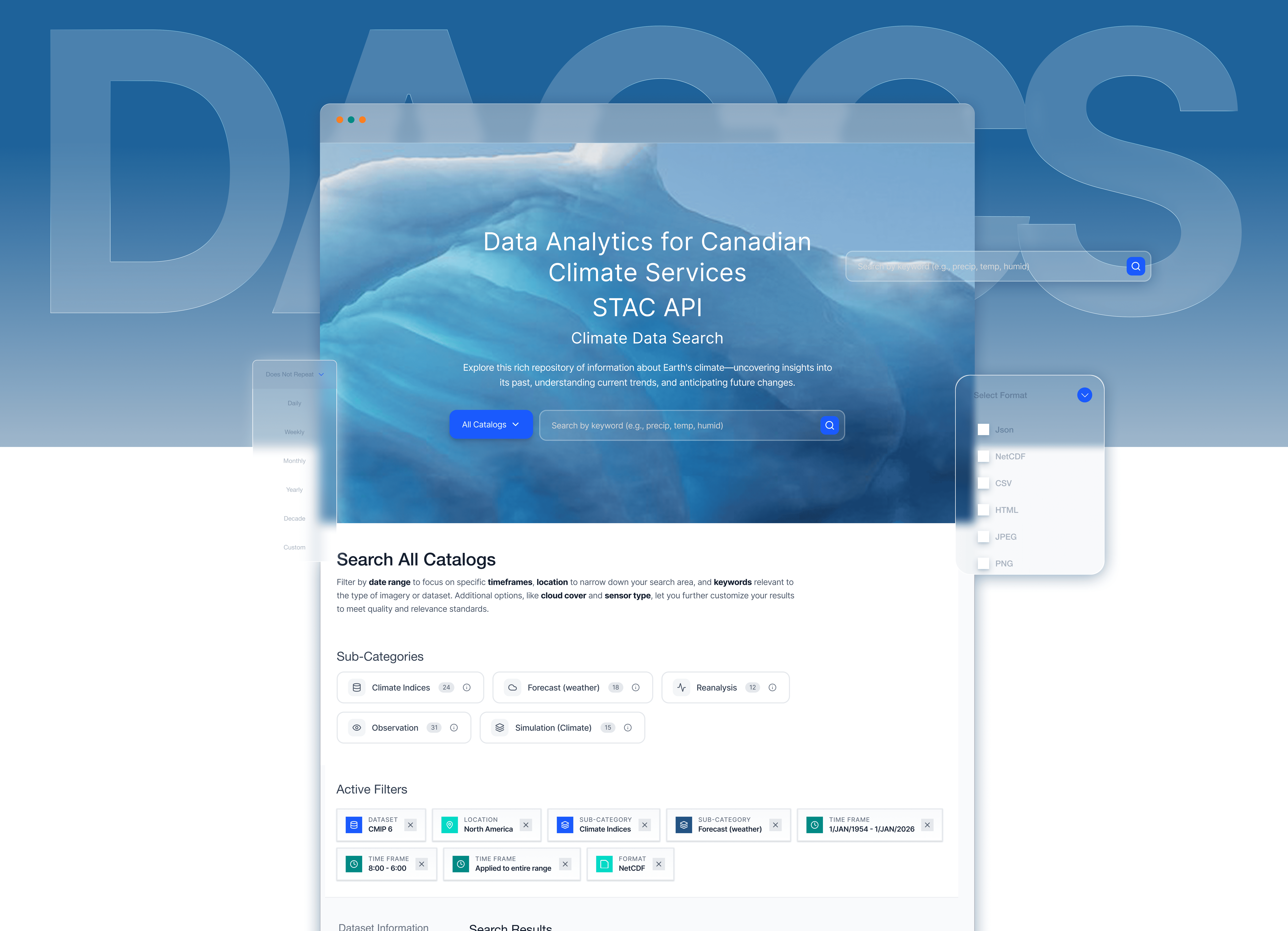
Before : Generic, Hidden Filters
The design provided only basic temporal and spatial filters - Critical filters that users commonly used to search relevant data were missing entirely. Researchers had to work around these limitations or abandon their search.
After User-Driven Advanced Filters
A clear "Sub-Categories" section displays the five user relevant data types with checkboxes and info icons. Users can now filter by data types with descriptions explaining each category. This guides researchers toward the right data type immediately.
Decision 5 : The Segmentation Risk That Paid Off
"What are you? Student / Researcher / Hobbyist"
This terrified me. My fear: What if people don't identify with these categories? What if it creates friction? What if asking them to self-select makes them bounce? In design reviews, I heard: "Why not just show everyone the same content? Why complicate it?" Fair question. So I tested it. 10 students. Two versions: One page with all content - Segmented paths with filtered content
9 out of 10 preferred segmentation!
That's the difference between accessibility and belonging. Anyone can use the site (accessibility). But do they feel like it was designed WITH them in mind (belonging)? The segmentation created belonging.
But here's what really convinced me. One student said:
"When I clicked 'Student,' it felt like someone actually thought about me. Like this site was FOR me, not just available to me."
I was stuck. Genuinely stuck.
Week 4, Thursday night, 11pm. I was staring at my Figma file, exhausted and frustrated. I'd spent TWO WEEKS on one page and nothing worked.
Then I asked myself a different question:
What if I'm solving the wrong problem?
I'd been trying to design for "the correct choice." Guide them to the "best" node. Optimize their decision.
But what if there IS no "correct" choice? What if all three nodes are valid, and students just need enough context to pick one that feels right?
What if confidence matters more than optimization?
That reframe unlocked everything.
I designed the earth visualization - not to be pretty, but to communicate: These nodes are part of a connected global network.
Then I added just enough context:
Status (Is it available?)
Registration limits (Can I join?)
Institution (Where is it?)
Contact (Who can I ask?)
What happens next (You'll wait 1-2 days for approval)
Decision 6 : Two Weeks in Node Selection
Red Oak. PAVICS. Hirondelle.
Three computational nodes. Different institutions. Different datasets. Different capabilities.
To users? Three meaningless names.
I tried everything:
Attempt 1: Comparison table
Detailed features, specs, availability. Result: Students felt like they were shopping for cell phone plans. Wrong mental model.
Attempt 2: Geographic map
Show where nodes are located. Result: Implied proximity matters. It doesn't. They're all remote.
When I tested this version, students said:
"Oh, I get it. These are different servers, and good to know there's a wait. Now I'm prepared."
"I'll choose Red Oak since it's at my university."
Not everyone made the same choice. But everyone made a confident choice.
That's the win.
The Moment I Knew It Actually Worked
Week 11. Final test. 2 first-year PhD student went from homepage to registration in 2 minutes, 43 seconds (previous average: 8+ minutes).
They looked up: "That was pretty easy. So I just wait for the email now?"
Yes. They understood what happens next. No confusion.
Good design feels like nothing.
Reflection
Three Months Later: What Actually Changed
But here's what mattered more.
+52%
Registration completion
-65%
Time to register (8min → 3min)
-71%
Reduction in support tickets
A professor emailed:
"I used to schedule 30-minute onboarding sessions with every new student. This semester, I just sent the link. They all figured it out."
A student posted in Slack:
"Finally, a research tool that doesn't make me feel stupid for asking questions."
That's impact. Not percentages. People feeling capable and supported.
Reflection
What Didn't Work (And What I'd Fix)
Let me be honest about my failures:
The FAQ Page Was an Afterthought
I designed it in 2 hours right before launch. Slapped some accordion components together. Called it done. Post-launch analytics: 3rd most visited page. Average time on page: 4 minutes. Students were hunting for answers there. And I'd given them the bare minimum. If I could go back: I'd treat FAQ as a critical onboarding tool, not a checkbox. I'd organize it by user journey stages, not alphabetically. I'd add visuals, videos, examples. The lesson I carry now: No page is "just" secondary. Every page is someone's lifeline.
I Should Have Designed the Emails First, Not Last
The confirmation and approval emails are functional but bland. They work, but they could reinforce the brand, build excitement, provide better preparation resources.
Emails are part of the user experience. I know that now.
I Didn't Test With Enough Diverse Users
We focused heavily on PhD students (the primary audience). But professional researchers and hobbyists use Marble too. Their needs are different.
Post-launch, we heard from professional researchers that they wished there was a "Skip orientation" option. They don't need the hand-holding.
If I'd tested with them earlier, I would've built that escape hatch.
My Design Principles (Before and After)
Before Marble, I believed:
Follow best practices religiously One CTA per page, always Hide complexity from users Perfect systems matter most Designers know better than users
After Marble, I know:
Best practices serve users, not ego Multiple paths beat singular optimization when users have different needs Honesty about complexity builds more trust than fake seamlessness Transparent imperfect systems beat opaque perfect ones Users' voices trump designer opinions
The biggest shift: I used to design for how systems SHOULD work. Now I design for how humans ACTUALLY experience them.
The biggest shift: I used to design for how systems SHOULD work. Now I design for how humans ACTUALLY experience them.
What I'd Build Next
Senior designers understand scope. Here's what I'd tackle with more time:
Real-time approval status tracking (requires backend work)
Smart tutorial recommendations based on node choice
Peer mentorship matching for new students
Mobile-optimized registration flow
Shipping isn't the end. It's a milestone.
Final Reflection
I used to think design was making things pretty and solving problems with clever solutions.
Now I know design is translation.
Between the brilliant scientists who built Marble and the brilliant students who needed it, something was lost in translation. Not because anyone was wrong, but because technical language and human language aren't the same.
My job wasn't to fix what was broken. It was to build a bridge between two different ways of thinking.
Sometimes that bridge is beautiful imagery.
Sometimes it's dual pathways.
Sometimes it's honest communication about imperfect systems.
But it always starts with empathy - sitting with someone's confusion until you understand it deeply, then translating that into pixels that help.
That's what design is.
That's what I did at Marble.
More Projects
UI / UX Design
Design 2 Learn - Pulse App
The existing grading system in the Pulse app creates friction in how students interpret and act on their academic data. Limited comparability across courses, poor feedback visibility, and lack of progress tracking hinder students’ ability to make informed decisions about their learning.
Year :
2024
Industry :
EdTech
Client :
University of Toronto
Project Duration :
3 weeks
Role:
Tools:
Figma, FigJam, ClaudeAi, FigmaMake, Descript
"The Email That Started Everything"
February 2024. The University of Toronto's Climate Research Department asked me to redesign their website.
I opened marbleclimate.com and stared at it for five minutes, genuinely confused.
If I - someone who designs digital products for a living - couldn't understand this, what chance did a sleep-deprived PhD student have at midnight?
Problem
Week 1: Falling Down the Rabbit Hole
The original site was built with care - comprehensive, technically accurate, thoroughly documented. Brilliant scientists created a complete reference guide to everything Marble offered.
It just hadn't been designed through a user experience lens yet.
01 Paradox of choice
"I was not sure which node should I choose! Thanks to the professors and the Marble team who walk me through it." - PhD student
01 Paradox of choice
02 - Long wait time for registration and student account approvals
Students depended heavily on professors or senior lab members to understand the platform, managing their accounts, requesting changes to their accounts.
“Every time a new student joins, we end up explaining the same tools again. It takes hours, and it’s not sustainable.” - HOD Climate Science Department
02 - Long wait time for registration and student account approvals
03 - Form filling and waiting time for registration to complete
Nodes, services, and the STAC Browser felt like separate systems rather than parts of one research workflow.
“I reached out to the team to find out how long it would take to access RedOak services after filling the registration form”
03 - Form filling and waiting time for registration to complete
Research & Insights
Before User Flow
Lands on home page - Selects a node without prior knowledge->New user fills a form for registration uncertain of the wait time-> 1 road block-> Uses a third party site Magpie for account management-> 2 logins on 2 other third party sites-> starts the research
After User Flow
Constraints
The Constraint That Became My Design Thesis
Week 2. The dev team told me we couldn't change the backend authentication system.
My carefully planned redesign collapsed in 30 seconds.
Marble is a gateway to nodes managed by separate institutions. Manual approvals aren't a bug - they're how the system works. We can't integrate Magpie. We can't automate approvals. We can't even show real-time status.
I went home defeated. next morning, I had a different thought:
What if this constraint was actually the answer?
Everyone designs for perfect systems - instant access, seamless experiences, magic moments. But real systems are messy. They have manual approvals, wait times, imperfect infrastructure.
What if I stopped trying to hide the mess and started being honest about it? I went ahead created a user flow and documented a report on how I would tackle the constraints to convince the team.
🎉Team was Onboarded
Since the team was onboarded and approved the login/account management system UI, I went ahead and designed low fidelity wireframes for the rest of the Mable website with only two screens -Home Page and About Page . I wanted users to find everythig in one place - Quick start menu, Information on technology and services offered, Nodes to select, Tutorials, FAQ's all accessible just on a quick scroll on Home Page. About Page for Information about Marble platform, acknowledging team members - The scientific and executive team, testimonials by existing Phd students and researchers on Marble platform.
How I managed constraints
Since I couldn't eliminate the wait, I designed around it:
1. Set expectations upfront
Before users even clicked "Register," I added clear messaging: "After submitting, you'll receive a confirmation email. Administrators typically review requests within 1-2 business days."
2. Turned waiting time into preparation time
The post-submission confirmation now said: "Registration submitted! While you wait for approval (1-2 days), explore our tutorials to prepare for your research." With direct links to getting-started resources.
3. Designed email communication as part of the experience
Created a confirmation email template that explained the approval process, provided a contact person, and linked to preparatory materials. The wait became less mysterious and more productive.
Process
🎉Team was Onboarded
"I was not sure which node should I choose! Thanks to the professors and the Marble team who walk me through it." - PhD student
Since the team was onboarded and approved the login/account management system UI, I went ahead and designed low fidelity wireframes for the rest of the Mable website with only two screens -Home Page and About Page . I wanted users to find everythig in one place - Quick start menu, Information on technology and services offered, Nodes to select, Tutorials, FAQ's all accessible just on a quick scroll on Home Page. About Page for Information about Marble platform, acknowledging team members - The scientific and executive team, testimonials by existing Phd students and researchers on Marble platform.
Here’s how the prototype evolved…
CONVERSATIONS THAT CHANGED MY APPROACH
I scheduled interviews with 3 PhD students, 2 climate researchers and 2 new users. I expected technical feedback - "the navigation is confusing," "the buttons are hard to find,".
Instead, the struggles were deep rooted, users did not struggle much with the UI, they struggled with onboarding experience. Let's dive straight in to see what they said!
Solution
This project introduces a 3D abstract artwork centered on a coral-colored spiral form with smooth, flowing curves. Set against a soft pink gradient background, the design leverages organic geometry to create a sense of movement and depth.
The use of coral tones brings warmth and vibrancy, while the gentle gradient enhances the overall softness and modern appeal. This composition aims to capture attention while remaining elegant and balanced.
Decision 1: Two Pathways, No Apologies
Week 3. My manager asked why Login was hidden until after clicking "Let's Dive!"
She was right to question it. I'd spent weeks criticizing the original site for treating everyone the same - and here I was about to make the exact same mistake.
Every design principle I'd learned said: One clear CTA per page. Don't give users choices.
But the research was undeniable: two distinct user groups with opposite needs.
I put both buttons on the hero. "Let's Dive!" for new users. "Login" for returning users. Equal weight. No hierarchy.
When I tested it with 5 students, nobody was confused. Each group naturally found their path.
The learning: Sometimes the "rules" we follow protect us from making hard decisions, not users from confusion.
Before No CTA in Hero Section
Users needed to browse through all available nodes as soon as they landed on homepage, leaving new users unclear of what to do1
After 2 CTA's in Hero Section
"Let's Dive!" for new users and "Login" for existing users giving users clear direction of what they can do as soon as they land of the Home Page.
Decision 2: The Persistent Quick Start Menu
What if one solution could serve all three?
I kept staring at my three problems: new users need orientation, returning users need speed, everyone needs to find tutorials.
After: That one solution! 💥
The Quick Start menu with four pathways (Choose a node, Tutorials, Discover data, Forum) - but here's the innovation: make it persistent. Not just on the homepage. Accessible from anywhere.
Decision 3 : The Image I Had to Fight For
Case I made
These students spend their days reading papers about climate catastrophe. They're analyzing data about ice melt, ocean acidification, species extinction. They chose this field because they care deeply about the planet.
This image isn't decoration. It's a reminder of why their work matters.
It says: You're not just accessing a server. You're researching systems that sustain life on Earth. That matters. Your work matters."
Sometimes the most important design decisions feel risky because they're emotional, not logical. But emotion is what makes people feel like they belong.
Decision 4 The Terminology Fight (And Why Student Voices Won)
Week 5. I suggested renaming "Explore the Technologies" to "Your Research ToolKit."
The technical team pushed back: "We're not selling products. We're providing access to technologies. That's accurate. JupyterLab IS a technology."
They were right. And they were wrong.
Technically accurate? Yes.
User-friendly? No.
But I wasn't going to win on opinion. So I brought data - specifically, student quotes:
"I didn't understand what 'integrated development environment' meant. I just wanted to know if I could run Python code."
"I kept looking for 'data access' but the page said 'data catalog' and I wasn't sure if that was the same thing."
Before : Generic, Hidden Filters
The design provided only basic temporal and spatial filters - Critical filters that users commonly used to search relevant data were missing entirely. Researchers had to work around these limitations or abandon their search.
After User-Driven Advanced Filters
A clear "Sub-Categories" section displays the five user relevant data types with checkboxes and info icons. Users can now filter by data types with descriptions explaining each category. This guides researchers toward the right data type immediately.
Decision 5 : The Segmentation Risk That Paid Off
"What are you? Student / Researcher / Hobbyist"
This terrified me. My fear: What if people don't identify with these categories? What if it creates friction? What if asking them to self-select makes them bounce? In design reviews, I heard: "Why not just show everyone the same content? Why complicate it?" Fair question. So I tested it. 10 students. Two versions: One page with all content - Segmented paths with filtered content
9 out of 10 preferred segmentation!
That's the difference between accessibility and belonging. Anyone can use the site (accessibility). But do they feel like it was designed WITH them in mind (belonging)? The segmentation created belonging.
But here's what really convinced me. One student said:
"When I clicked 'Student,' it felt like someone actually thought about me. Like this site was FOR me, not just available to me."
I was stuck. Genuinely stuck.
Week 4, Thursday night, 11pm. I was staring at my Figma file, exhausted and frustrated. I'd spent TWO WEEKS on one page and nothing worked.
Then I asked myself a different question:
What if I'm solving the wrong problem?
I'd been trying to design for "the correct choice." Guide them to the "best" node. Optimize their decision.
But what if there IS no "correct" choice? What if all three nodes are valid, and students just need enough context to pick one that feels right?
What if confidence matters more than optimization?
That reframe unlocked everything.
I designed the earth visualization - not to be pretty, but to communicate: These nodes are part of a connected global network.
Then I added just enough context:
Status (Is it available?)
Registration limits (Can I join?)
Institution (Where is it?)
Contact (Who can I ask?)
What happens next (You'll wait 1-2 days for approval)
Decision 6 : Two Weeks in Node Selection
Red Oak. PAVICS. Hirondelle.
Three computational nodes. Different institutions. Different datasets. Different capabilities.
To users? Three meaningless names.
I tried everything:
Attempt 1: Comparison table
Detailed features, specs, availability. Result: Students felt like they were shopping for cell phone plans. Wrong mental model.
Attempt 2: Geographic map
Show where nodes are located. Result: Implied proximity matters. It doesn't. They're all remote.
When I tested this version, students said:
"Oh, I get it. These are different servers, and good to know there's a wait. Now I'm prepared."
"I'll choose Red Oak since it's at my university."
Not everyone made the same choice. But everyone made a confident choice.
That's the win.
The Moment I Knew It Actually Worked
Week 11. Final test. 2 first-year PhD student went from homepage to registration in 2 minutes, 43 seconds (previous average: 8+ minutes).
They looked up: "That was pretty easy. So I just wait for the email now?"
Yes. They understood what happens next. No confusion.
Good design feels like nothing.
Reflection
Three Months Later: What Actually Changed
But here's what mattered more.
+52%
Registration completion
-65%
Time to register (8min → 3min)
-71%
Reduction in support tickets
A professor emailed:
"I used to schedule 30-minute onboarding sessions with every new student. This semester, I just sent the link. They all figured it out."
A student posted in Slack:
"Finally, a research tool that doesn't make me feel stupid for asking questions."
That's impact. Not percentages. People feeling capable and supported.
Reflection
What Didn't Work (And What I'd Fix)
Let me be honest about my failures:
The FAQ Page Was an Afterthought
I designed it in 2 hours right before launch. Slapped some accordion components together. Called it done. Post-launch analytics: 3rd most visited page. Average time on page: 4 minutes. Students were hunting for answers there. And I'd given them the bare minimum. If I could go back: I'd treat FAQ as a critical onboarding tool, not a checkbox. I'd organize it by user journey stages, not alphabetically. I'd add visuals, videos, examples. The lesson I carry now: No page is "just" secondary. Every page is someone's lifeline.
I Should Have Designed the Emails First, Not Last
The confirmation and approval emails are functional but bland. They work, but they could reinforce the brand, build excitement, provide better preparation resources.
Emails are part of the user experience. I know that now.
I Didn't Test With Enough Diverse Users
We focused heavily on PhD students (the primary audience). But professional researchers and hobbyists use Marble too. Their needs are different.
Post-launch, we heard from professional researchers that they wished there was a "Skip orientation" option. They don't need the hand-holding.
If I'd tested with them earlier, I would've built that escape hatch.
My Design Principles (Before and After)
Before Marble, I believed:
Follow best practices religiously One CTA per page, always Hide complexity from users Perfect systems matter most Designers know better than users
After Marble, I know:
Best practices serve users, not ego Multiple paths beat singular optimization when users have different needs Honesty about complexity builds more trust than fake seamlessness Transparent imperfect systems beat opaque perfect ones Users' voices trump designer opinions
The biggest shift: I used to design for how systems SHOULD work. Now I design for how humans ACTUALLY experience them.
The biggest shift: I used to design for how systems SHOULD work. Now I design for how humans ACTUALLY experience them.
What I'd Build Next
Senior designers understand scope. Here's what I'd tackle with more time:
Real-time approval status tracking (requires backend work)
Smart tutorial recommendations based on node choice
Peer mentorship matching for new students
Mobile-optimized registration flow
Shipping isn't the end. It's a milestone.
Final Reflection
I used to think design was making things pretty and solving problems with clever solutions.
Now I know design is translation.
Between the brilliant scientists who built Marble and the brilliant students who needed it, something was lost in translation. Not because anyone was wrong, but because technical language and human language aren't the same.
My job wasn't to fix what was broken. It was to build a bridge between two different ways of thinking.
Sometimes that bridge is beautiful imagery.
Sometimes it's dual pathways.
Sometimes it's honest communication about imperfect systems.
But it always starts with empathy - sitting with someone's confusion until you understand it deeply, then translating that into pixels that help.
That's what design is.
That's what I did at Marble.