Product Design
UofT's STAC Browser
Discover how I re-designed a climate research platform that provides easy access to climate data to climate researchers, students and scientist. With the help of these datasets researchers build climate prediction models which can predict Canadian climate conditions up to 100 years in the future.
Year :
2024
Industry :
Climate Research & Data Analytics
Client :
University of Toronto
Project Duration :
12 months
Role:
UI/UX Designer
Tools:
Figma, GitHub, ClaudeAI, V0 Vercel, Descript, Microsoft Clarity
AS THE PRODUCT DESIGNER ON THE DATA ANALYTICS CANADIAN CLIMATE SERVICES TEAM, I…
Led design efforts for rebuilding the data search platform and bulk filtering experiences
Conducted 14+ user research sessions with climate scientists, researchers, and students
Pioneered AI integration in our design process using WEVO, Descript and Figma Make
Collaborated closely with PM, developer and system architect to align technical feasibility with user-centered design goals and academic data standards.
Built a reusable component library and established a design review process to ensure design consistency, accessibility, and seamless handoff across teams.
Established design review processes to ensure quality delivery despite handoff challenges
Problem
Tedious Workflows Hindering Efficiency
Fragmented Search and Filtering Slowing Down Climate Research
The STAC Browser serves as a central platform for researchers and institutions to access thousands of global climate datasets. However, three critical aspects of the data discovery workflow were slowing down research efficiency and collaboration:
01 Paradox of Choice
94% of novice users didn't know which catalog to choose
"I never know which catalog to browse first. Should I search CMIP6 or the general catalog? I end up clicking around randomly until I find something." -PhD Student
"Do I need ERA5 or CMIP6? What's the difference? I just want temperature data." — Postdoc Researcher
01 Paradox of Choice
02. Crucial Filters
User wanted more than just spatial and temporal filters to find climate datasets
"I have lat/lon coordinates from my field work, but the interface only lets me click on a map. I can't just paste my coordinates." - Research Scientist
"I wish I could preview what filters I've set before applying them. Right now I can't even see all my active filters at once." - Postdoc
02. Crucial Filters
03 - Technical Jargons, Missing Contextual Explanation
Dataset names are incomprehensible strings of technical acronyms with no built-in explanations, users wanted contextual explanation for each acronym or technical terms in a dataset name
"The dataset name is 'tasmin_day_LIKESM1-0-1-L_ssp585_r1i1p1f2_gn_2100'. What is tasmin? What's ssp585? I have no idea what this is." - PhD Student (new to climate science)
"I need to keep external documentation open in another window just to understand what I'm looking at." -Climate scientist
03 - Technical Jargons, Missing Contextual Explanation
Process
Card Sorting
Using Mural I did card sorting to understand metadata, services provided by RedOak - A node managed by University of Toronto to provide access to climate datasets.
Compared the services provided by RedOak with Hirondelle - node managed by Concordia University.
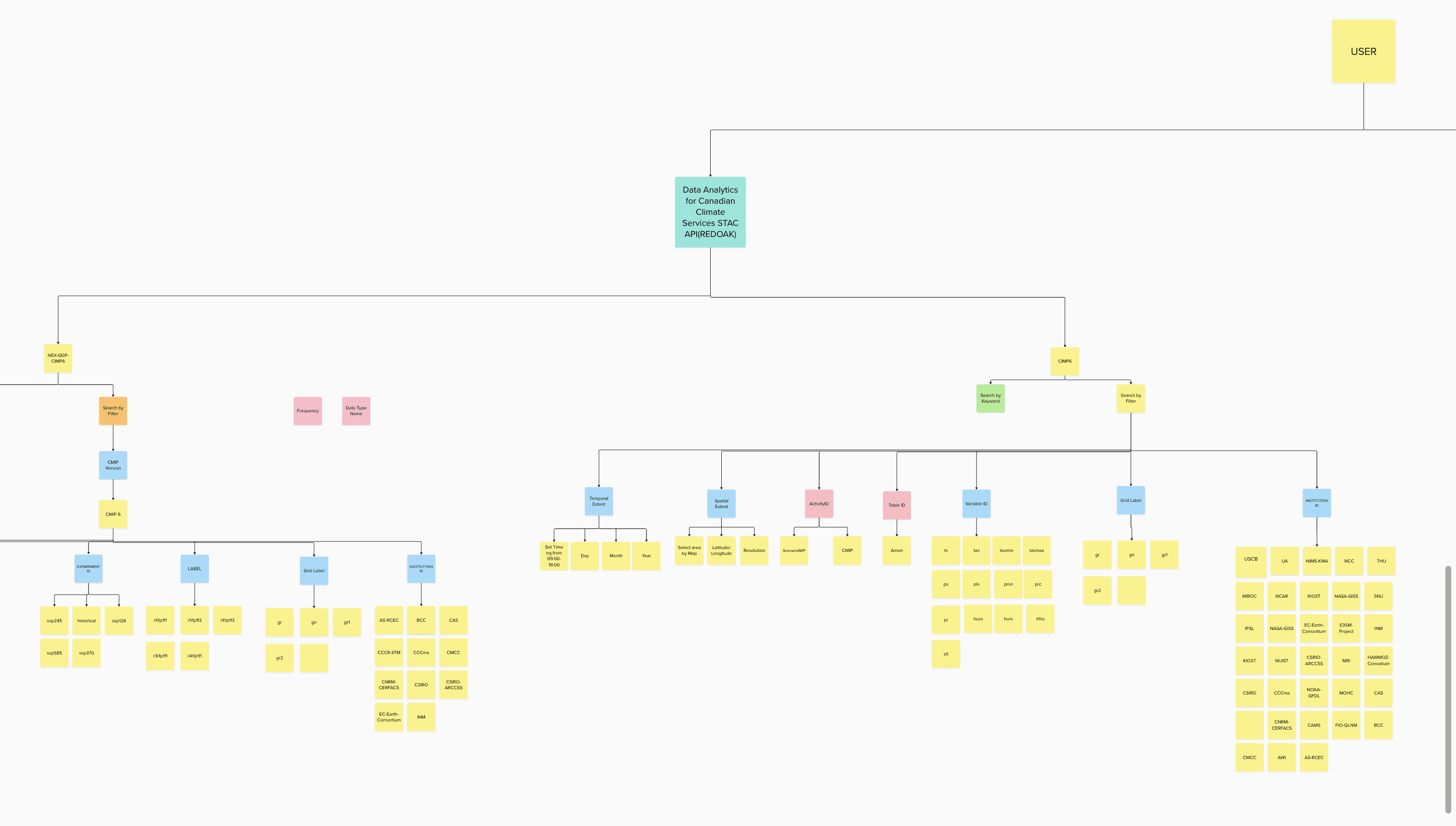
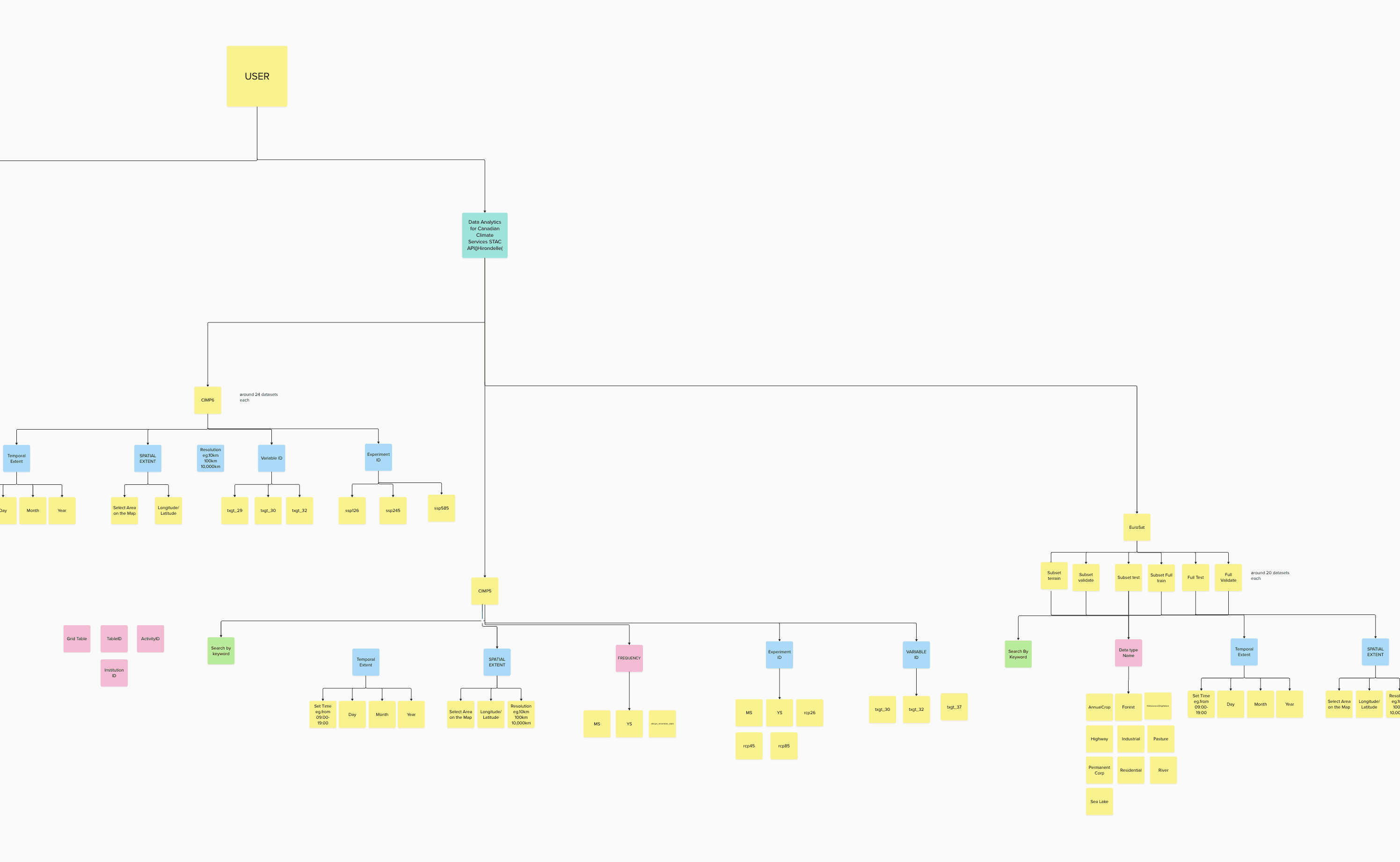
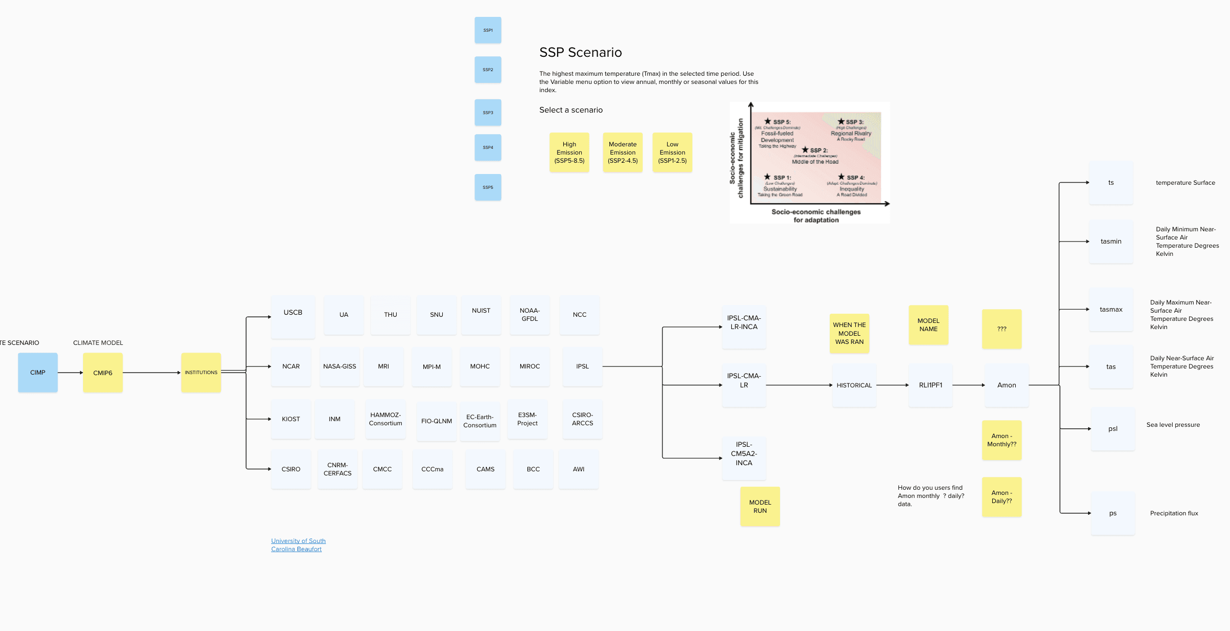
Built filter trees to understand all technical jargons - Activity ID, Table ID, Variable ID, Grid Label, Institution ID - commonly used by students and researches to filter datasets used to build the climate prediction models.
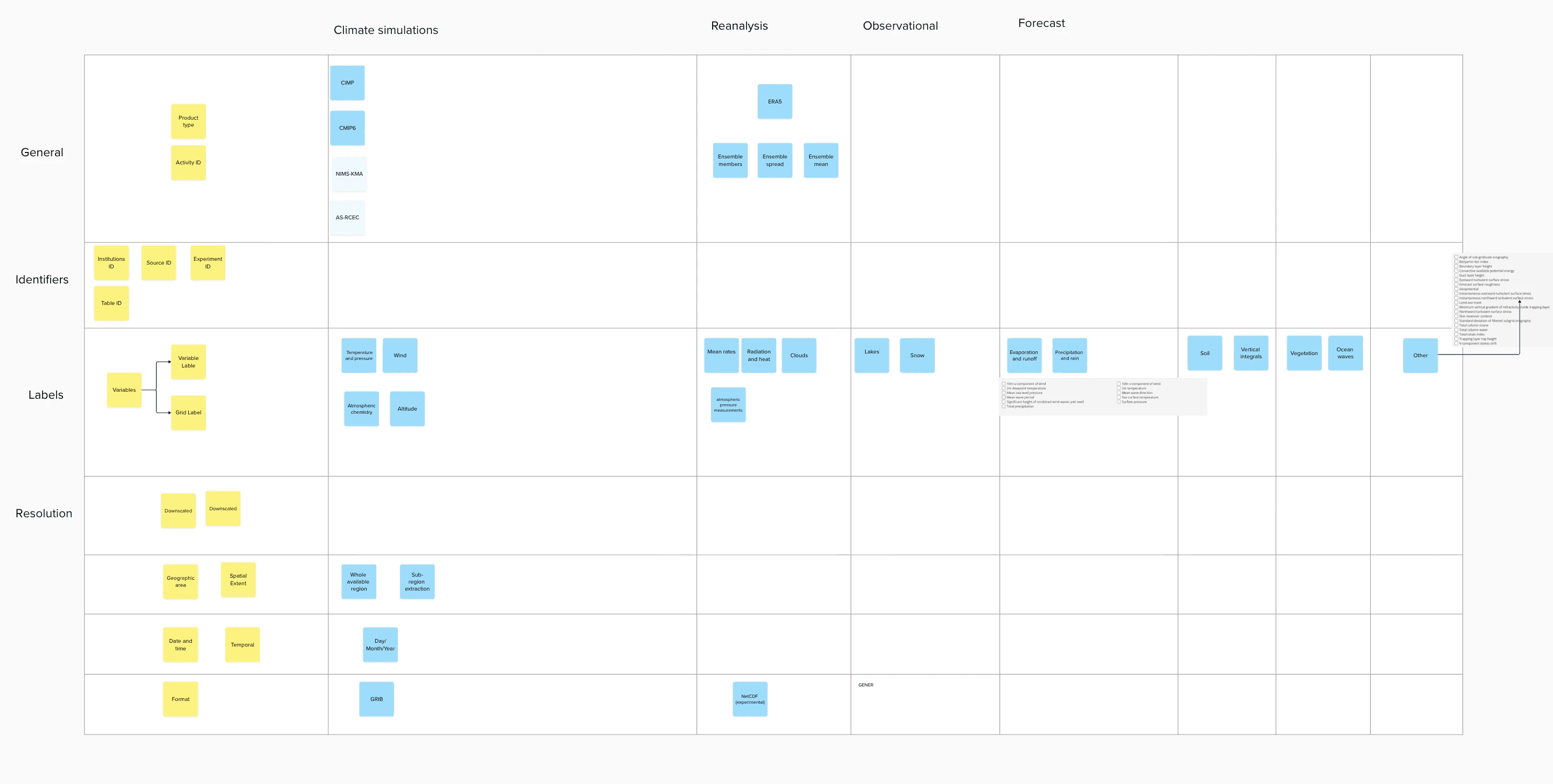
Understanding Commonly used Filters
Filter Tree - Metadata, Services Comparison between RedOak by University of Toronto and Hirondelle by Concordia University
Filter Tree - Metadata, Services Comparison between RedOak by University of Toronto and Hirondelle by Concordia University
Understanding Technical Jargons
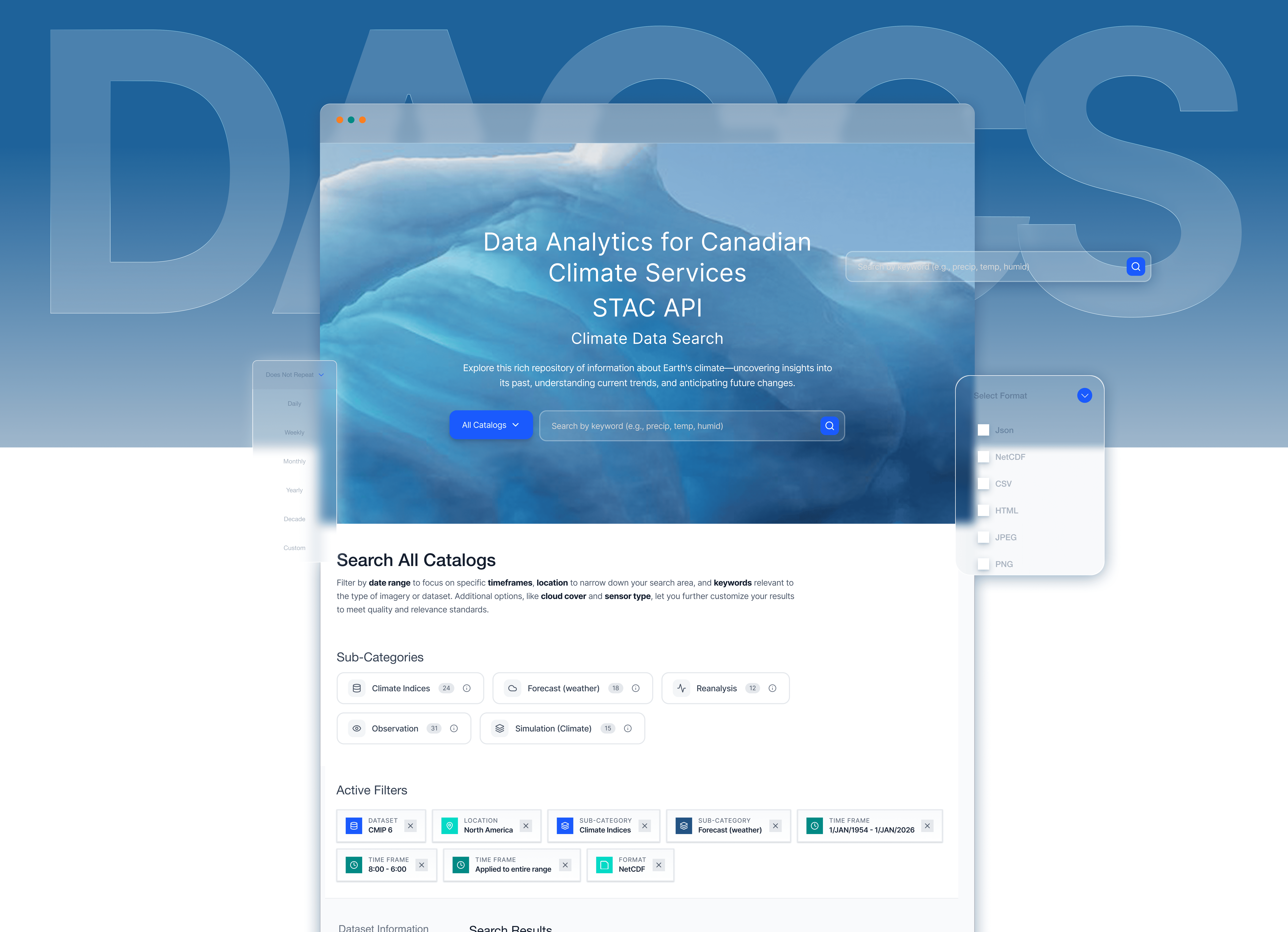
From v0 Prototype to High-Fi Design in Figma
"I never know which catalog to browse first. Should I search CMIP6 or the general catalog? I end up clicking around randomly until I find something." -PhD Student
"Do I need ERA5 or CMIP6? What's the difference? I just want temperature data." — Postdoc Researcher
We shipped the improved report builder experience first. At the time, we experimented with handing off the AI-generated v0 prototype directly to engineering—it felt efficient since it was already built and we weren’t using an official Figma design system.
But the result didn’t match our vision. I ended up recreating the design in Figma and writing multiple cosmetic updates, which slowed down development more than expected.
So for the Search by Filters, I shifted gears: I delivered a polished Figma prototype instead. It made collaboration easier, ensured visual consistency, and saved engineering time.
Here’s how the dataset filter feature evolved…


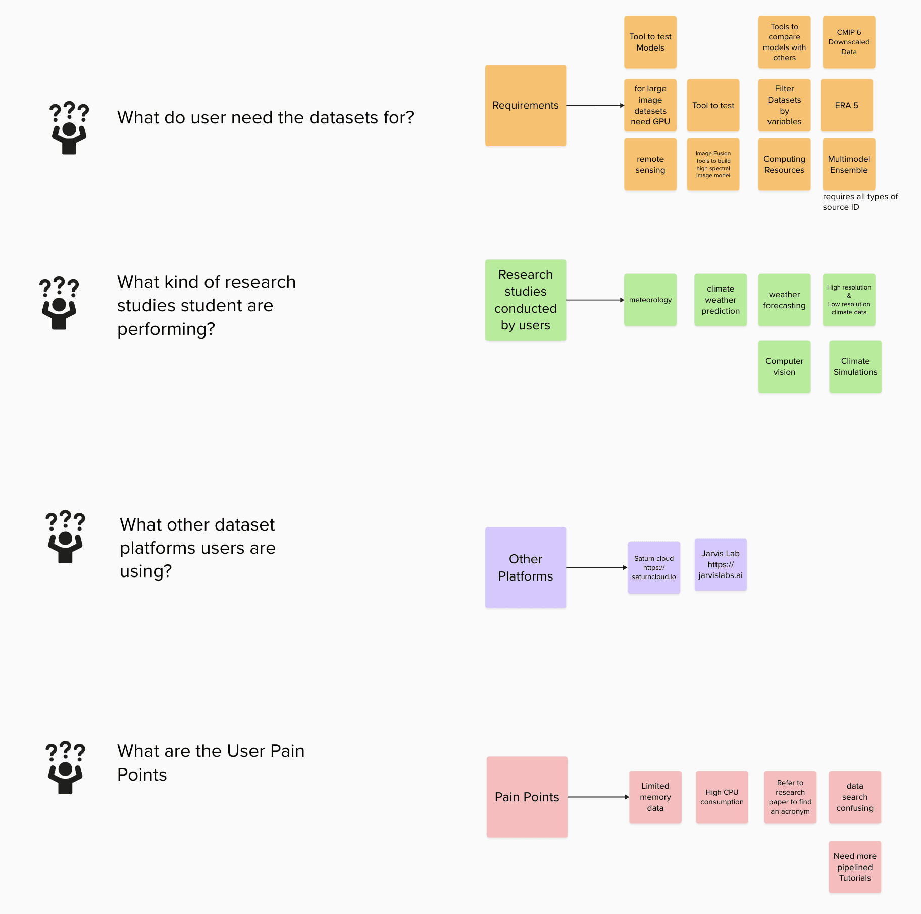
UNDERSTANDING OUR USERS: RESEARCHERS UNDER PRESSURE
Through 15+ interviews and usability sessions with climate scientists, data engineers, and research fellows, I uncovered some key insights, decoded insights based on priority, high value, constraints and objectives.
Delivered solutions to each decoded problem through multiple feedback sessions with the stakeholders and iterations based on high stake feeback vlaues.
Solution
Streamlining Complex Workflows Through AI-Accelerated Design
My final designs reflect what I learned from previous iterations and what I heard from users: they wanted clarity, control, and fewer steps. Here’s how I brought that to life.
ELEMENT 1: Contextualization
Before Catalog-First Navigation
5 - clicks, (Catalog Search Page -> Dataset Search Page )2 navigation steps to search a dataset by keyword.
After Search-first Experience
2 clicks, One step to search the right catalog & datasets that belongs to the respective catalog.
BeforE

After
Element 2 : Consolidation
Before: Scattered Information Architecture
Users navigated to individual catalog pages to view metadata, sharing links, and other vital information for users.
After: Organized Information Sidebar
Users can now find the metadata, access source links, sharing link, and licensing information in a structured left sidebar.

BeforE

After
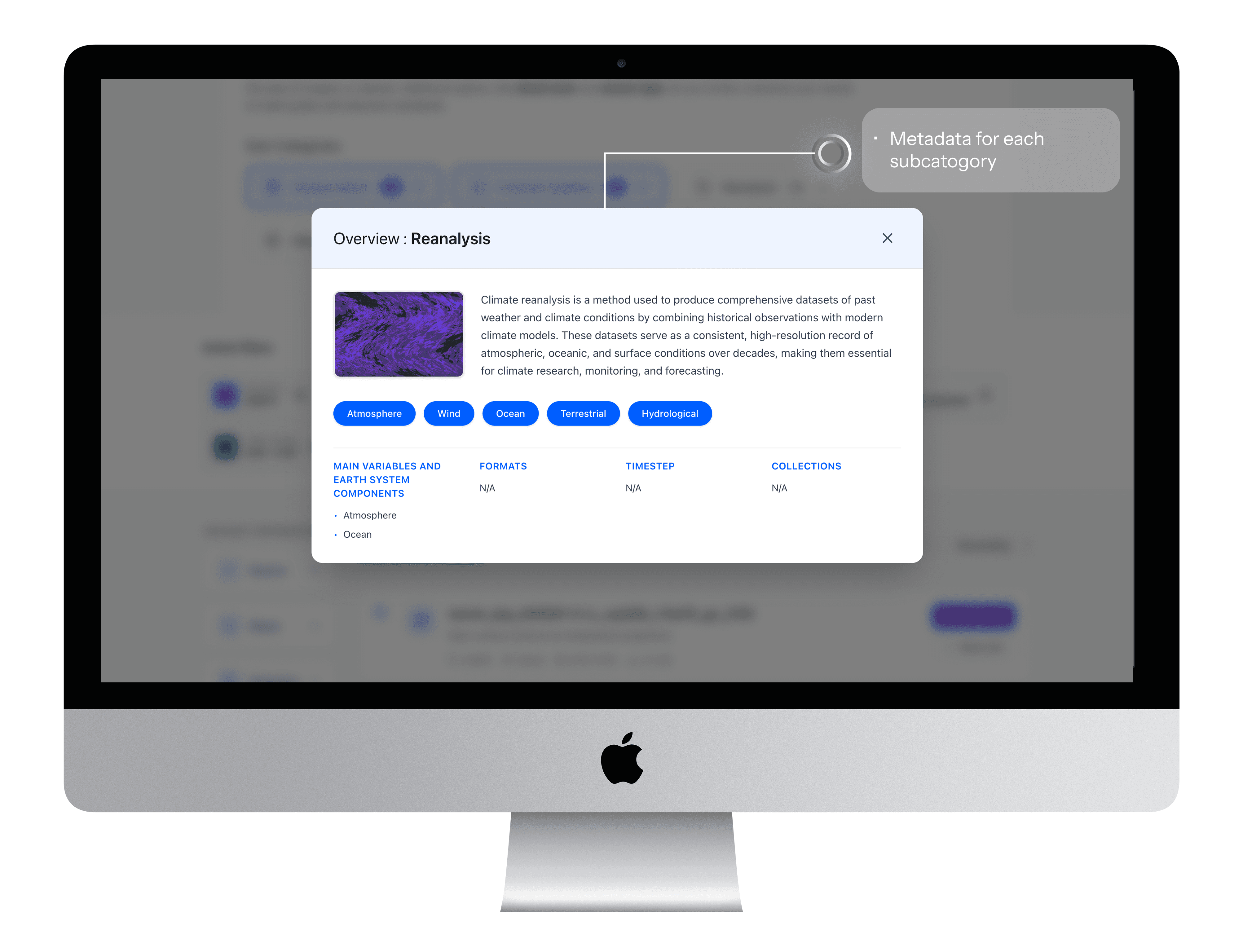
Element 3 : Scaffolding
Before: Unguided Search Experience
Users were unaware of the specific sub-category terms that could help them find datasets more quickly.
After: Category-Based Search Guidance
A selectable list of sub-categories that nudges researchers toward commonly used search terms, with brief explanations for each.
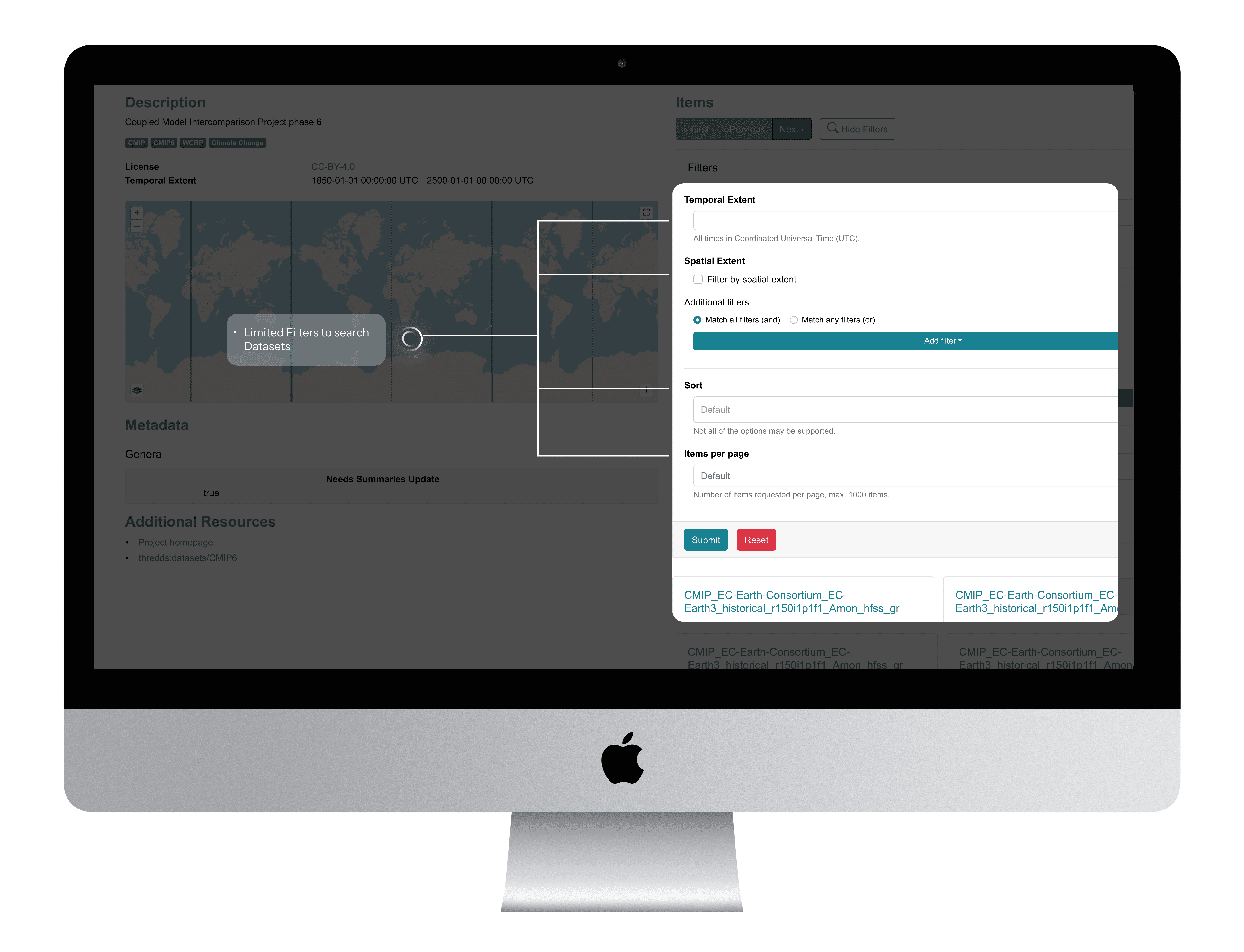
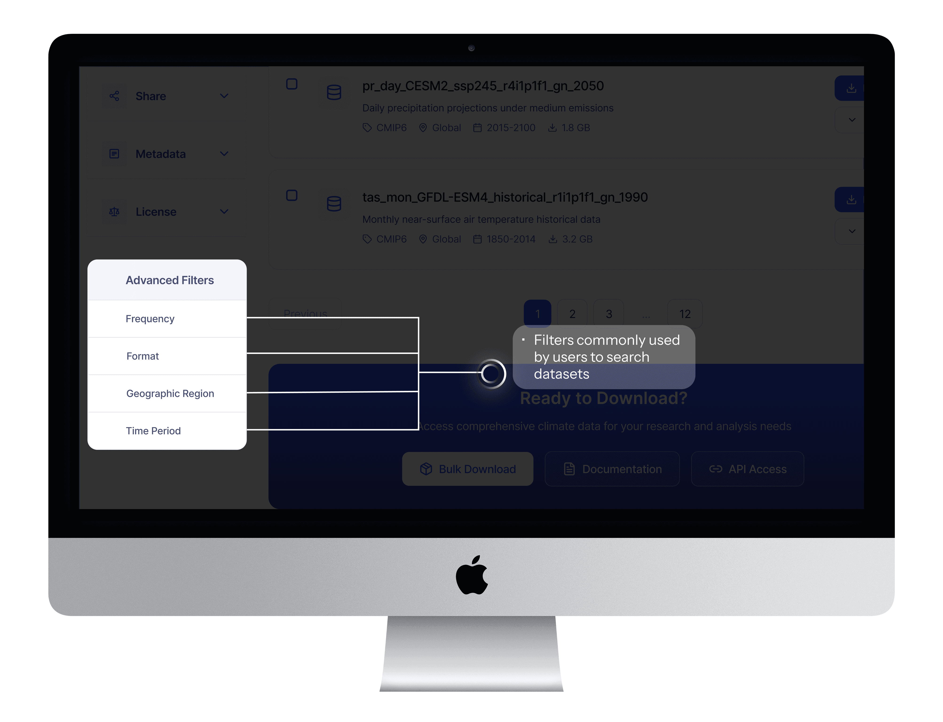
Element 4 : Prioritization
Before : Generic, Hidden Filters
Critical filters existed but research insights helped identify all critical filters to the users
After: Research-Prioritized Filter Panel
User research revealed that Frequency, Format, Location, and Timeframe were the most relied-upon filters when narrowing down relevant datasets.
BeforE
After
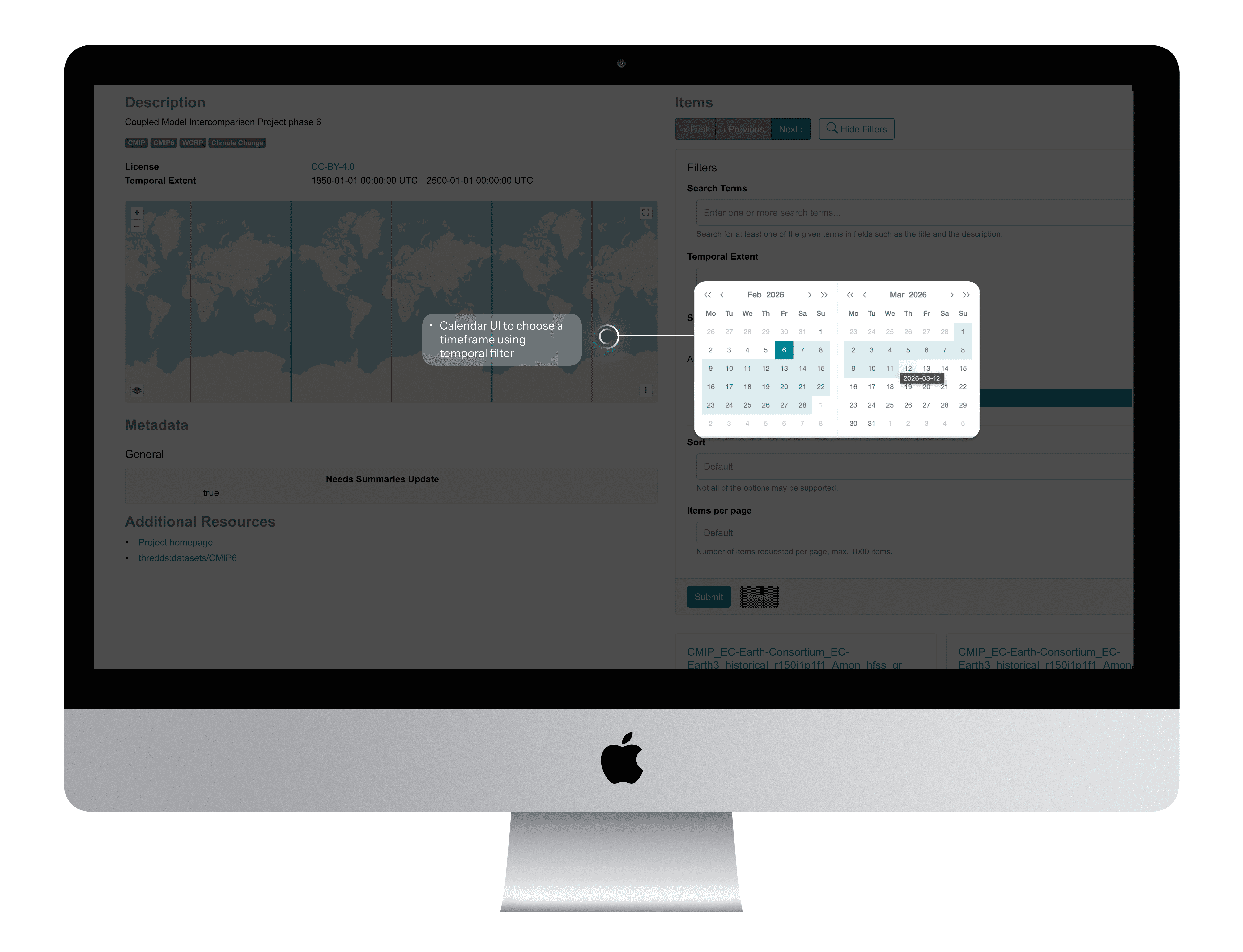
Element 5 : Law of Similarity : Leveraging mental models
Before: Custom Temporal Filter Pattern
The temporal filter relied on a simple date-range picker, which did not support recurring or complex research queries.
After : Google Calendar Mental Model
The redesigned filter adopts Google Calendar's proven interaction pattern: start/end dates with time inputs, recurrence options ("Does Not Repeat" / "Never" / "Ends On"), and "All Day" checkbox.
BeforE
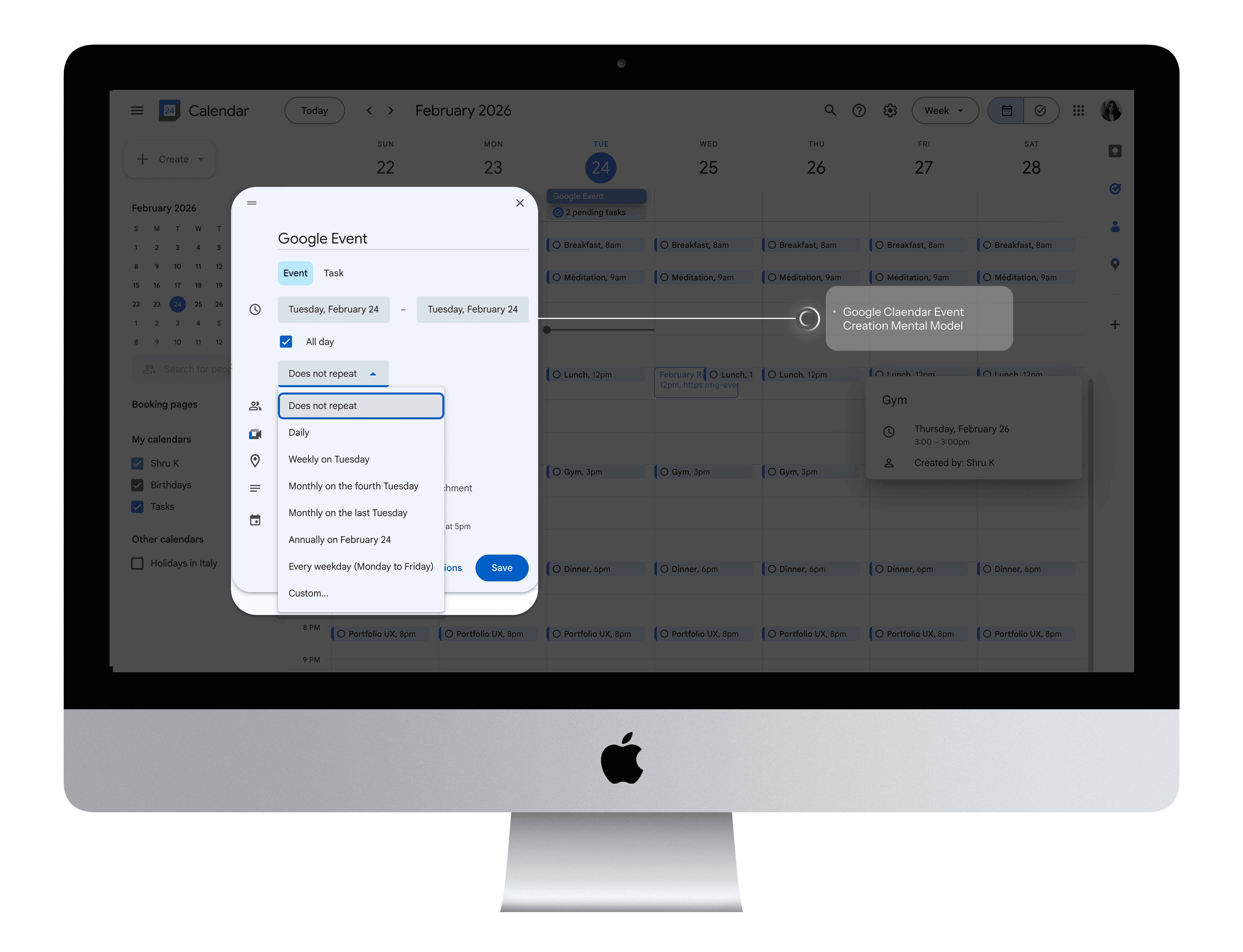
Mental Model
After
Real Use Case: Monsoon Analysis
Climate researcher needs precipitation data for June - September, 1955–1961:
Start: June 1955
End: September 1955
Recurrence ← KEY FEATURE!
Frequency: Monthly ← KEY FEATURE!
Ends of December 1961
Result: System returns monthly precipitation for June - Sep in all 7 years. One interaction, no workarounds! 🌧️
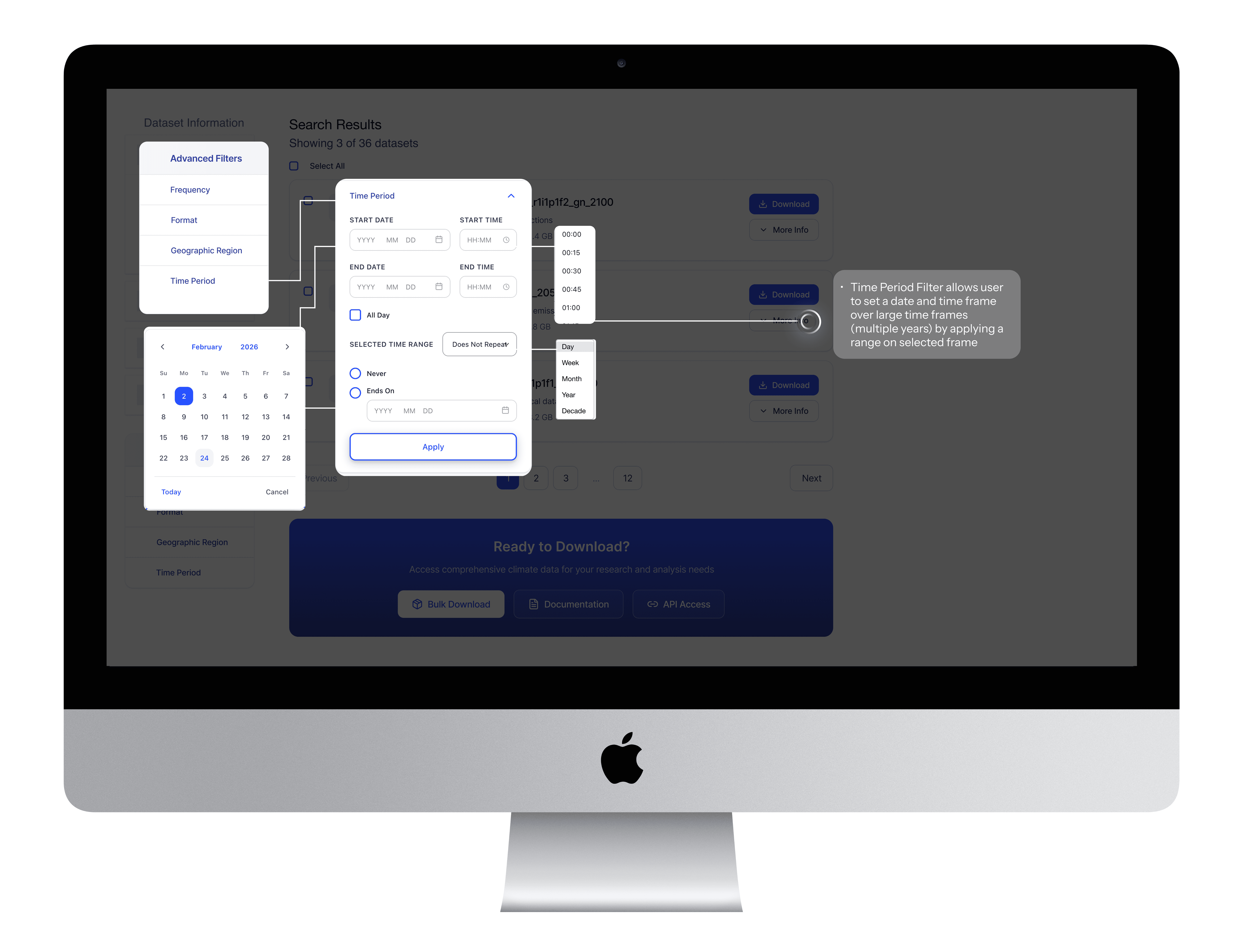
Element 6 : Accommodation
Before: Spatial Filter with bounding box
Simple checkbox enables spatial filtering via map-based bounding box selection.
After: Spatial Filter with user centric selection options.
Spatial filter supporting city name, coordinates, bounding box, map pin, and shapefile upload serving different types of user needs
BeforE

After
Element 7 : Contextual Metadata
Before : Cryptic acronyms in dataset naming convention
Technical jargon with No explanations on acronyms, Information overload with no clarity
After: Contextual Metadata Breakdown
Clear acronyms, temporal resolution, model and scenario explanations
BeforE

After
Reflection
From pain points to power features
Key Outcomes
89%
Reduction in filter configuration errors
76%
Faster complex filter configuration
8X
Reduction in unnecessary search queries
Reflection
Navigating Ambiguity, Overcoming Challenges
This project pushed me to navigate multiple constraints while maintaining design quality and user experience.
🤖 AI INTEGRATION
Balancing AI efficiency with design quality, managing inconsistent outputs, and development handoff issues.
What I did :
Prioritized consistency over personal aesthetic preferences to reduce cognitive load and development friction.
Built necessary components in Figma
Used SLDS 1 to ensure the most precise, realistic hand-off possible
Worked with PM to create detailed acceptance criteria for hand-off
👩🎨 DESIGN’S NEW ROLE ON THE TEAM
This was the first time my team had its own designer. My developer had only received a Figma file once before, so we had to figure out hand-off workflows from scratch.
💡KEY LEARNINGS
AI as a Design Accelerator
I learned to leverage AI for rapid ideation and prototyping while maintaining design quality through strategic prompt engineering.
Prioritization Under Constraints
Learned to focus on MVP essentials over nice-to-haves, delivering meaningful progress within technical and timeline constraints.
This experience fundamentally changed how I approach design challenges, proving that AI can accelerate the creative process while human insight remains essential for creating truly user-centered solutions.
💡CHECK OUT RECENT VERSION OF AI ACCELERATED DESIGN…
More Projects


Product Design
UofT's STAC Browser
Discover how I re-designed a climate research platform that provides easy access to climate data to climate researchers, students and scientist. With the help of these datasets researchers build climate prediction models which can predict Canadian climate conditions up to 100 years in the future.
Year :
2024
Industry :
Climate Research & Data Analytics
Client :
University of Toronto
Project Duration :
12 months
Role:
UI/UX Designer
Tools:
Figma, GitHub, ClaudeAI, V0 Vercel, Descript, Microsoft Clarity
AS THE PRODUCT DESIGNER ON THE DATA ANALYTICS CANADIAN CLIMATE SERVICES TEAM, I…
Led design efforts for rebuilding the data search platform and bulk filtering experiences
Conducted 14+ user research sessions with climate scientists, researchers, and students
Pioneered AI integration in our design process using WEVO, Descript and Figma Make
Collaborated closely with PM, developer and system architect to align technical feasibility with user-centered design goals and academic data standards.
Built a reusable component library and established a design review process to ensure design consistency, accessibility, and seamless handoff across teams.
Established design review processes to ensure quality delivery despite handoff challenges
Problem
Tedious Workflows Hindering Efficiency
Fragmented Search and Filtering Slowing Down Climate Research
The STAC Browser serves as a central platform for researchers and institutions to access thousands of global climate datasets. However, three critical aspects of the data discovery workflow were slowing down research efficiency and collaboration:
01 Paradox of Choice
94% of novice users didn't know which catalog to choose
"I never know which catalog to browse first. Should I search CMIP6 or the general catalog? I end up clicking around randomly until I find something." -PhD Student
"Do I need ERA5 or CMIP6? What's the difference? I just want temperature data." — Postdoc Researcher
01 Paradox of Choice
02. Crucial Filters
User wanted more than just spatial and temporal filters to find climate datasets
"I have lat/lon coordinates from my field work, but the interface only lets me click on a map. I can't just paste my coordinates." - Research Scientist
"I wish I could preview what filters I've set before applying them. Right now I can't even see all my active filters at once." - Postdoc
02. Crucial Filters
03 - Technical Jargons, Missing Contextual Explanation
Dataset names are incomprehensible strings of technical acronyms with no built-in explanations, users wanted contextual explanation for each acronym or technical terms in a dataset name
"The dataset name is 'tasmin_day_LIKESM1-0-1-L_ssp585_r1i1p1f2_gn_2100'. What is tasmin? What's ssp585? I have no idea what this is." - PhD Student (new to climate science)
"I need to keep external documentation open in another window just to understand what I'm looking at." -Climate scientist
03 - Technical Jargons, Missing Contextual Explanation
Process
Card Sorting
Using Mural I did card sorting to understand metadata, services provided by RedOak - A node managed by University of Toronto to provide access to climate datasets.
Compared the services provided by RedOak with Hirondelle - node managed by Concordia University.
Built filter trees to understand all technical jargons - Activity ID, Table ID, Variable ID, Grid Label, Institution ID - commonly used by students and researches to filter datasets used to build the climate prediction models.
Understanding Commonly used Filters
Filter Tree - Metadata, Services Comparison between RedOak by University of Toronto and Hirondelle by Concordia University
Filter Tree - Metadata, Services Comparison between RedOak by University of Toronto and Hirondelle by Concordia University
Understanding Technical Jargons
From v0 Prototype to High-Fi Design in Figma
"I never know which catalog to browse first. Should I search CMIP6 or the general catalog? I end up clicking around randomly until I find something." -PhD Student
"Do I need ERA5 or CMIP6? What's the difference? I just want temperature data." — Postdoc Researcher
We shipped the improved report builder experience first. At the time, we experimented with handing off the AI-generated v0 prototype directly to engineering—it felt efficient since it was already built and we weren’t using an official Figma design system.
But the result didn’t match our vision. I ended up recreating the design in Figma and writing multiple cosmetic updates, which slowed down development more than expected.
So for the Search by Filters, I shifted gears: I delivered a polished Figma prototype instead. It made collaboration easier, ensured visual consistency, and saved engineering time.
Here’s how the dataset filter feature evolved…
UNDERSTANDING OUR USERS: RESEARCHERS UNDER PRESSURE
Through 15+ interviews and usability sessions with climate scientists, data engineers, and research fellows, I uncovered some key insights, decoded insights based on priority, high value, constraints and objectives.
Delivered solutions to each decoded problem through multiple feedback sessions with the stakeholders and iterations based on high stake feeback vlaues.
Solution
Streamlining Complex Workflows Through AI-Accelerated Design
My final designs reflect what I learned from previous iterations and what I heard from users: they wanted clarity, control, and fewer steps. Here’s how I brought that to life.
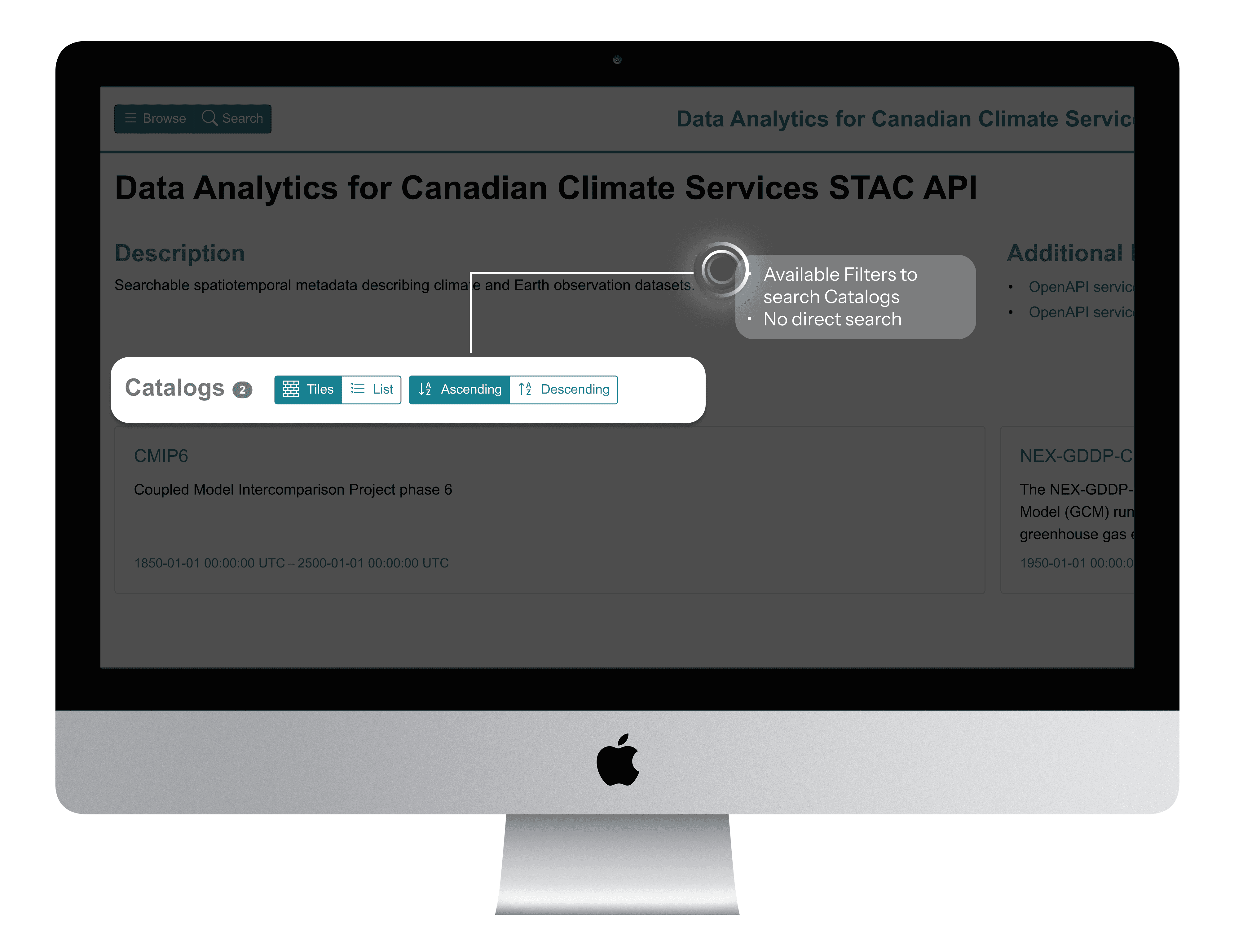
ELEMENT 1: Contextualization
Before Catalog-First Navigation
5 - clicks, (Catalog Search Page -> Dataset Search Page )2 navigation steps to search a dataset by keyword.
After Search-first Experience
2 clicks, One step to search the right catalog & datasets that belongs to the respective catalog.
BeforE
After
Element 2 : Consolidation
Before: Scattered Information Architecture
Users navigated to individual catalog pages to view metadata, sharing links, and other vital information for users.
After: Organized Information Sidebar
Users can now find the metadata, access source links, sharing link, and licensing information in a structured left sidebar.
BeforE
After
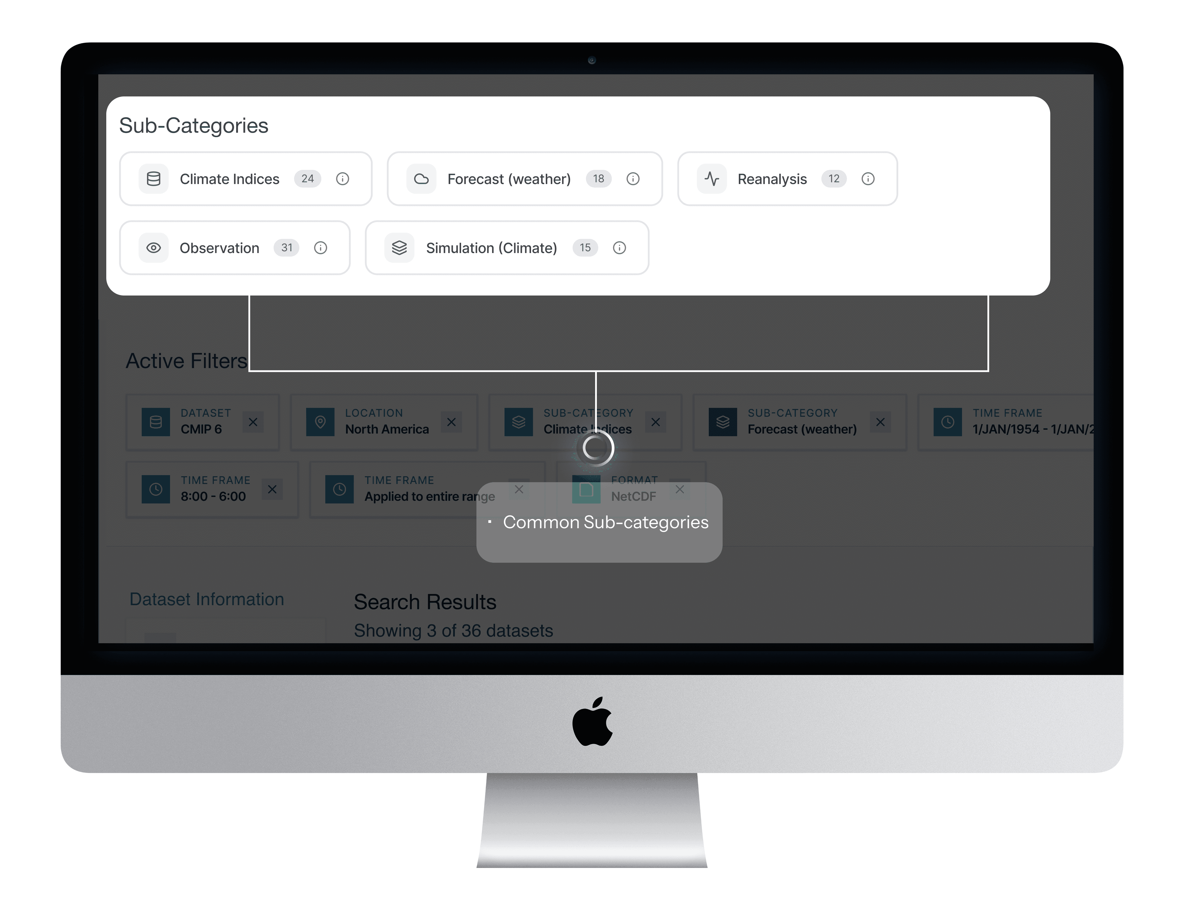
Element 3 : Scaffolding
Before: Unguided Search Experience
Users were unaware of the specific sub-category terms that could help them find datasets more quickly.
After: Category-Based Search Guidance
A selectable list of sub-categories that nudges researchers toward commonly used search terms, with brief explanations for each.
Element 4 : Prioritization
Before : Generic, Hidden Filters
Critical filters existed but research insights helped identify all critical filters to the users
After: Research-Prioritized Filter Panel
User research revealed that Frequency, Format, Location, and Timeframe were the most relied-upon filters when narrowing down relevant datasets.
BeforE
After
Element 5 : Law of Similarity : Leveraging mental models
Before: Custom Temporal Filter Pattern
The temporal filter relied on a simple date-range picker, which did not support recurring or complex research queries.
After : Google Calendar Mental Model
The redesigned filter adopts Google Calendar's proven interaction pattern: start/end dates with time inputs, recurrence options ("Does Not Repeat" / "Never" / "Ends On"), and "All Day" checkbox.
BeforE
Mental Model
After
Real Use Case: Monsoon Analysis
Climate researcher needs precipitation data for June - September, 1955–1961:
Start: June 1955
End: September 1955
Recurrence ← KEY FEATURE!
Frequency: Monthly ← KEY FEATURE!
Ends of December 1961
Result: System returns monthly precipitation for June - Sep in all 7 years. One interaction, no workarounds! 🌧️
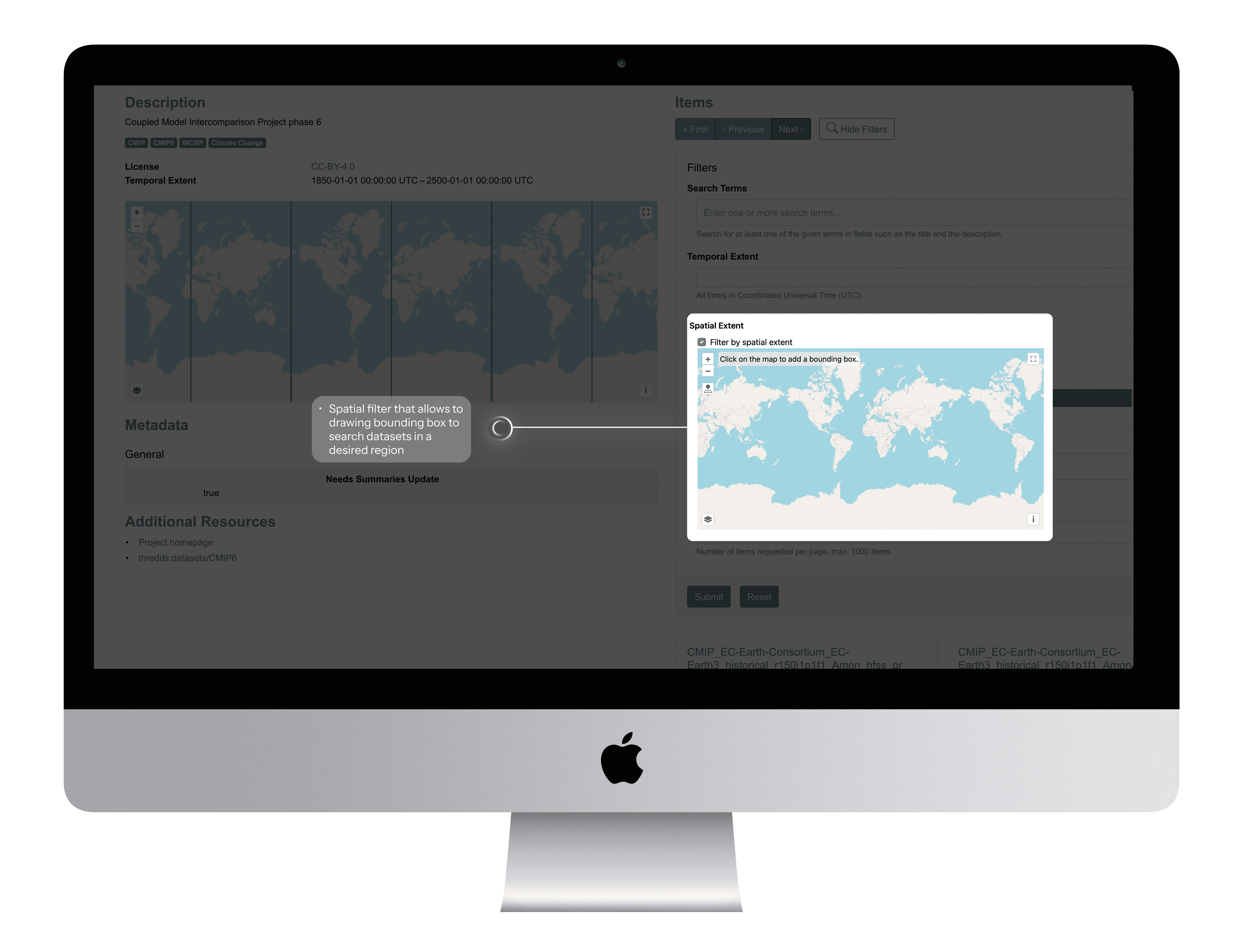
Element 6 : Accommodation
Before: Spatial Filter with bounding box
Simple checkbox enables spatial filtering via map-based bounding box selection.
After: Spatial Filter with user centric selection options.
Spatial filter supporting city name, coordinates, bounding box, map pin, and shapefile upload serving different types of user needs
BeforE
After
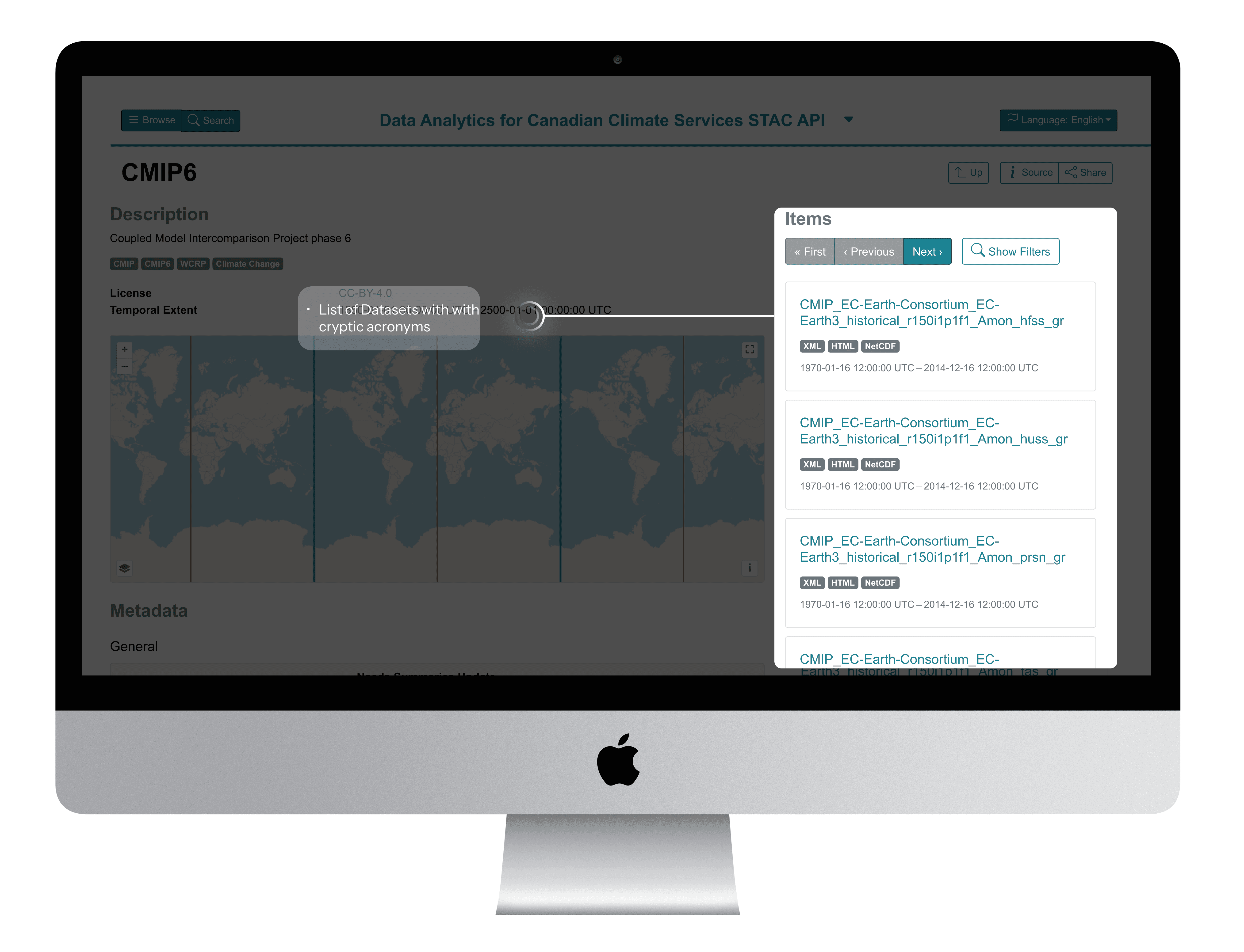
Element 7 : Contextual Metadata
Before : Cryptic acronyms in dataset naming convention
Technical jargon with No explanations on acronyms, Information overload with no clarity
After: Contextual Metadata Breakdown
Clear acronyms, temporal resolution, model and scenario explanations
BeforE
After
Reflection
From pain points to power features
Key Outcomes
89%
Reduction in filter configuration errors
76%
Faster complex filter configuration
8X
Reduction in unnecessary search queries
Reflection
Navigating Ambiguity, Overcoming Challenges
This project pushed me to navigate multiple constraints while maintaining design quality and user experience.
🤖 AI INTEGRATION
Balancing AI efficiency with design quality, managing inconsistent outputs, and development handoff issues.
What I did :
Prioritized consistency over personal aesthetic preferences to reduce cognitive load and development friction.
Built necessary components in Figma
Used SLDS 1 to ensure the most precise, realistic hand-off possible
Worked with PM to create detailed acceptance criteria for hand-off
👩🎨 DESIGN’S NEW ROLE ON THE TEAM
This was the first time my team had its own designer. My developer had only received a Figma file once before, so we had to figure out hand-off workflows from scratch.
💡KEY LEARNINGS
AI as a Design Accelerator
I learned to leverage AI for rapid ideation and prototyping while maintaining design quality through strategic prompt engineering.
Prioritization Under Constraints
Learned to focus on MVP essentials over nice-to-haves, delivering meaningful progress within technical and timeline constraints.
This experience fundamentally changed how I approach design challenges, proving that AI can accelerate the creative process while human insight remains essential for creating truly user-centered solutions.
💡CHECK OUT RECENT VERSION OF AI ACCELERATED DESIGN…
More Projects
Product Design
UofT's STAC Browser
Discover how I re-designed a climate research platform that provides easy access to climate data to climate researchers, students and scientist. With the help of these datasets researchers build climate prediction models which can predict Canadian climate conditions up to 100 years in the future.
Year :
2024
Industry :
Climate Research & Data Analytics
Client :
University of Toronto
Project Duration :
12 months
Role:
UI/UX Designer
Tools:
Figma, GitHub, ClaudeAI, V0 Vercel, Descript, Microsoft Clarity
AS THE PRODUCT DESIGNER ON THE DATA ANALYTICS CANADIAN CLIMATE SERVICES TEAM, I…
Led design efforts for rebuilding the data search platform and bulk filtering experiences
Conducted 14+ user research sessions with climate scientists, researchers, and students
Pioneered AI integration in our design process using WEVO, Descript and Figma Make
Collaborated closely with PM, developer and system architect to align technical feasibility with user-centered design goals and academic data standards.
Built a reusable component library and established a design review process to ensure design consistency, accessibility, and seamless handoff across teams.
Established design review processes to ensure quality delivery despite handoff challenges
Problem
Tedious Workflows Hindering Efficiency
Fragmented Search and Filtering Slowing Down Climate Research
The STAC Browser serves as a central platform for researchers and institutions to access thousands of global climate datasets. However, three critical aspects of the data discovery workflow were slowing down research efficiency and collaboration:
01 Paradox of Choice
94% of novice users didn't know which catalog to choose
"I never know which catalog to browse first. Should I search CMIP6 or the general catalog? I end up clicking around randomly until I find something." -PhD Student
"Do I need ERA5 or CMIP6? What's the difference? I just want temperature data." — Postdoc Researcher
01 Paradox of Choice
02. Crucial Filters
User wanted more than just spatial and temporal filters to find climate datasets
"I have lat/lon coordinates from my field work, but the interface only lets me click on a map. I can't just paste my coordinates." - Research Scientist
"I wish I could preview what filters I've set before applying them. Right now I can't even see all my active filters at once." - Postdoc
02. Crucial Filters
03 - Technical Jargons, Missing Contextual Explanation
Dataset names are incomprehensible strings of technical acronyms with no built-in explanations, users wanted contextual explanation for each acronym or technical terms in a dataset name
"The dataset name is 'tasmin_day_LIKESM1-0-1-L_ssp585_r1i1p1f2_gn_2100'. What is tasmin? What's ssp585? I have no idea what this is." - PhD Student (new to climate science)
"I need to keep external documentation open in another window just to understand what I'm looking at." -Climate scientist
03 - Technical Jargons, Missing Contextual Explanation
Process
Card Sorting
Using Mural I did card sorting to understand metadata, services provided by RedOak - A node managed by University of Toronto to provide access to climate datasets.
Compared the services provided by RedOak with Hirondelle - node managed by Concordia University.
Built filter trees to understand all technical jargons - Activity ID, Table ID, Variable ID, Grid Label, Institution ID - commonly used by students and researches to filter datasets used to build the climate prediction models.
Understanding Commonly used Filters
Filter Tree - Metadata, Services Comparison between RedOak by University of Toronto and Hirondelle by Concordia University
Filter Tree - Metadata, Services Comparison between RedOak by University of Toronto and Hirondelle by Concordia University
Understanding Technical Jargons
From v0 Prototype to High-Fi Design in Figma
"I never know which catalog to browse first. Should I search CMIP6 or the general catalog? I end up clicking around randomly until I find something." -PhD Student
"Do I need ERA5 or CMIP6? What's the difference? I just want temperature data." — Postdoc Researcher
We shipped the improved report builder experience first. At the time, we experimented with handing off the AI-generated v0 prototype directly to engineering—it felt efficient since it was already built and we weren’t using an official Figma design system.
But the result didn’t match our vision. I ended up recreating the design in Figma and writing multiple cosmetic updates, which slowed down development more than expected.
So for the Search by Filters, I shifted gears: I delivered a polished Figma prototype instead. It made collaboration easier, ensured visual consistency, and saved engineering time.
Here’s how the dataset filter feature evolved…
UNDERSTANDING OUR USERS: RESEARCHERS UNDER PRESSURE
Through 15+ interviews and usability sessions with climate scientists, data engineers, and research fellows, I uncovered some key insights, decoded insights based on priority, high value, constraints and objectives.
Delivered solutions to each decoded problem through multiple feedback sessions with the stakeholders and iterations based on high stake feeback vlaues.
Solution
Streamlining Complex Workflows Through AI-Accelerated Design
My final designs reflect what I learned from previous iterations and what I heard from users: they wanted clarity, control, and fewer steps. Here’s how I brought that to life.
ELEMENT 1: Contextualization
Before Catalog-First Navigation
5 - clicks, (Catalog Search Page -> Dataset Search Page )2 navigation steps to search a dataset by keyword.
After Search-first Experience
2 clicks, One step to search the right catalog & datasets that belongs to the respective catalog.
BeforE
After
Element 2 : Consolidation
Before: Scattered Information Architecture
Users navigated to individual catalog pages to view metadata, sharing links, and other vital information for users.
After: Organized Information Sidebar
Users can now find the metadata, access source links, sharing link, and licensing information in a structured left sidebar.
BeforE
After
Element 3 : Scaffolding
Before: Unguided Search Experience
Users were unaware of the specific sub-category terms that could help them find datasets more quickly.
After: Category-Based Search Guidance
A selectable list of sub-categories that nudges researchers toward commonly used search terms, with brief explanations for each.
Element 4 : Prioritization
Before : Generic, Hidden Filters
Critical filters existed but research insights helped identify all critical filters to the users
After: Research-Prioritized Filter Panel
User research revealed that Frequency, Format, Location, and Timeframe were the most relied-upon filters when narrowing down relevant datasets.
BeforE
After
Element 5 : Law of Similarity : Leveraging mental models
Before: Custom Temporal Filter Pattern
The temporal filter relied on a simple date-range picker, which did not support recurring or complex research queries.
After : Google Calendar Mental Model
The redesigned filter adopts Google Calendar's proven interaction pattern: start/end dates with time inputs, recurrence options ("Does Not Repeat" / "Never" / "Ends On"), and "All Day" checkbox.
BeforE
Mental Model
After
Real Use Case: Monsoon Analysis
Climate researcher needs precipitation data for June - September, 1955–1961:
Start: June 1955
End: September 1955
Recurrence ← KEY FEATURE!
Frequency: Monthly ← KEY FEATURE!
Ends of December 1961
Result: System returns monthly precipitation for June - Sep in all 7 years. One interaction, no workarounds! 🌧️
Element 6 : Accommodation
Before: Spatial Filter with bounding box
Simple checkbox enables spatial filtering via map-based bounding box selection.
After: Spatial Filter with user centric selection options.
Spatial filter supporting city name, coordinates, bounding box, map pin, and shapefile upload serving different types of user needs
BeforE
After
Element 7 : Contextual Metadata
Before : Cryptic acronyms in dataset naming convention
Technical jargon with No explanations on acronyms, Information overload with no clarity
After: Contextual Metadata Breakdown
Clear acronyms, temporal resolution, model and scenario explanations
BeforE
After
Reflection
From pain points to power features
Key Outcomes
89%
Reduction in filter configuration errors
76%
Faster complex filter configuration
8X
Reduction in unnecessary search queries
Reflection
Navigating Ambiguity, Overcoming Challenges
This project pushed me to navigate multiple constraints while maintaining design quality and user experience.
🤖 AI INTEGRATION
Balancing AI efficiency with design quality, managing inconsistent outputs, and development handoff issues.
What I did :
Prioritized consistency over personal aesthetic preferences to reduce cognitive load and development friction.
Built necessary components in Figma
Used SLDS 1 to ensure the most precise, realistic hand-off possible
Worked with PM to create detailed acceptance criteria for hand-off
👩🎨 DESIGN’S NEW ROLE ON THE TEAM
This was the first time my team had its own designer. My developer had only received a Figma file once before, so we had to figure out hand-off workflows from scratch.
💡KEY LEARNINGS
AI as a Design Accelerator
I learned to leverage AI for rapid ideation and prototyping while maintaining design quality through strategic prompt engineering.
Prioritization Under Constraints
Learned to focus on MVP essentials over nice-to-haves, delivering meaningful progress within technical and timeline constraints.
This experience fundamentally changed how I approach design challenges, proving that AI can accelerate the creative process while human insight remains essential for creating truly user-centered solutions.