Strategic UX Redesign
SEO AI
Strategic UX redesign sprint for a keyword ranking and content intelligence platform
Year :
2025-2026
Industry :
Digital Marketing SaaS / SEO Technology
Client :
Search Atlas
Project Duration :
1 year
Role:
UX Designer & Strategist
Tools:
Figma, Claude.Ai, Figma Make, Nielsen Heuristics

As a Senior UI/UX designer....
I redesigned the Keyword Rank Tracker to reduce cognitive load and improve task completion speed for SEO professionals managing large keyword portfolios, while maintaining access to comprehensive data.
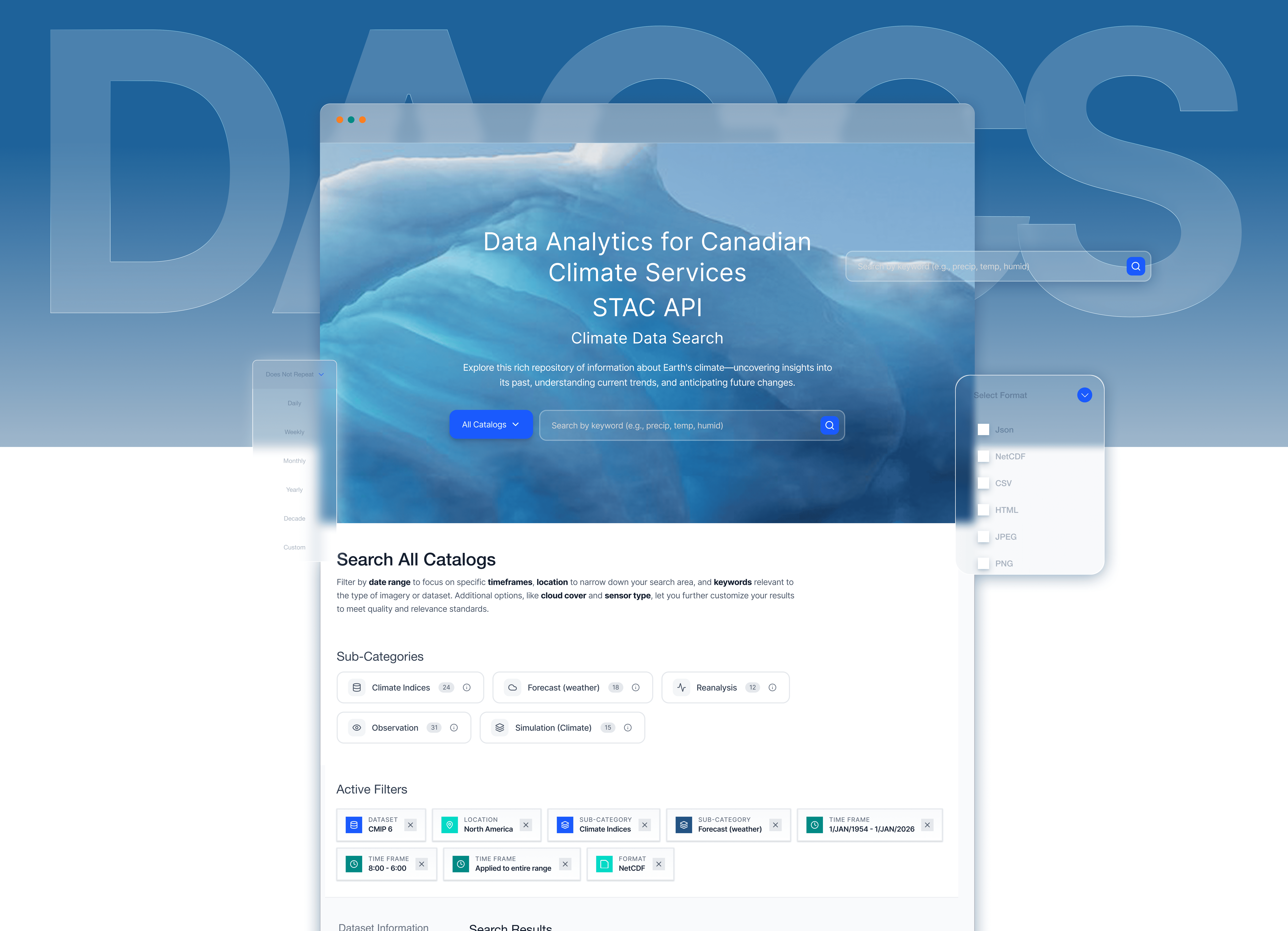
Problem
The Challenge
The current dashboard presents 11 simultaneous columns with 15 elements per row, creating cognitive paralysis that overwhelms users instead of guiding them toward informed decisions.
Research & Insights
CRITICAL (4 issues)
1. Information Overload (H#8: Aesthetic & Minimalist Design) - 11 columns + multiple data visualizations per row overwhelm users
2. Data Freshness Unclear (H#1: Visibility of System Status) - Small "Last Updated" timestamp easily missed, users can't assess data currency
3. Filter Status Hidden (H#1: Visibility of System Status) - Active filters shown only in pagination area, requiring scrolling
4. No Bulk Action Safeguards (H#5: Error Prevention) - No confirmation dialogs for destructive actions, enabling accidental data loss
HIGH IMPACT (4 issues)
5. Unexplained Jargon (H#2: Match Between System and Real World)
6. No Clear All Filters (H#3: User Control and Freedom)
7. Chart Redundancy (H#8: Aesthetic & Minimalist Design)
8. Inconsistent Change Indicators (H#4: Consistency and Standards)
Process
Strategic Approach
I employed a systematic heuristic evaluation framework combined with AI-assisted analysis to maximize efficiency and thoroughness:
1. Heuristic Evaluation Using Nielsen's 10 Principles
Since I had no opportunity to recruit participants for qualitative or quantitative research, I conducted a comprehensive audit using Nielsen Norman Group's established usability heuristics as the evaluation framework. This industry-standard methodology ensures systematic coverage of all critical usability dimensions when we have no access to participants.
2. AI-Assisted Analysis with Claude.ai
This approach demonstrates strategic tool selection — using AI not as a replacement for design expertise, but as a productivity multiplier that allowed me to focus cognitive energy on strategic decisions rather than tactical execution.
Leveraging Claude.ai as a design thinking partner accelerated my analysis process
• Rapid iteration on solution concepts
• Generation of multiple design alternatives
• Documentation and presentation creation
• Validation of heuristic application
Process
Solving the core problem - COGNITIVE OVERLOAD
Information overload with 11 simultaneous columns creates cognitive paralysis. The interface prioritizes data completeness over decision-making speed, overwhelming users instead of guiding them.

Let me walk you through how I solved the core problem - information overload caused by 11 simultaneous columns.
I implemented a two-part progressive disclosure strategy:
First, collapsible charts. The overview charts consumed 400 pixels but showed data already in the table below. I made them collapsible by default with summary cards showing key metrics. This reclaimed space for 5 more keywords to be visible.
Second, expandable row metrics. I reduced the default columns from 11 to just 3 Keyword, Position, and Change. Users can quickly scan for wins and losses. When they need details on a specific keyword, they click to expand a panel showing traffic data, trend charts, and keyword details.
The result: 50% reduction in cognitive load while maintaining 100% data access. Users can now complete their daily keyword review 3x faster
CRITICAL (2 ISSUES)
Solution
Streamlining Complex Workflows Through AI-Accelerated Design :
The redesign sprint focused on creating a more intuitive and visually appealing user experience. Navigation was simplified with a clear, consistent menu structure and prominent search functionality, allowing users to find products quickly and easily. The checkout process was streamlined by reducing unnecessary steps, providing clear progress indicators, and integrating popular payment options for convenience.
The new interface adopted a sleek, modern aesthetic with ample white space, clean typography, and cohesive color schemes, making the app feel both fresh and trustworthy.
CRITICAL ISSUE 1 : DATA FRESHNESS UNCLEAR
BEFORE - BURIED TIMESTAMP
The "Last Updated" indicator was a small icon with no clear label, easily missed during daily workflows.
AFTER - CONTEXTUAL DATA FRESHNESS TOOLTIP
The "Recent" button in the top-right now acts as a live data freshness indicator. Hovering reveals a tooltip showing exactly when data was last updated.
CRITICAL ISSUE 2 : MOVEMENT LACKS TIMEFRAME
BEFORE - CONTEXT-FREE MOVEMENT METRICS
The tracker displayed raw movement indicators-"Up: 5, Down: 15"-with no timeframe attached. Users couldn't tell if these shifts happened overnight, over a week, or over a month
AFTER - CONTEXTUAL POSITION CHANGE
Position changes now include the comparison period inline - "↑ +3 vs. last week" - directly in the table row. No extra clicks, no cross-referencing. Users can immediately assess whether a ranking shift is significant enough to act on.
HIGH IMPACT ISSUE 1 : UNEXPLAINED JARGON
BEFORE - UNEXPLAINED ABBREVIATIONS
Column headers like "CPC $", "SERP", and "SF" appeared with no tooltips, definitions, or contextual guidance.
AFTER - CONTEXTUAL TOOLTIPS + INTENT ICONS
Every abbreviated column header now reveals a plain-language definition on hover. Search intent types are replaced with color-coded icons with a persistent legend visible at all times. The interface now teaches as it works.

HIGH IMPACT ISSUE 2 : NO CLEAR ALL FILTERS
Every second spent resetting filters manually is a second stolen from actual analysis. For professionals reviewing hundreds of keywords daily, friction compounds fast.
BEFORE - NO CLEAR FILTERS OPTION
Once filters were applied, there was no mechanism to clear them, not a reset button, not even a manual one-by-one option.
AFTER - ONE-CLICK FILTER CONTROL
A "Clear All Filters" button now sits inline with the active filter bar, resetting everything in a single click.
HIGH IMPACT ISSUE 3 : CHART REDUNDANCY
BEFORE - CHARTS CONSUMING CRITICAL SPACE
Oversized performance charts occupied the top portion of every tracker view by default. The bubble charts in particular had low information density visually complex but analytically redundant. Every pixel they consumed pushed the actual keyword table further out of view.
AFTER - COLLAPSIBLE CHARTS WITH SUMMARY CARDS
Charts now collapse by default, replaced by four compact summary metric cards showing the most critical numbers at a glance. Users who want the visual context can expand via a "Show Charts" toggle. This single change reclaims 400px of vertical space - enough to surface 5 additional keywords without scrolling.
Real Use Case: Monsoon Analysis
Reflection
From pain points to power features
THIS PROJECT PROVED THAT REDUCING COMPLEXITY ISN'T ABOUT REMOVING CAPABILITY — IT'S ABOUT REVEALING IT.
50%
Reduction in cognitive load
7X
Faster daily workflows for power users
70%
Fewer accidental deletions
Reflection
Navigating Ambiguity, Overcoming Challenges
This project pushed me to navigate multiple constraints while maintaining design quality and user experience.
🤖 AI INTEGRATION
Using Claude.ai as a design thinking partner meant rapidly generating and stress-testing multiple solution directions simultaneously, while keeping all strategic decisions human-driven.
What I did :
👩🎨 DESIGN’S NEW ROLE ON THE TEAM
I operated as both researcher and designer, conducting the heuristic audit, prioritizing issues by severity, designing solutions in Figma, and building a functional prototype in Figma Make. End-to-end, no handoffs.
💡KEY LEARNINGS
AI as a Design Accelerator
Claude.ai compressed documentation and ideation time by 75%, freeing cognitive energy for the decisions that actually required design judgment.
Prioritization Under Constraints
With no user recruitment possible, Nielsen's heuristics provided a defensible, research-backed framework for identifying and ranking issues systematically.
More Projects

Strategic UX Redesign
SEO AI
Strategic UX redesign sprint for a keyword ranking and content intelligence platform
Year :
2025-2026
Industry :
Digital Marketing SaaS / SEO Technology
Client :
Search Atlas
Project Duration :
1 year
Role:
UX Designer & Strategist
Tools:
Figma, Claude.Ai, Figma Make, Nielsen Heuristics
As a Senior UI/UX designer....
I redesigned the Keyword Rank Tracker to reduce cognitive load and improve task completion speed for SEO professionals managing large keyword portfolios, while maintaining access to comprehensive data.
Problem
The Challenge
The current dashboard presents 11 simultaneous columns with 15 elements per row, creating cognitive paralysis that overwhelms users instead of guiding them toward informed decisions.
Research & Insights
CRITICAL (4 issues)
1. Information Overload (H#8: Aesthetic & Minimalist Design) - 11 columns + multiple data visualizations per row overwhelm users
2. Data Freshness Unclear (H#1: Visibility of System Status) - Small "Last Updated" timestamp easily missed, users can't assess data currency
3. Filter Status Hidden (H#1: Visibility of System Status) - Active filters shown only in pagination area, requiring scrolling
4. No Bulk Action Safeguards (H#5: Error Prevention) - No confirmation dialogs for destructive actions, enabling accidental data loss
HIGH IMPACT (4 issues)
5. Unexplained Jargon (H#2: Match Between System and Real World)
6. No Clear All Filters (H#3: User Control and Freedom)
7. Chart Redundancy (H#8: Aesthetic & Minimalist Design)
8. Inconsistent Change Indicators (H#4: Consistency and Standards)
Process
Strategic Approach
I employed a systematic heuristic evaluation framework combined with AI-assisted analysis to maximize efficiency and thoroughness:
1. Heuristic Evaluation Using Nielsen's 10 Principles
Since I had no opportunity to recruit participants for qualitative or quantitative research, I conducted a comprehensive audit using Nielsen Norman Group's established usability heuristics as the evaluation framework. This industry-standard methodology ensures systematic coverage of all critical usability dimensions when we have no access to participants.
2. AI-Assisted Analysis with Claude.ai
This approach demonstrates strategic tool selection — using AI not as a replacement for design expertise, but as a productivity multiplier that allowed me to focus cognitive energy on strategic decisions rather than tactical execution.
Leveraging Claude.ai as a design thinking partner accelerated my analysis process
• Rapid iteration on solution concepts
• Generation of multiple design alternatives
• Documentation and presentation creation
• Validation of heuristic application
Process
Solving the core problem - COGNITIVE OVERLOAD
Information overload with 11 simultaneous columns creates cognitive paralysis. The interface prioritizes data completeness over decision-making speed, overwhelming users instead of guiding them.
Let me walk you through how I solved the core problem - information overload caused by 11 simultaneous columns.
I implemented a two-part progressive disclosure strategy:
First, collapsible charts. The overview charts consumed 400 pixels but showed data already in the table below. I made them collapsible by default with summary cards showing key metrics. This reclaimed space for 5 more keywords to be visible.
Second, expandable row metrics. I reduced the default columns from 11 to just 3 Keyword, Position, and Change. Users can quickly scan for wins and losses. When they need details on a specific keyword, they click to expand a panel showing traffic data, trend charts, and keyword details.
The result: 50% reduction in cognitive load while maintaining 100% data access. Users can now complete their daily keyword review 3x faster
CRITICAL (2 ISSUES)
Solution
Streamlining Complex Workflows Through AI-Accelerated Design :
The redesign sprint focused on creating a more intuitive and visually appealing user experience. Navigation was simplified with a clear, consistent menu structure and prominent search functionality, allowing users to find products quickly and easily. The checkout process was streamlined by reducing unnecessary steps, providing clear progress indicators, and integrating popular payment options for convenience.
The new interface adopted a sleek, modern aesthetic with ample white space, clean typography, and cohesive color schemes, making the app feel both fresh and trustworthy.
CRITICAL ISSUE 1 : DATA FRESHNESS UNCLEAR
BEFORE - BURIED TIMESTAMP
The "Last Updated" indicator was a small icon with no clear label, easily missed during daily workflows.
AFTER - CONTEXTUAL DATA FRESHNESS TOOLTIP
The "Recent" button in the top-right now acts as a live data freshness indicator. Hovering reveals a tooltip showing exactly when data was last updated.
CRITICAL ISSUE 2 : MOVEMENT LACKS TIMEFRAME
BEFORE - CONTEXT-FREE MOVEMENT METRICS
The tracker displayed raw movement indicators-"Up: 5, Down: 15"-with no timeframe attached. Users couldn't tell if these shifts happened overnight, over a week, or over a month
AFTER - CONTEXTUAL POSITION CHANGE
Position changes now include the comparison period inline - "↑ +3 vs. last week" - directly in the table row. No extra clicks, no cross-referencing. Users can immediately assess whether a ranking shift is significant enough to act on.
HIGH IMPACT ISSUE 1 : UNEXPLAINED JARGON
BEFORE - UNEXPLAINED ABBREVIATIONS
Column headers like "CPC $", "SERP", and "SF" appeared with no tooltips, definitions, or contextual guidance.
AFTER - CONTEXTUAL TOOLTIPS + INTENT ICONS
Every abbreviated column header now reveals a plain-language definition on hover. Search intent types are replaced with color-coded icons with a persistent legend visible at all times. The interface now teaches as it works.
HIGH IMPACT ISSUE 2 : NO CLEAR ALL FILTERS
Every second spent resetting filters manually is a second stolen from actual analysis. For professionals reviewing hundreds of keywords daily, friction compounds fast.
BEFORE - NO CLEAR FILTERS OPTION
Once filters were applied, there was no mechanism to clear them, not a reset button, not even a manual one-by-one option.
AFTER - ONE-CLICK FILTER CONTROL
A "Clear All Filters" button now sits inline with the active filter bar, resetting everything in a single click.
HIGH IMPACT ISSUE 3 : CHART REDUNDANCY
BEFORE - CHARTS CONSUMING CRITICAL SPACE
Oversized performance charts occupied the top portion of every tracker view by default. The bubble charts in particular had low information density visually complex but analytically redundant. Every pixel they consumed pushed the actual keyword table further out of view.
AFTER - COLLAPSIBLE CHARTS WITH SUMMARY CARDS
Charts now collapse by default, replaced by four compact summary metric cards showing the most critical numbers at a glance. Users who want the visual context can expand via a "Show Charts" toggle. This single change reclaims 400px of vertical space - enough to surface 5 additional keywords without scrolling.
Real Use Case: Monsoon Analysis
Reflection
From pain points to power features
THIS PROJECT PROVED THAT REDUCING COMPLEXITY ISN'T ABOUT REMOVING CAPABILITY — IT'S ABOUT REVEALING IT.
50%
Reduction in cognitive load
7X
Faster daily workflows for power users
70%
Fewer accidental deletions
Reflection
Navigating Ambiguity, Overcoming Challenges
This project pushed me to navigate multiple constraints while maintaining design quality and user experience.
🤖 AI INTEGRATION
Using Claude.ai as a design thinking partner meant rapidly generating and stress-testing multiple solution directions simultaneously, while keeping all strategic decisions human-driven.
What I did :
👩🎨 DESIGN’S NEW ROLE ON THE TEAM
I operated as both researcher and designer, conducting the heuristic audit, prioritizing issues by severity, designing solutions in Figma, and building a functional prototype in Figma Make. End-to-end, no handoffs.
💡KEY LEARNINGS
AI as a Design Accelerator
Claude.ai compressed documentation and ideation time by 75%, freeing cognitive energy for the decisions that actually required design judgment.
Prioritization Under Constraints
With no user recruitment possible, Nielsen's heuristics provided a defensible, research-backed framework for identifying and ranking issues systematically.
More Projects
Strategic UX Redesign
SEO AI
Strategic UX redesign sprint for a keyword ranking and content intelligence platform
Year :
2025-2026
Industry :
Digital Marketing SaaS / SEO Technology
Client :
Search Atlas
Project Duration :
1 year
Role:
UX Designer & Strategist
Tools:
Figma, Claude.Ai, Figma Make, Nielsen Heuristics
As a Senior UI/UX designer....
I redesigned the Keyword Rank Tracker to reduce cognitive load and improve task completion speed for SEO professionals managing large keyword portfolios, while maintaining access to comprehensive data.
Problem
The Challenge
The current dashboard presents 11 simultaneous columns with 15 elements per row, creating cognitive paralysis that overwhelms users instead of guiding them toward informed decisions.
Research & Insights
CRITICAL (4 issues)
1. Information Overload (H#8: Aesthetic & Minimalist Design) - 11 columns + multiple data visualizations per row overwhelm users
2. Data Freshness Unclear (H#1: Visibility of System Status) - Small "Last Updated" timestamp easily missed, users can't assess data currency
3. Filter Status Hidden (H#1: Visibility of System Status) - Active filters shown only in pagination area, requiring scrolling
4. No Bulk Action Safeguards (H#5: Error Prevention) - No confirmation dialogs for destructive actions, enabling accidental data loss
HIGH IMPACT (4 issues)
5. Unexplained Jargon (H#2: Match Between System and Real World)
6. No Clear All Filters (H#3: User Control and Freedom)
7. Chart Redundancy (H#8: Aesthetic & Minimalist Design)
8. Inconsistent Change Indicators (H#4: Consistency and Standards)
Process
Strategic Approach
I employed a systematic heuristic evaluation framework combined with AI-assisted analysis to maximize efficiency and thoroughness:
1. Heuristic Evaluation Using Nielsen's 10 Principles
Since I had no opportunity to recruit participants for qualitative or quantitative research, I conducted a comprehensive audit using Nielsen Norman Group's established usability heuristics as the evaluation framework. This industry-standard methodology ensures systematic coverage of all critical usability dimensions when we have no access to participants.
2. AI-Assisted Analysis with Claude.ai
This approach demonstrates strategic tool selection — using AI not as a replacement for design expertise, but as a productivity multiplier that allowed me to focus cognitive energy on strategic decisions rather than tactical execution.
Leveraging Claude.ai as a design thinking partner accelerated my analysis process
• Rapid iteration on solution concepts
• Generation of multiple design alternatives
• Documentation and presentation creation
• Validation of heuristic application
Process
Solving the core problem - COGNITIVE OVERLOAD
Information overload with 11 simultaneous columns creates cognitive paralysis. The interface prioritizes data completeness over decision-making speed, overwhelming users instead of guiding them.
Let me walk you through how I solved the core problem - information overload caused by 11 simultaneous columns.
I implemented a two-part progressive disclosure strategy:
First, collapsible charts. The overview charts consumed 400 pixels but showed data already in the table below. I made them collapsible by default with summary cards showing key metrics. This reclaimed space for 5 more keywords to be visible.
Second, expandable row metrics. I reduced the default columns from 11 to just 3 Keyword, Position, and Change. Users can quickly scan for wins and losses. When they need details on a specific keyword, they click to expand a panel showing traffic data, trend charts, and keyword details.
The result: 50% reduction in cognitive load while maintaining 100% data access. Users can now complete their daily keyword review 3x faster
CRITICAL (2 ISSUES)
Solution
Streamlining Complex Workflows Through AI-Accelerated Design :
The redesign sprint focused on creating a more intuitive and visually appealing user experience. Navigation was simplified with a clear, consistent menu structure and prominent search functionality, allowing users to find products quickly and easily. The checkout process was streamlined by reducing unnecessary steps, providing clear progress indicators, and integrating popular payment options for convenience.
The new interface adopted a sleek, modern aesthetic with ample white space, clean typography, and cohesive color schemes, making the app feel both fresh and trustworthy.
CRITICAL ISSUE 1 : DATA FRESHNESS UNCLEAR
BEFORE - BURIED TIMESTAMP
The "Last Updated" indicator was a small icon with no clear label, easily missed during daily workflows.
AFTER - CONTEXTUAL DATA FRESHNESS TOOLTIP
The "Recent" button in the top-right now acts as a live data freshness indicator. Hovering reveals a tooltip showing exactly when data was last updated.
CRITICAL ISSUE 2 : MOVEMENT LACKS TIMEFRAME
BEFORE - CONTEXT-FREE MOVEMENT METRICS
The tracker displayed raw movement indicators-"Up: 5, Down: 15"-with no timeframe attached. Users couldn't tell if these shifts happened overnight, over a week, or over a month
AFTER - CONTEXTUAL POSITION CHANGE
Position changes now include the comparison period inline - "↑ +3 vs. last week" - directly in the table row. No extra clicks, no cross-referencing. Users can immediately assess whether a ranking shift is significant enough to act on.
HIGH IMPACT ISSUE 1 : UNEXPLAINED JARGON
BEFORE - UNEXPLAINED ABBREVIATIONS
Column headers like "CPC $", "SERP", and "SF" appeared with no tooltips, definitions, or contextual guidance.
AFTER - CONTEXTUAL TOOLTIPS + INTENT ICONS
Every abbreviated column header now reveals a plain-language definition on hover. Search intent types are replaced with color-coded icons with a persistent legend visible at all times. The interface now teaches as it works.
HIGH IMPACT ISSUE 2 : NO CLEAR ALL FILTERS
Every second spent resetting filters manually is a second stolen from actual analysis. For professionals reviewing hundreds of keywords daily, friction compounds fast.
BEFORE - NO CLEAR FILTERS OPTION
Once filters were applied, there was no mechanism to clear them, not a reset button, not even a manual one-by-one option.
AFTER - ONE-CLICK FILTER CONTROL
A "Clear All Filters" button now sits inline with the active filter bar, resetting everything in a single click.
HIGH IMPACT ISSUE 3 : CHART REDUNDANCY
BEFORE - CHARTS CONSUMING CRITICAL SPACE
Oversized performance charts occupied the top portion of every tracker view by default. The bubble charts in particular had low information density visually complex but analytically redundant. Every pixel they consumed pushed the actual keyword table further out of view.
AFTER - COLLAPSIBLE CHARTS WITH SUMMARY CARDS
Charts now collapse by default, replaced by four compact summary metric cards showing the most critical numbers at a glance. Users who want the visual context can expand via a "Show Charts" toggle. This single change reclaims 400px of vertical space - enough to surface 5 additional keywords without scrolling.
Real Use Case: Monsoon Analysis
Reflection
From pain points to power features
THIS PROJECT PROVED THAT REDUCING COMPLEXITY ISN'T ABOUT REMOVING CAPABILITY — IT'S ABOUT REVEALING IT.
50%
Reduction in cognitive load
7X
Faster daily workflows for power users
70%
Fewer accidental deletions
Reflection
Navigating Ambiguity, Overcoming Challenges
This project pushed me to navigate multiple constraints while maintaining design quality and user experience.
🤖 AI INTEGRATION
Using Claude.ai as a design thinking partner meant rapidly generating and stress-testing multiple solution directions simultaneously, while keeping all strategic decisions human-driven.
What I did :
👩🎨 DESIGN’S NEW ROLE ON THE TEAM
I operated as both researcher and designer, conducting the heuristic audit, prioritizing issues by severity, designing solutions in Figma, and building a functional prototype in Figma Make. End-to-end, no handoffs.
💡KEY LEARNINGS
AI as a Design Accelerator
Claude.ai compressed documentation and ideation time by 75%, freeing cognitive energy for the decisions that actually required design judgment.
Prioritization Under Constraints
With no user recruitment possible, Nielsen's heuristics provided a defensible, research-backed framework for identifying and ranking issues systematically.