Branding
SIMULATION-BASED THUNKABLE ONBOARDING COURSE
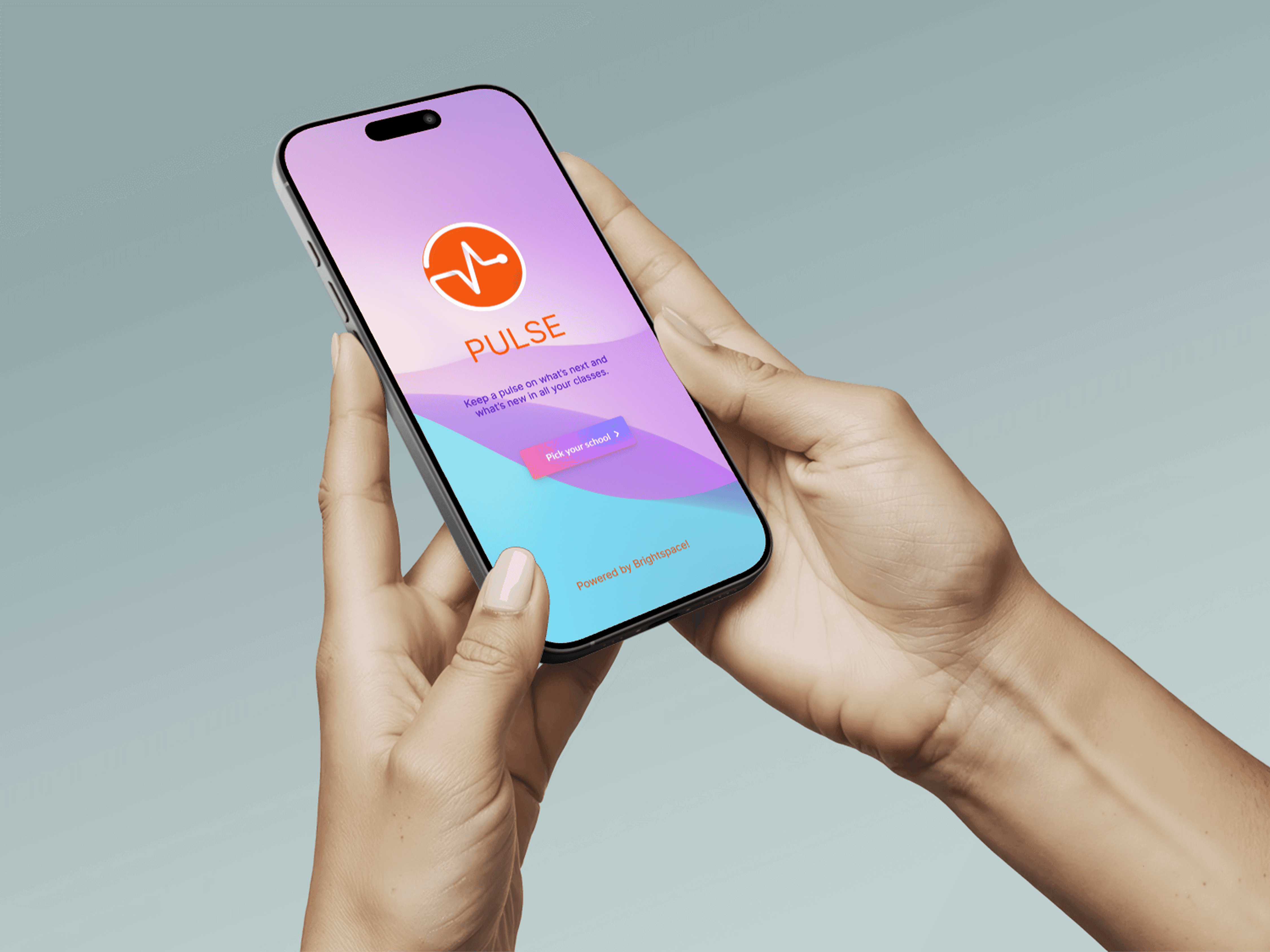
Designed an interactive, simulation-based onboarding course to help young learners build their first mobile app independently using Thunkable. The experience replaces passive instruction with guided, hands-on learning.
Year :
2026
Industry :
Ed-tech
Client :
Students ages 8–14 · WhiteHat Jr platform
Project Duration :
1 month
Role:
Learning Experience Designer
Tools:
Articulate Storyline 360 · Thunkable · Figma

Context
In February 2020, I joined WhiteHat Jr. as a coding mentor for kids aged 6 to 14.
WhiteHat Jr. was an online coding platform launched just before COVID, with only 30 teachers and 200 students at the time. The platform was founded by Karan Bajaj and was later acquired by BYJU’S in 2020.
The model was to run eight one-hour, one-on-one trial sessions each day. In these sessions, you would complete an activity with the student, build a basic app (such as button-click or color-change logic), and walk the parents through the curriculum.
If the parents were convinced, the student was enrolled in a set number of sessions that they could take at their own pace. Scheduling was flexible, so students could book a class at any time of day.
In my first two months on the platform, I conducted around 200 trial sessions and onboarded 70 students who went on to take classes with me over the next two years.


Problem
Pre/Post- Trial Preparation
Beginner learners struggled to understand how to use Thunkable independently. Traditional instruction relied heavily on explanations rather than practice, leading to confusion, low confidence, and dependency on instructors.
Research & Insights
Learning Goal
Design an interactive onboarding course where students simulate using Thunkable and learn how to build their first app through guided interaction.
100/2000 live classes recorded for research
WhiteHatJr. made 100 live class recording available to me for research purposes. These classes were conducted by intermidiate tutors and helped me combine my live class experience data with theirs.
4 stages involved to build an experiential learning
This learning module is inspired by Kolb's Experiential Learning stages.
Concrete Experience - Student must do it themselves for learning to occur.
Reflective Observation
Building Action Map
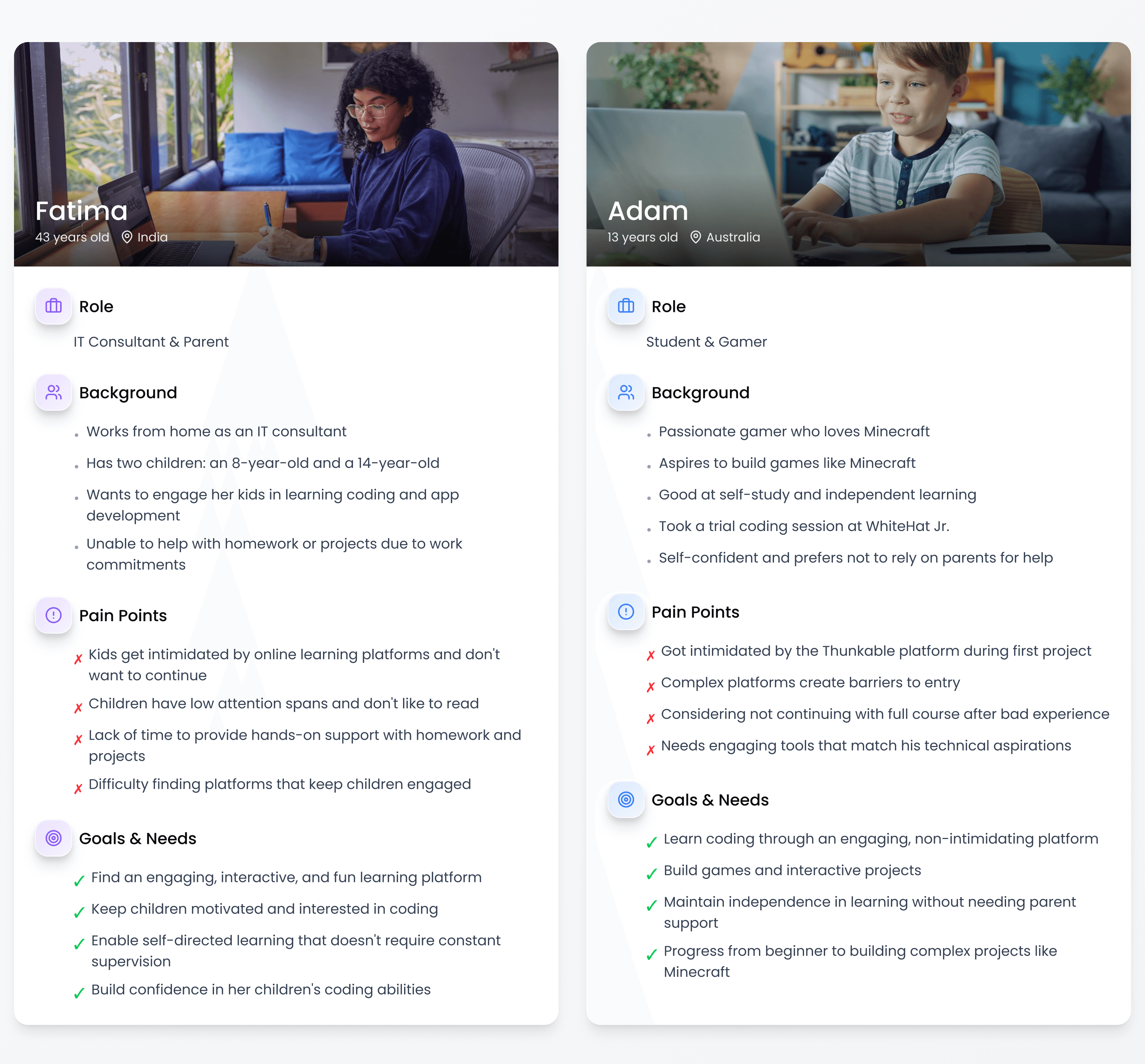
User personas gave a clear idea of who our users were and the experience they expected. This help me plan the Action Map.
Action Map

Design Library
Following several rounds of stakeholder alignment and constraint-driven iteration, the action map was approved, allowing me to transition into a key phase of the project: developing a robust, reusable design library to ensure consistency and scalability.

Text-Based Story Board
I developed a practitioner's habit of observation as my my primary research source. Every time a student hesitated, clicked the wrong element, misread an instruction, or waited for me to intervene, I noted it not in a formal research log, but in the accumulated, repeatable way that practitioners build knowledge over time.
The same failure appeared with a different student, in a different session, and the pattern became impossible to ignore.
This approach meant the storyboard wasn't built from content to be covered. It was built from mistakes to be prevented.

Process
Articulate Storyline 360 - Development Skills
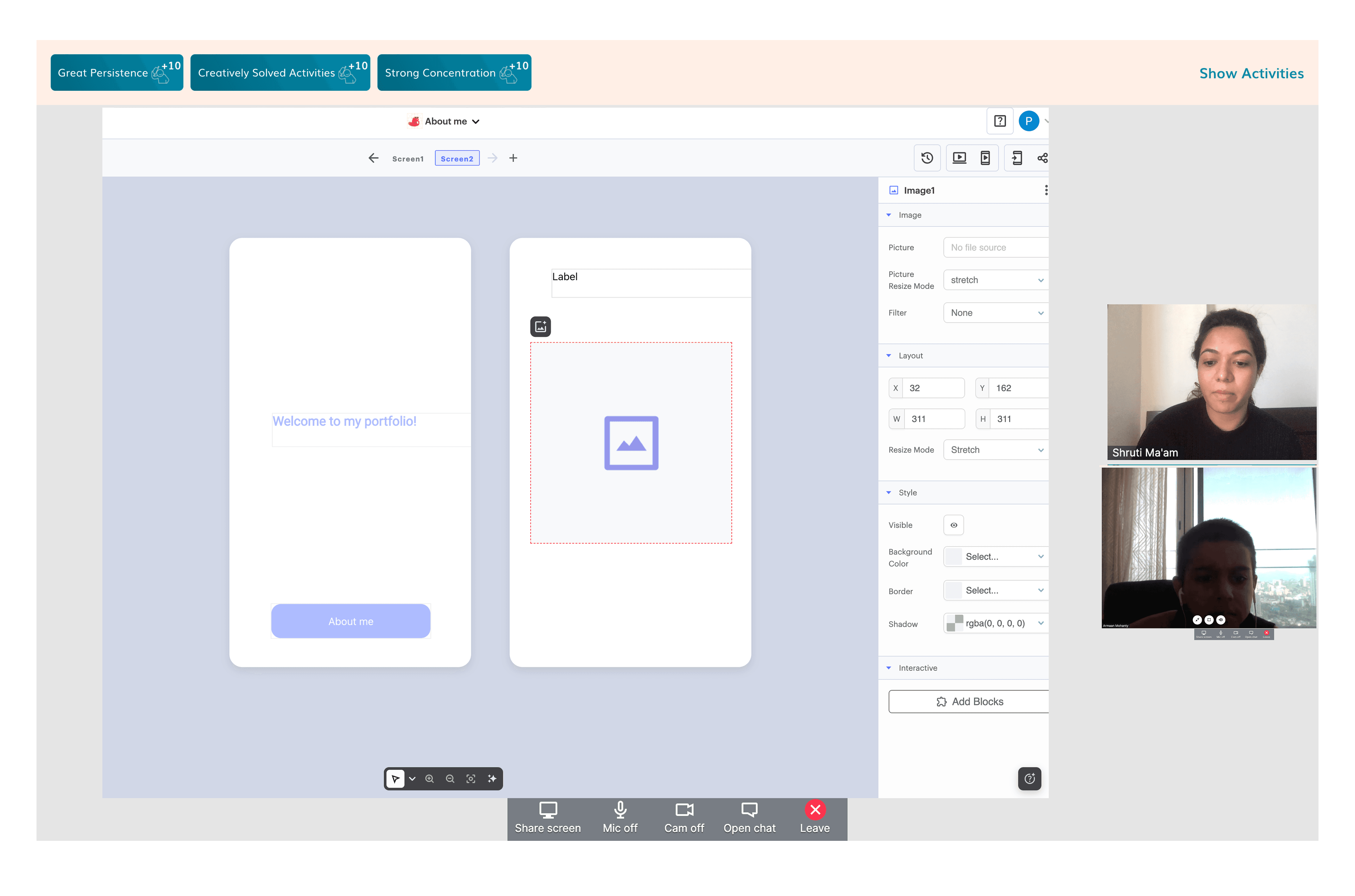
I used simulation-based learning to replicate the real Thunkable interface, allowing learners to practice actions in a safe, guided environment. Instead of telling users what to do, the course lets them learn by doing through step-by-step interactions, feedback, and scenario-based challenges.
Style Guide & Visual Consistency
Established fonts, colours, and component styles upfront, applied consistently across all 90+ slides
Ensured zero visual drift between the course UI and the real Thunkable interface
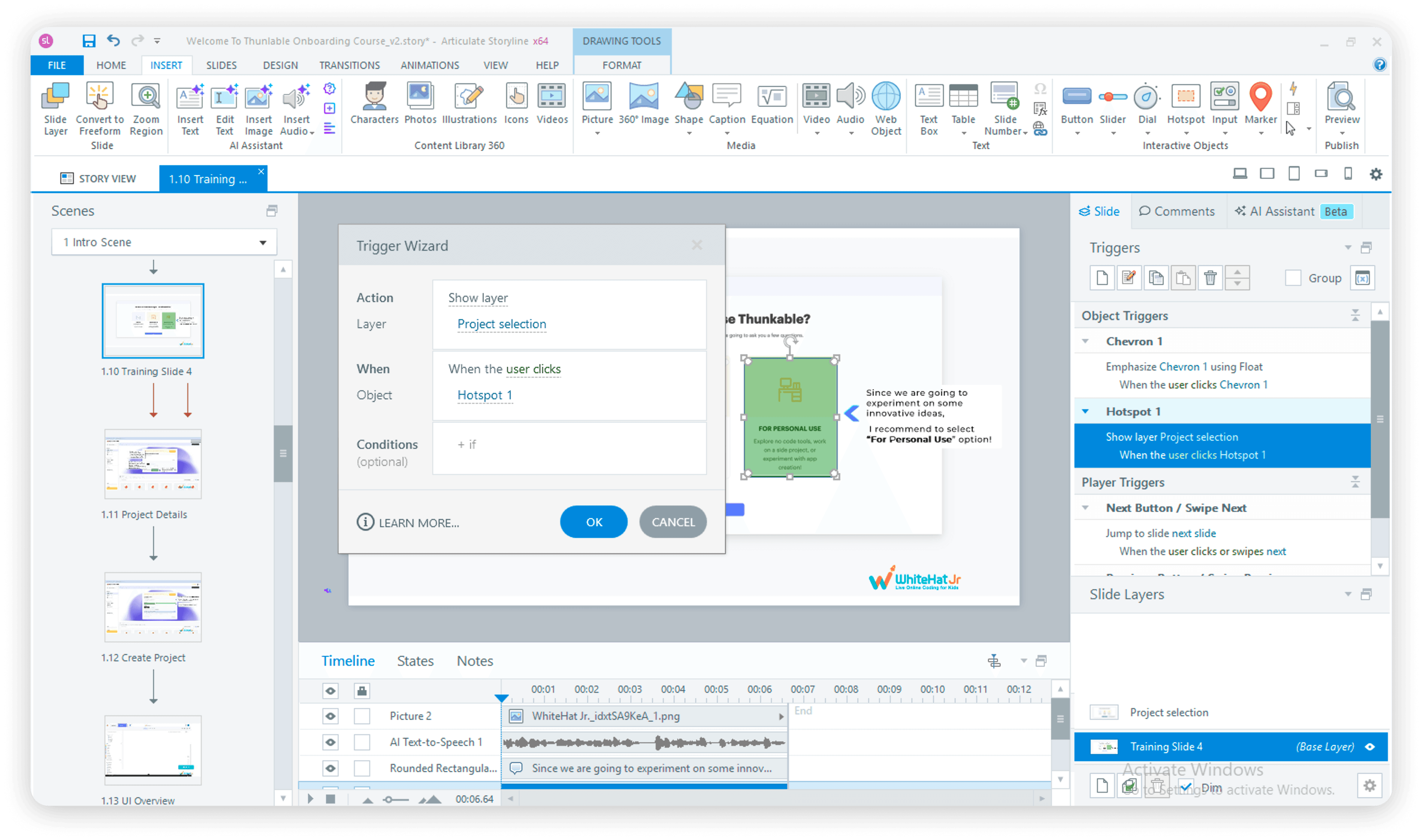
Simulations - Hotspots & Layers
Built all platform simulations using hotspots placed directly on UI elements
Each hotspot triggers a new layer replicating the next screen state, e.g. clicking the Login button surfaces a Login screen layer
Applied this approach consistently across sign-up flow, Design mode, and Blocks editor simulations
Conditional triggers controlled exactly when each layer appeared, based on learner action
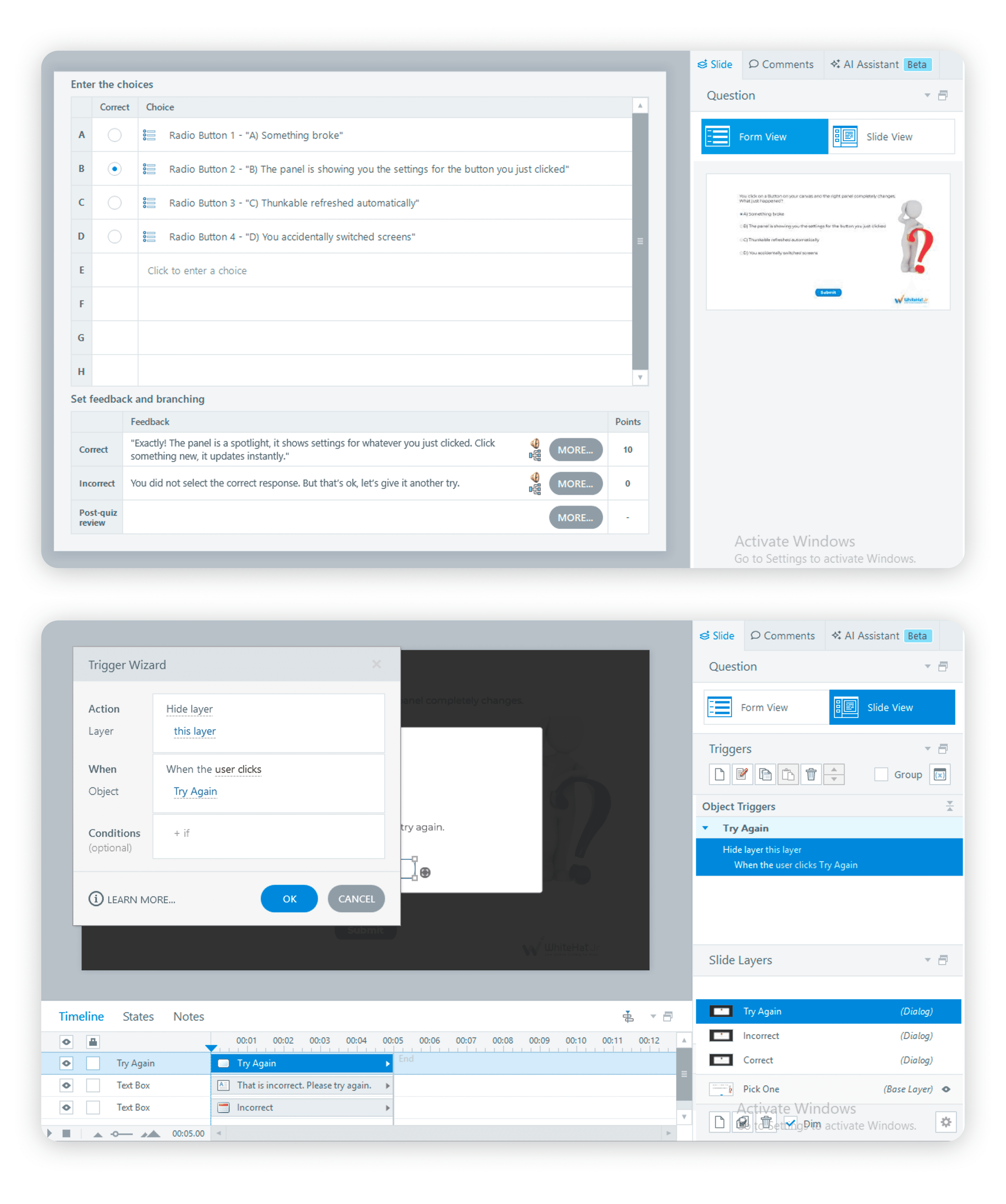
Freeform Quizzes - Pick One
Used Slide View to design the visual layout, radio button options, question text, character asset
Used Form View to set correct/incorrect answers, add targeted feedback, and enable Try Again
Try Again removed the dead end, learners could retry without losing progress
AI-generated audio added directly in Form View for all feedback states
Freeform Quizzes - Drag and Drop
Defined draggable objects and drop targets on the base layer
Used conditional triggers to show the correct result layer when the object landed on the right drop zone
Built a working Design Mode simulation: learner drags a Label component onto the canvas → a custom editing panel layer appears → learner types directly into a text input field on that layer
Every successful interaction acknowledged by Aura, feedback was empathetic, specific, and motivating at every step
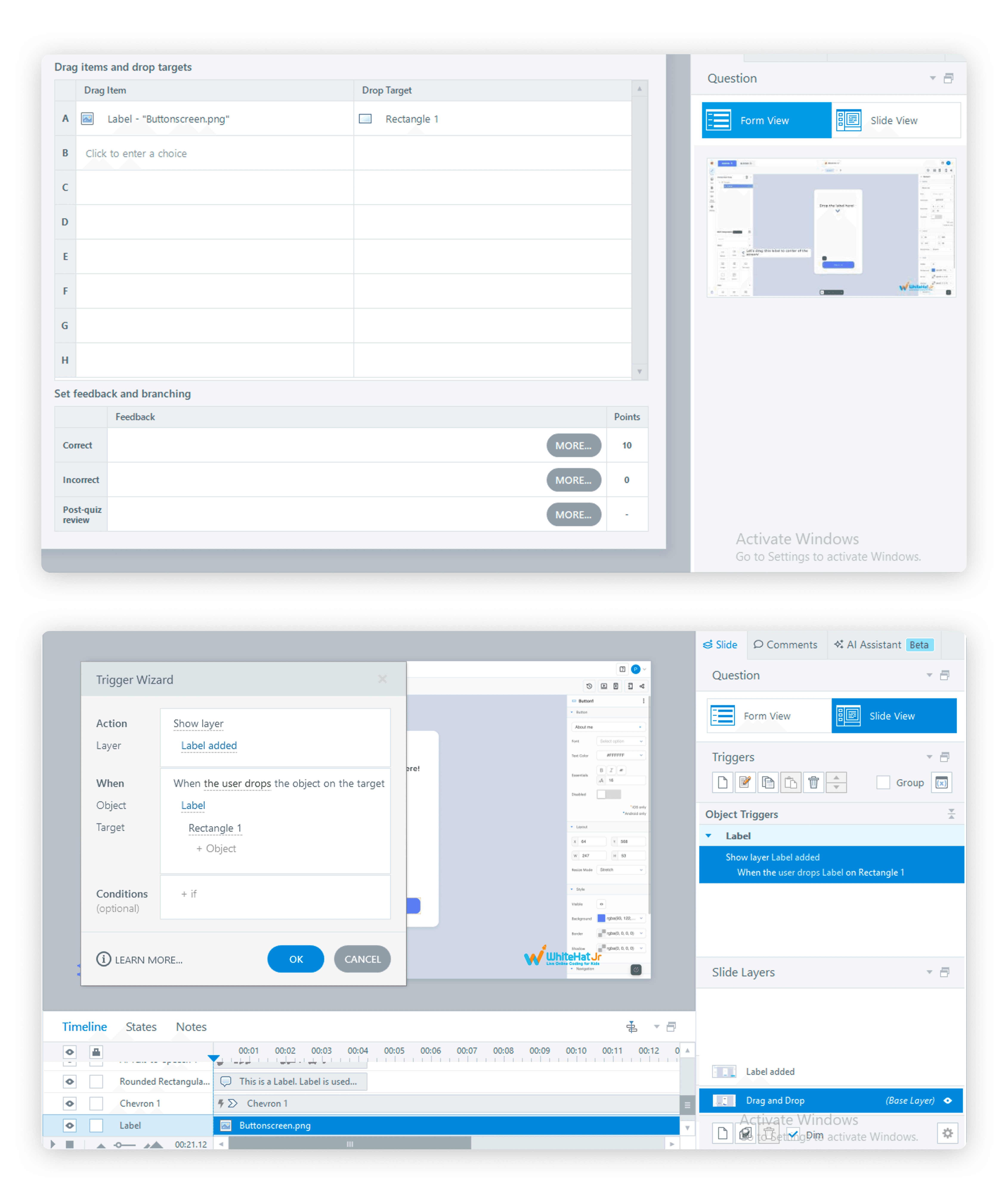
Triggers & Conditional Logic
Conditional triggers used throughout to gate layer visibility based on learner behaviour
Ensured no interaction advanced without the correct action being performed first
Multiple trigger sequences coordinated animation, audio, and state changes in precise order
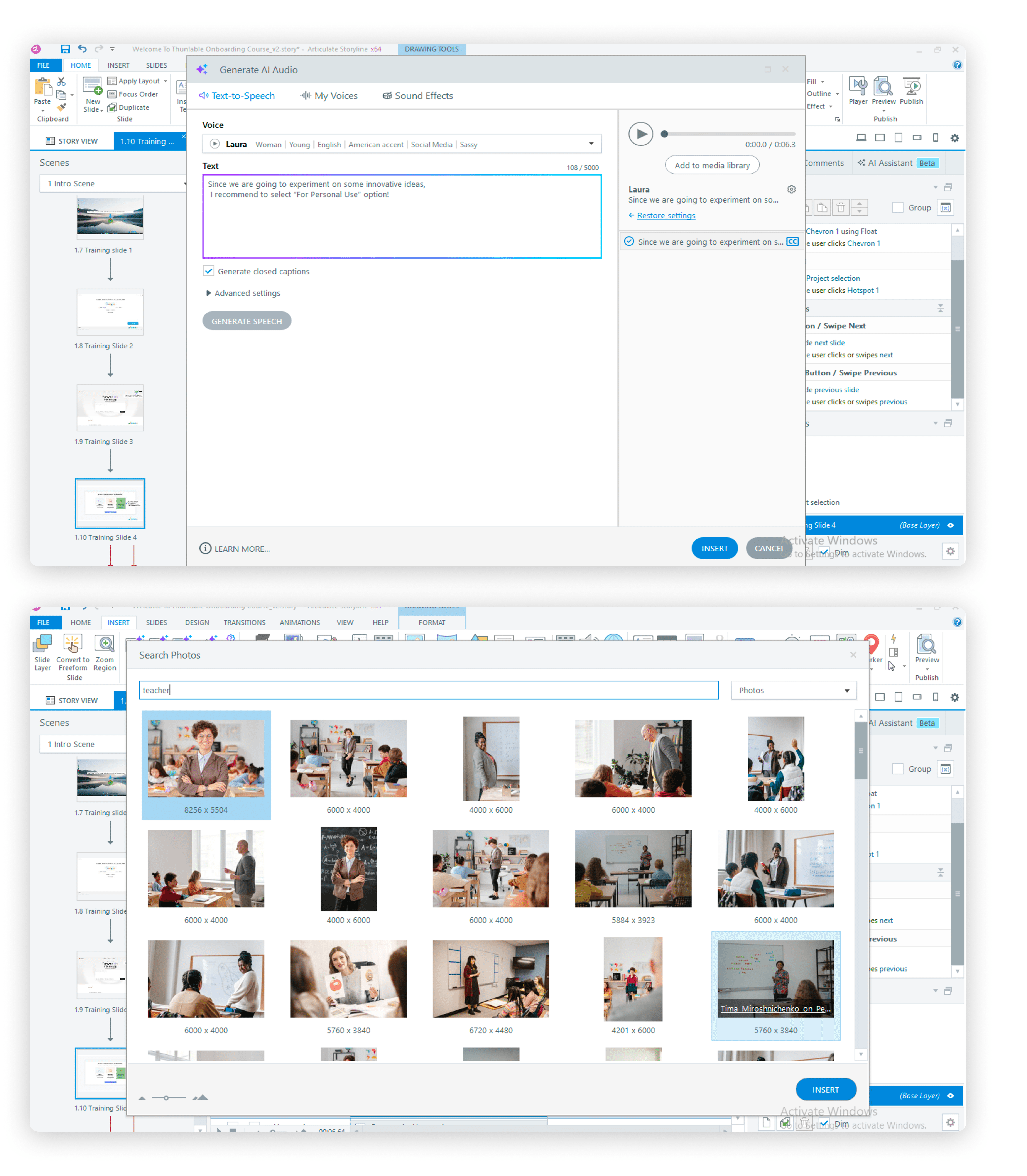
AI Features - Articulate Storyline 360
AI image generation used for visual assets
AI audio generation used for voiceover and feedback audio across all slides
Auto Accessibility Issue Recognition used from the start of development, flagged and resolved issues in real time rather than as a post-build audit
Accessibility - WCAG Standards
Closed captions on all audio content
Alt text on all images and interactive elements
Language options and audio support for deaf and hard-of-hearing learners
Contrast ratios and focus indicators verified throughout
Accessibility issues identified and resolved during development using Storyline's built-in recognition tool,not retrofitted after the fact
User Testing & Iteration
I ran informal think-aloud sessions with 3 adult participants and 2 young participants, testing whether the course could be navigated independently, without any guidance.


What worked
• Course described as engaging and interactive by all 5 participants
• Simulation tasks held attention, participants leaned in, didn't click through
• All 5 expressed genuine interest in continuing to learn Thunkable after completing the course
What needed fixing
Issue | Fix |
|---|---|
Instruction text disappeared at end of timeline participants didn't know what to type | Extended timeline hold + added persistent instruction bar until correct action is completed |
Aura dialogue advanced before participants finished reading | Replaced timeline triggers with manual click-to-advance on all Aura slides |
Hotspot hit areas too small - adjacent clicks triggered error states | Expanded hit areas + added pulsing highlight to guide first click |
FROM CLASSROOM TO COURSE - CLOSING THE LOOP
This project gave me the rare opportunity to be the researcher, the designer, the developer, and the learner, all at once.
90+ slide interactive course in Articulate Storyline 360
Screen-accurate simulations of the Thunkable interface
Branching scenarios and guided interactions
Drag-and-drop and click-based activities
Feedback-driven learning flows
WCAG 2.1 AA accessible experience
Learning Impact

🔍 THE ADVANTAGE
Having taught on this exact platform for two years meant I could design with a level of specificity most instructional designers can't access.
🤖 AI INTEGRATION
Every simulation, every feedback line, every Aura moment traces back to a real student, a real mistake, and a real moment of confusion I had personally witnessed and this was all possible with Articulate Storyline 360's in-built AI efficiency.
💡KEY LEARNINGS
UX RIGOUR TRANSFERS TO ID
Every UX principle I applied over 9 years, scaffolding, feedback loops, progressive disclosure, accessibility, maps directly to instructional design. The vocabulary changes. The thinking doesn't.
TEACHING IS RESEARCH
2,000+ one-on-one sessions with students is a longitudinal, naturalistic study. I just didn't know to call it that at the time. Practitioners hold research data they've never formalised. This project taught me to formalise it.
More Projects

Branding
SIMULATION-BASED THUNKABLE ONBOARDING COURSE
Designed an interactive, simulation-based onboarding course to help young learners build their first mobile app independently using Thunkable. The experience replaces passive instruction with guided, hands-on learning.
Year :
2026
Industry :
Ed-tech
Client :
Students ages 8–14 · WhiteHat Jr platform
Project Duration :
1 month
Role:
Learning Experience Designer
Tools:
Articulate Storyline 360 · Thunkable · Figma
Context
In February 2020, I joined WhiteHat Jr. as a coding mentor for kids aged 6 to 14.
WhiteHat Jr. was an online coding platform launched just before COVID, with only 30 teachers and 200 students at the time. The platform was founded by Karan Bajaj and was later acquired by BYJU’S in 2020.
The model was to run eight one-hour, one-on-one trial sessions each day. In these sessions, you would complete an activity with the student, build a basic app (such as button-click or color-change logic), and walk the parents through the curriculum.
If the parents were convinced, the student was enrolled in a set number of sessions that they could take at their own pace. Scheduling was flexible, so students could book a class at any time of day.
In my first two months on the platform, I conducted around 200 trial sessions and onboarded 70 students who went on to take classes with me over the next two years.
Problem
Pre/Post- Trial Preparation
Beginner learners struggled to understand how to use Thunkable independently. Traditional instruction relied heavily on explanations rather than practice, leading to confusion, low confidence, and dependency on instructors.
Research & Insights
Learning Goal
Design an interactive onboarding course where students simulate using Thunkable and learn how to build their first app through guided interaction.
100/2000 live classes recorded for research
WhiteHatJr. made 100 live class recording available to me for research purposes. These classes were conducted by intermidiate tutors and helped me combine my live class experience data with theirs.
4 stages involved to build an experiential learning
This learning module is inspired by Kolb's Experiential Learning stages.
Concrete Experience - Student must do it themselves for learning to occur.
Reflective Observation
Building Action Map
User personas gave a clear idea of who our users were and the experience they expected. This help me plan the Action Map.
Action Map
Design Library
Following several rounds of stakeholder alignment and constraint-driven iteration, the action map was approved, allowing me to transition into a key phase of the project: developing a robust, reusable design library to ensure consistency and scalability.
Text-Based Story Board
I developed a practitioner's habit of observation as my my primary research source. Every time a student hesitated, clicked the wrong element, misread an instruction, or waited for me to intervene, I noted it not in a formal research log, but in the accumulated, repeatable way that practitioners build knowledge over time.
The same failure appeared with a different student, in a different session, and the pattern became impossible to ignore.
This approach meant the storyboard wasn't built from content to be covered. It was built from mistakes to be prevented.
Process
Articulate Storyline 360 - Development Skills
I used simulation-based learning to replicate the real Thunkable interface, allowing learners to practice actions in a safe, guided environment. Instead of telling users what to do, the course lets them learn by doing through step-by-step interactions, feedback, and scenario-based challenges.
Style Guide & Visual Consistency
Established fonts, colours, and component styles upfront, applied consistently across all 90+ slides
Ensured zero visual drift between the course UI and the real Thunkable interface
Simulations - Hotspots & Layers
Built all platform simulations using hotspots placed directly on UI elements
Each hotspot triggers a new layer replicating the next screen state, e.g. clicking the Login button surfaces a Login screen layer
Applied this approach consistently across sign-up flow, Design mode, and Blocks editor simulations
Conditional triggers controlled exactly when each layer appeared, based on learner action
Freeform Quizzes - Pick One
Used Slide View to design the visual layout, radio button options, question text, character asset
Used Form View to set correct/incorrect answers, add targeted feedback, and enable Try Again
Try Again removed the dead end, learners could retry without losing progress
AI-generated audio added directly in Form View for all feedback states
Freeform Quizzes - Drag and Drop
Defined draggable objects and drop targets on the base layer
Used conditional triggers to show the correct result layer when the object landed on the right drop zone
Built a working Design Mode simulation: learner drags a Label component onto the canvas → a custom editing panel layer appears → learner types directly into a text input field on that layer
Every successful interaction acknowledged by Aura, feedback was empathetic, specific, and motivating at every step
Triggers & Conditional Logic
Conditional triggers used throughout to gate layer visibility based on learner behaviour
Ensured no interaction advanced without the correct action being performed first
Multiple trigger sequences coordinated animation, audio, and state changes in precise order
AI Features - Articulate Storyline 360
AI image generation used for visual assets
AI audio generation used for voiceover and feedback audio across all slides
Auto Accessibility Issue Recognition used from the start of development, flagged and resolved issues in real time rather than as a post-build audit
Accessibility - WCAG Standards
Closed captions on all audio content
Alt text on all images and interactive elements
Language options and audio support for deaf and hard-of-hearing learners
Contrast ratios and focus indicators verified throughout
Accessibility issues identified and resolved during development using Storyline's built-in recognition tool,not retrofitted after the fact
User Testing & Iteration
I ran informal think-aloud sessions with 3 adult participants and 2 young participants, testing whether the course could be navigated independently, without any guidance.
What worked
• Course described as engaging and interactive by all 5 participants
• Simulation tasks held attention, participants leaned in, didn't click through
• All 5 expressed genuine interest in continuing to learn Thunkable after completing the course
What needed fixing
Issue | Fix |
|---|---|
Instruction text disappeared at end of timeline participants didn't know what to type | Extended timeline hold + added persistent instruction bar until correct action is completed |
Aura dialogue advanced before participants finished reading | Replaced timeline triggers with manual click-to-advance on all Aura slides |
Hotspot hit areas too small - adjacent clicks triggered error states | Expanded hit areas + added pulsing highlight to guide first click |
FROM CLASSROOM TO COURSE - CLOSING THE LOOP
This project gave me the rare opportunity to be the researcher, the designer, the developer, and the learner, all at once.
90+ slide interactive course in Articulate Storyline 360
Screen-accurate simulations of the Thunkable interface
Branching scenarios and guided interactions
Drag-and-drop and click-based activities
Feedback-driven learning flows
WCAG 2.1 AA accessible experience
Learning Impact
🔍 THE ADVANTAGE
Having taught on this exact platform for two years meant I could design with a level of specificity most instructional designers can't access.
🤖 AI INTEGRATION
Every simulation, every feedback line, every Aura moment traces back to a real student, a real mistake, and a real moment of confusion I had personally witnessed and this was all possible with Articulate Storyline 360's in-built AI efficiency.
💡KEY LEARNINGS
UX RIGOUR TRANSFERS TO ID
Every UX principle I applied over 9 years, scaffolding, feedback loops, progressive disclosure, accessibility, maps directly to instructional design. The vocabulary changes. The thinking doesn't.
TEACHING IS RESEARCH
2,000+ one-on-one sessions with students is a longitudinal, naturalistic study. I just didn't know to call it that at the time. Practitioners hold research data they've never formalised. This project taught me to formalise it.
More Projects
Branding
SIMULATION-BASED THUNKABLE ONBOARDING COURSE
Designed an interactive, simulation-based onboarding course to help young learners build their first mobile app independently using Thunkable. The experience replaces passive instruction with guided, hands-on learning.
Year :
2026
Industry :
Ed-tech
Client :
Students ages 8–14 · WhiteHat Jr platform
Project Duration :
1 month
Role:
Learning Experience Designer
Tools:
Articulate Storyline 360 · Thunkable · Figma
Context
In February 2020, I joined WhiteHat Jr. as a coding mentor for kids aged 6 to 14.
WhiteHat Jr. was an online coding platform launched just before COVID, with only 30 teachers and 200 students at the time. The platform was founded by Karan Bajaj and was later acquired by BYJU’S in 2020.
The model was to run eight one-hour, one-on-one trial sessions each day. In these sessions, you would complete an activity with the student, build a basic app (such as button-click or color-change logic), and walk the parents through the curriculum.
If the parents were convinced, the student was enrolled in a set number of sessions that they could take at their own pace. Scheduling was flexible, so students could book a class at any time of day.
In my first two months on the platform, I conducted around 200 trial sessions and onboarded 70 students who went on to take classes with me over the next two years.
Problem
Pre/Post- Trial Preparation
Beginner learners struggled to understand how to use Thunkable independently. Traditional instruction relied heavily on explanations rather than practice, leading to confusion, low confidence, and dependency on instructors.
Research & Insights
Learning Goal
Design an interactive onboarding course where students simulate using Thunkable and learn how to build their first app through guided interaction.
100/2000 live classes recorded for research
WhiteHatJr. made 100 live class recording available to me for research purposes. These classes were conducted by intermidiate tutors and helped me combine my live class experience data with theirs.
4 stages involved to build an experiential learning
This learning module is inspired by Kolb's Experiential Learning stages.
Concrete Experience - Student must do it themselves for learning to occur.
Reflective Observation
Building Action Map
User personas gave a clear idea of who our users were and the experience they expected. This help me plan the Action Map.
Action Map
Design Library
Following several rounds of stakeholder alignment and constraint-driven iteration, the action map was approved, allowing me to transition into a key phase of the project: developing a robust, reusable design library to ensure consistency and scalability.
Text-Based Story Board
I developed a practitioner's habit of observation as my my primary research source. Every time a student hesitated, clicked the wrong element, misread an instruction, or waited for me to intervene, I noted it not in a formal research log, but in the accumulated, repeatable way that practitioners build knowledge over time.
The same failure appeared with a different student, in a different session, and the pattern became impossible to ignore.
This approach meant the storyboard wasn't built from content to be covered. It was built from mistakes to be prevented.
Process
Articulate Storyline 360 - Development Skills
I used simulation-based learning to replicate the real Thunkable interface, allowing learners to practice actions in a safe, guided environment. Instead of telling users what to do, the course lets them learn by doing through step-by-step interactions, feedback, and scenario-based challenges.
Style Guide & Visual Consistency
Established fonts, colours, and component styles upfront, applied consistently across all 90+ slides
Ensured zero visual drift between the course UI and the real Thunkable interface
Simulations - Hotspots & Layers
Built all platform simulations using hotspots placed directly on UI elements
Each hotspot triggers a new layer replicating the next screen state, e.g. clicking the Login button surfaces a Login screen layer
Applied this approach consistently across sign-up flow, Design mode, and Blocks editor simulations
Conditional triggers controlled exactly when each layer appeared, based on learner action
Freeform Quizzes - Pick One
Used Slide View to design the visual layout, radio button options, question text, character asset
Used Form View to set correct/incorrect answers, add targeted feedback, and enable Try Again
Try Again removed the dead end, learners could retry without losing progress
AI-generated audio added directly in Form View for all feedback states
Freeform Quizzes - Drag and Drop
Defined draggable objects and drop targets on the base layer
Used conditional triggers to show the correct result layer when the object landed on the right drop zone
Built a working Design Mode simulation: learner drags a Label component onto the canvas → a custom editing panel layer appears → learner types directly into a text input field on that layer
Every successful interaction acknowledged by Aura, feedback was empathetic, specific, and motivating at every step
Triggers & Conditional Logic
Conditional triggers used throughout to gate layer visibility based on learner behaviour
Ensured no interaction advanced without the correct action being performed first
Multiple trigger sequences coordinated animation, audio, and state changes in precise order
AI Features - Articulate Storyline 360
AI image generation used for visual assets
AI audio generation used for voiceover and feedback audio across all slides
Auto Accessibility Issue Recognition used from the start of development, flagged and resolved issues in real time rather than as a post-build audit
Accessibility - WCAG Standards
Closed captions on all audio content
Alt text on all images and interactive elements
Language options and audio support for deaf and hard-of-hearing learners
Contrast ratios and focus indicators verified throughout
Accessibility issues identified and resolved during development using Storyline's built-in recognition tool,not retrofitted after the fact
User Testing & Iteration
I ran informal think-aloud sessions with 3 adult participants and 2 young participants, testing whether the course could be navigated independently, without any guidance.
What worked
• Course described as engaging and interactive by all 5 participants
• Simulation tasks held attention, participants leaned in, didn't click through
• All 5 expressed genuine interest in continuing to learn Thunkable after completing the course
What needed fixing
Issue | Fix |
|---|---|
Instruction text disappeared at end of timeline participants didn't know what to type | Extended timeline hold + added persistent instruction bar until correct action is completed |
Aura dialogue advanced before participants finished reading | Replaced timeline triggers with manual click-to-advance on all Aura slides |
Hotspot hit areas too small - adjacent clicks triggered error states | Expanded hit areas + added pulsing highlight to guide first click |
FROM CLASSROOM TO COURSE - CLOSING THE LOOP
This project gave me the rare opportunity to be the researcher, the designer, the developer, and the learner, all at once.
90+ slide interactive course in Articulate Storyline 360
Screen-accurate simulations of the Thunkable interface
Branching scenarios and guided interactions
Drag-and-drop and click-based activities
Feedback-driven learning flows
WCAG 2.1 AA accessible experience
Learning Impact
🔍 THE ADVANTAGE
Having taught on this exact platform for two years meant I could design with a level of specificity most instructional designers can't access.
🤖 AI INTEGRATION
Every simulation, every feedback line, every Aura moment traces back to a real student, a real mistake, and a real moment of confusion I had personally witnessed and this was all possible with Articulate Storyline 360's in-built AI efficiency.
💡KEY LEARNINGS
UX RIGOUR TRANSFERS TO ID
Every UX principle I applied over 9 years, scaffolding, feedback loops, progressive disclosure, accessibility, maps directly to instructional design. The vocabulary changes. The thinking doesn't.
TEACHING IS RESEARCH
2,000+ one-on-one sessions with students is a longitudinal, naturalistic study. I just didn't know to call it that at the time. Practitioners hold research data they've never formalised. This project taught me to formalise it.